PORTFOLIO
Campaigns
Below are some of the campaigns I’ve worked on over the past four years, from 2021 to now. This includes two years as an Art Director at The Fourth Agency in Toronto, one year as a remote Art Director for Mijor Agency in Vietnam, and several campaigns I executed as a graphic designer for various brands in Vietnam during the COVID-19 pandemic.
- Tong Mein
- Avenue Group
- Closed Casket
- Cai Mam
- Dermafirm
- VSLand
- Mijor Agency
- Laziit
CAMPAIGNS
Tong Mein
The Fourth Agency team completed Tong Mein’s rebranding in about two months during the summer of 2023. Tong Mein, based in Toronto, focuses on health-conscious cuisine tailored for patients and operates three branches, with the newest located at The Well Spadina. The owner, of Vietnamese and Chinese heritage, infuses the food and brand image with a blend of Western and Eastern cultures.
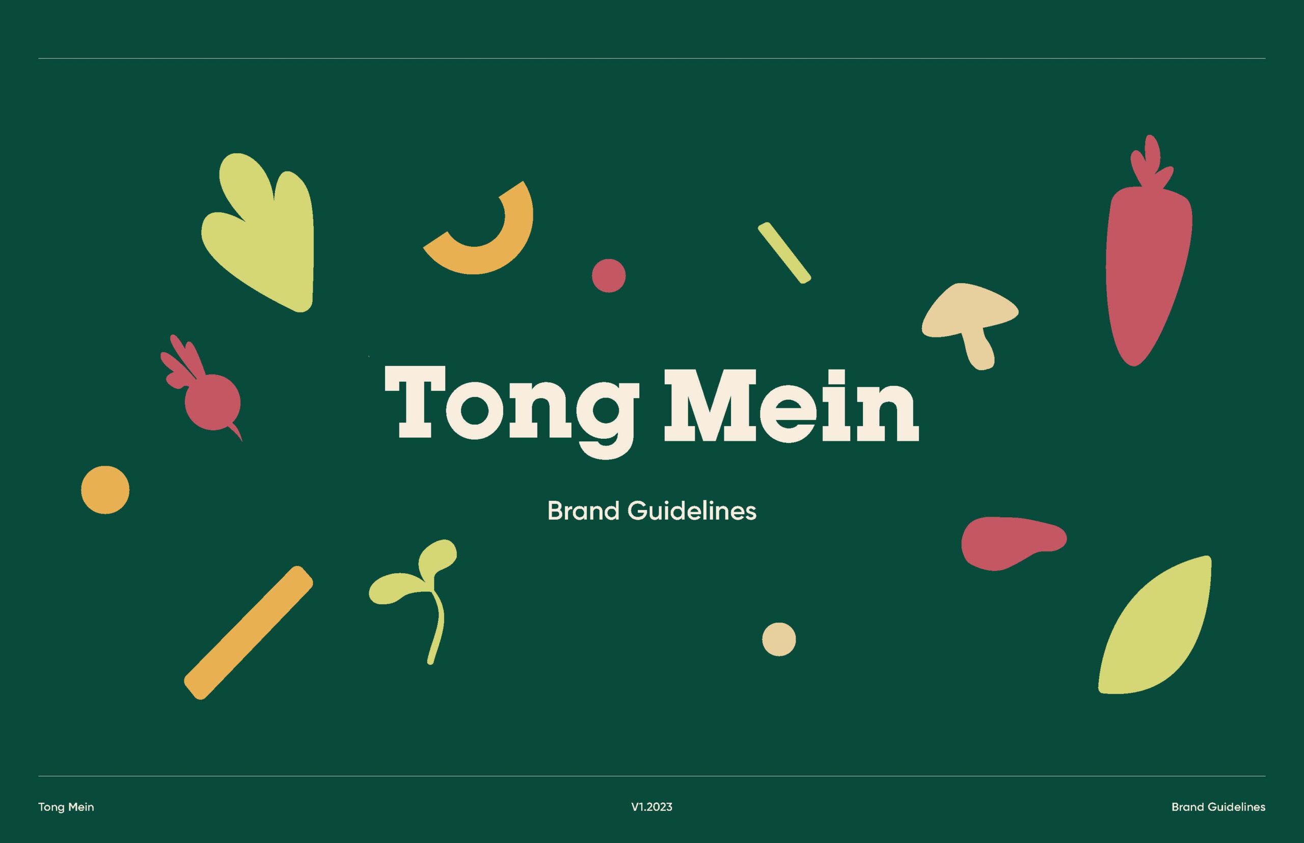
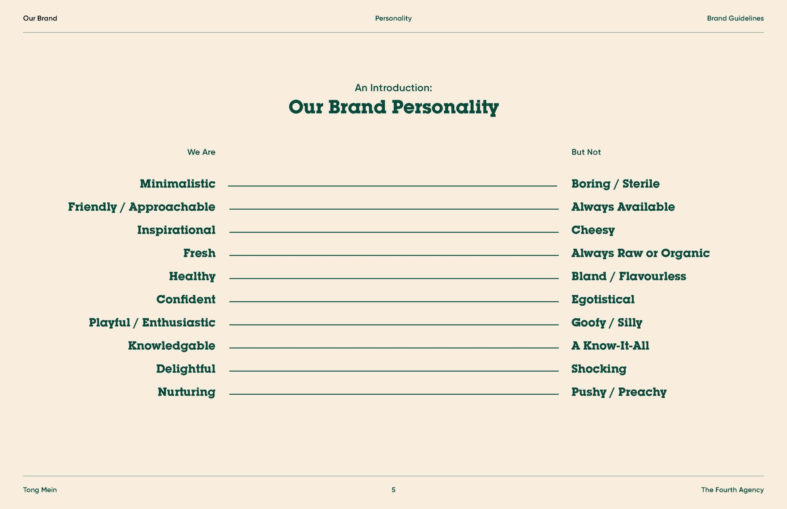
We aimed to position Tong Mein as a health-oriented restaurant chain akin to Freshii and Kupfert & Kim, appealing to all demographics. Hence, Tong Mein’s visual identity needed to be straightforward, employing East Asian typography and natural color schemes.
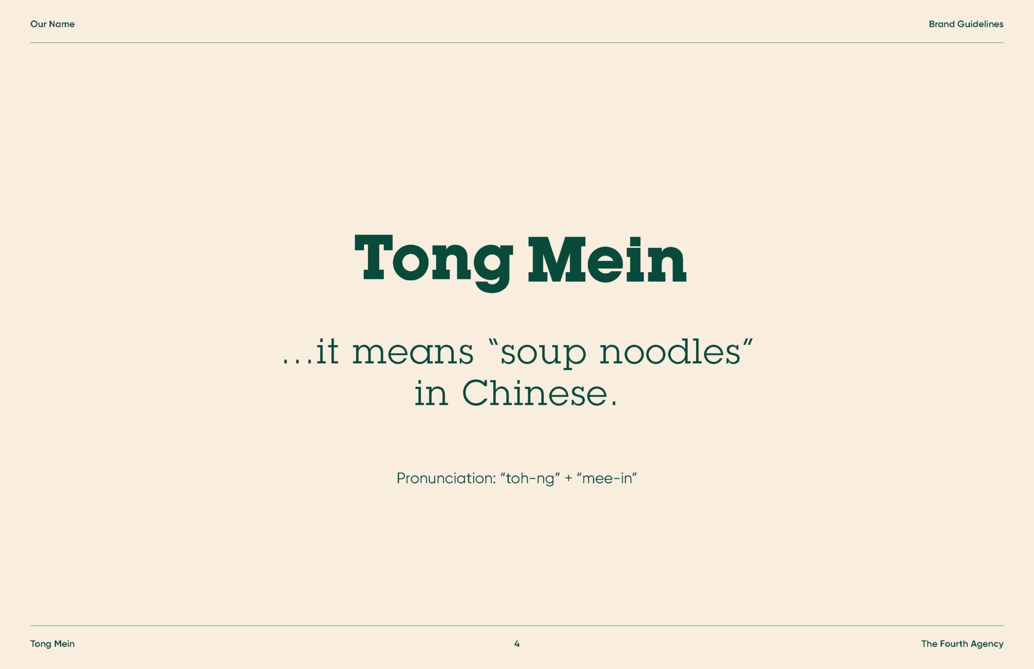
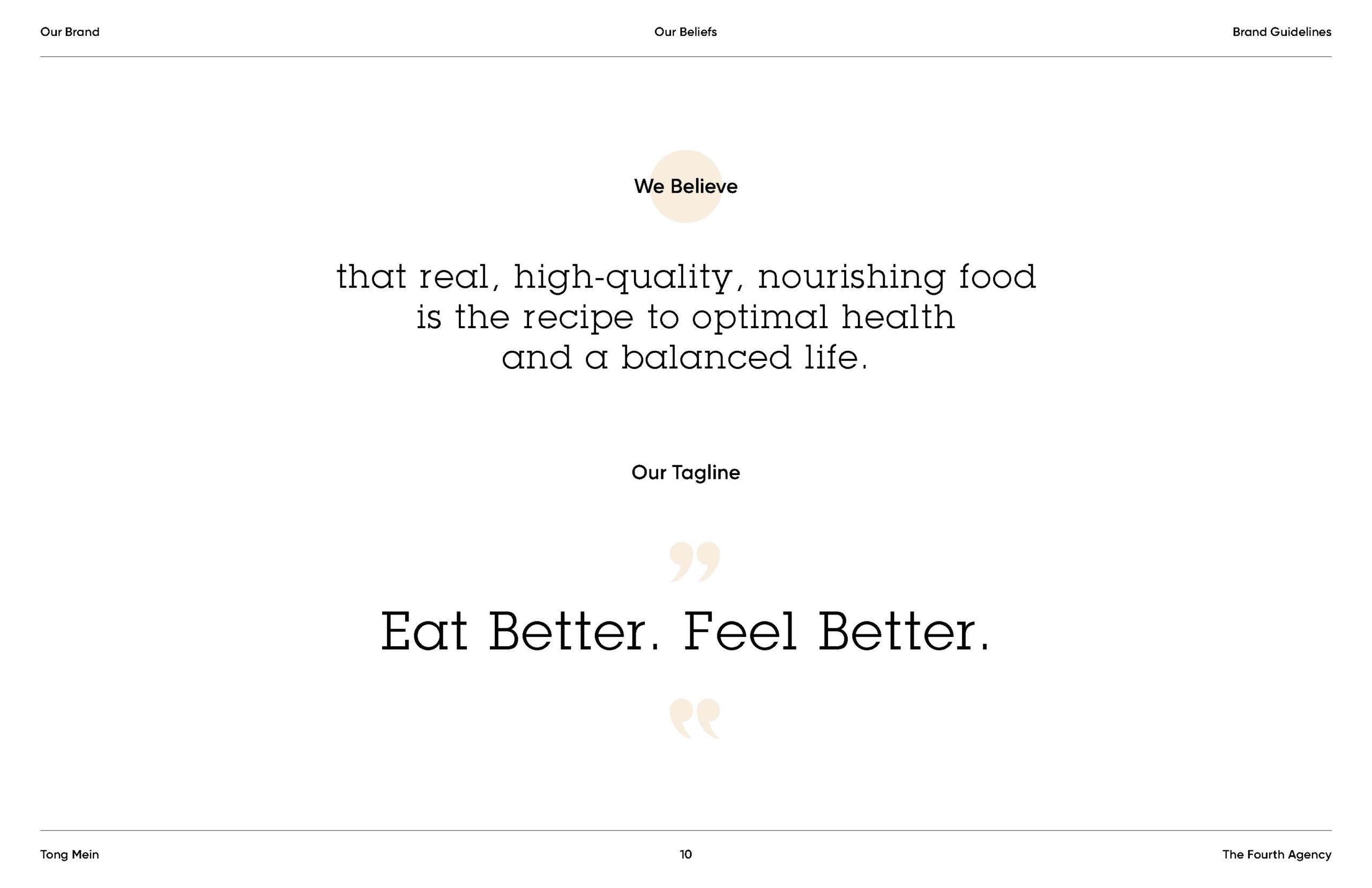
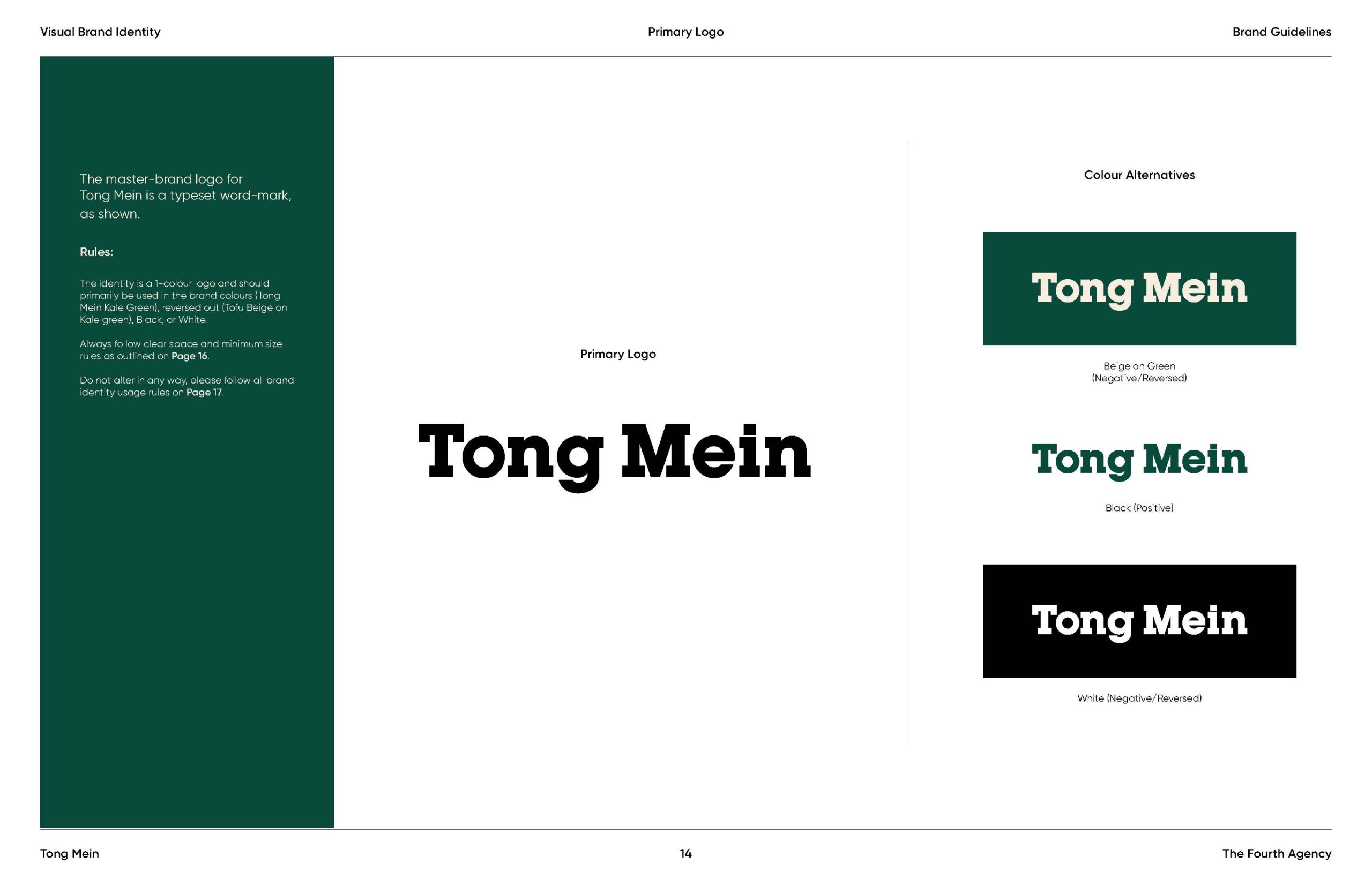
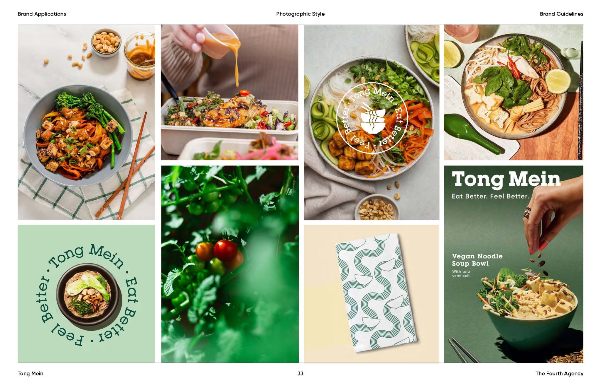
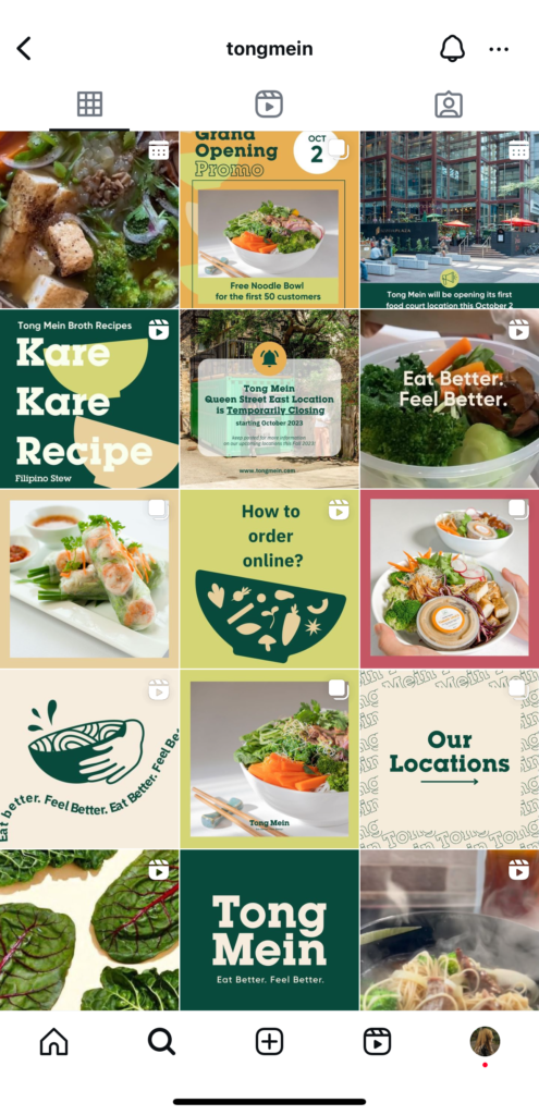
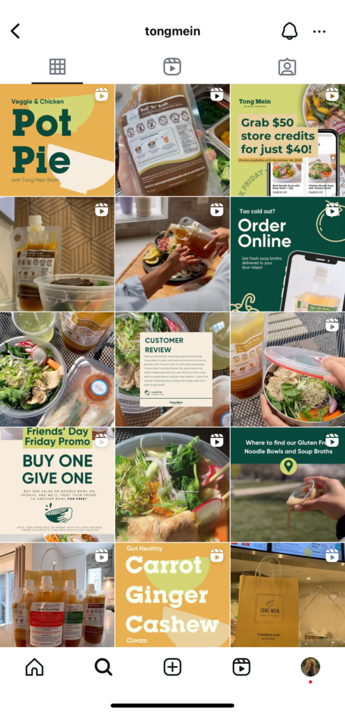
Below are some pages from the brand guidelines we developed. Tong Mein’s application of these guidelines on Instagram demonstrates a consistent and aesthetically pleasing approach.
Our team:
CD: Magdalene Kan
AD: Isabelle Landry
Tong Mein Website | Tong Mein Instagram
Brand Guideline
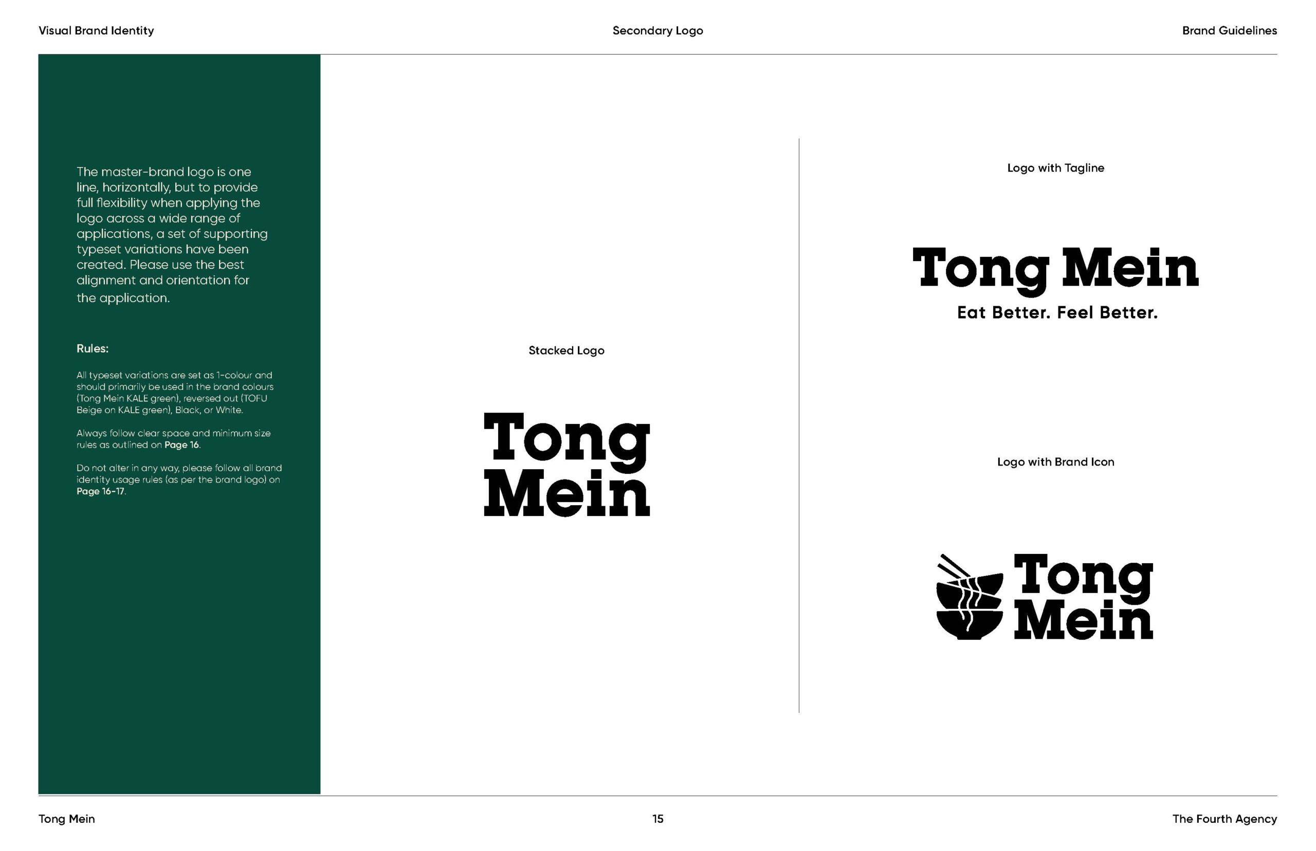
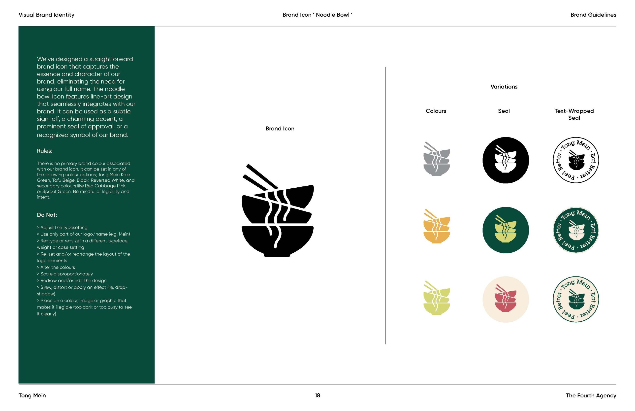
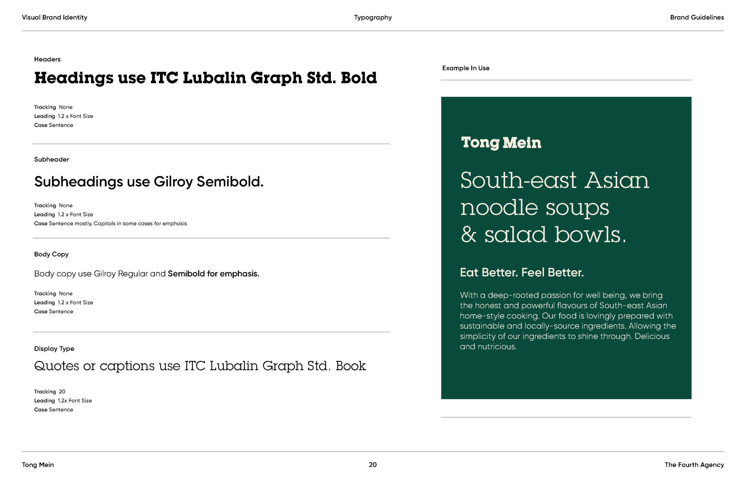
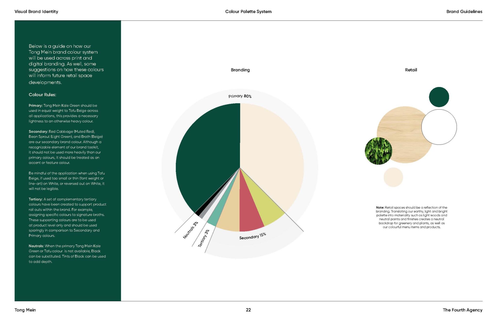
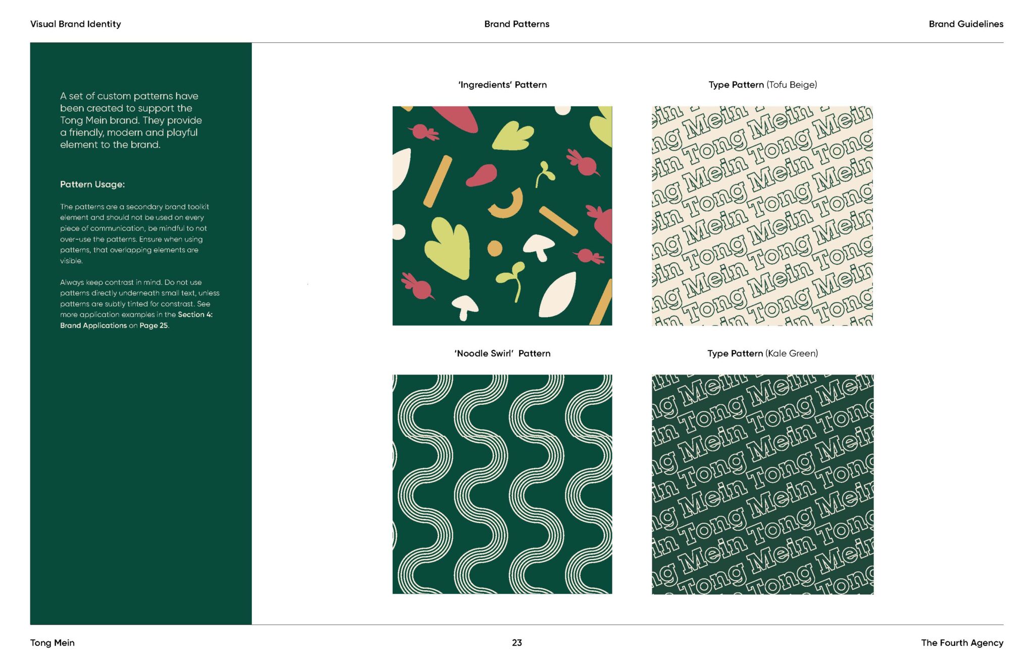
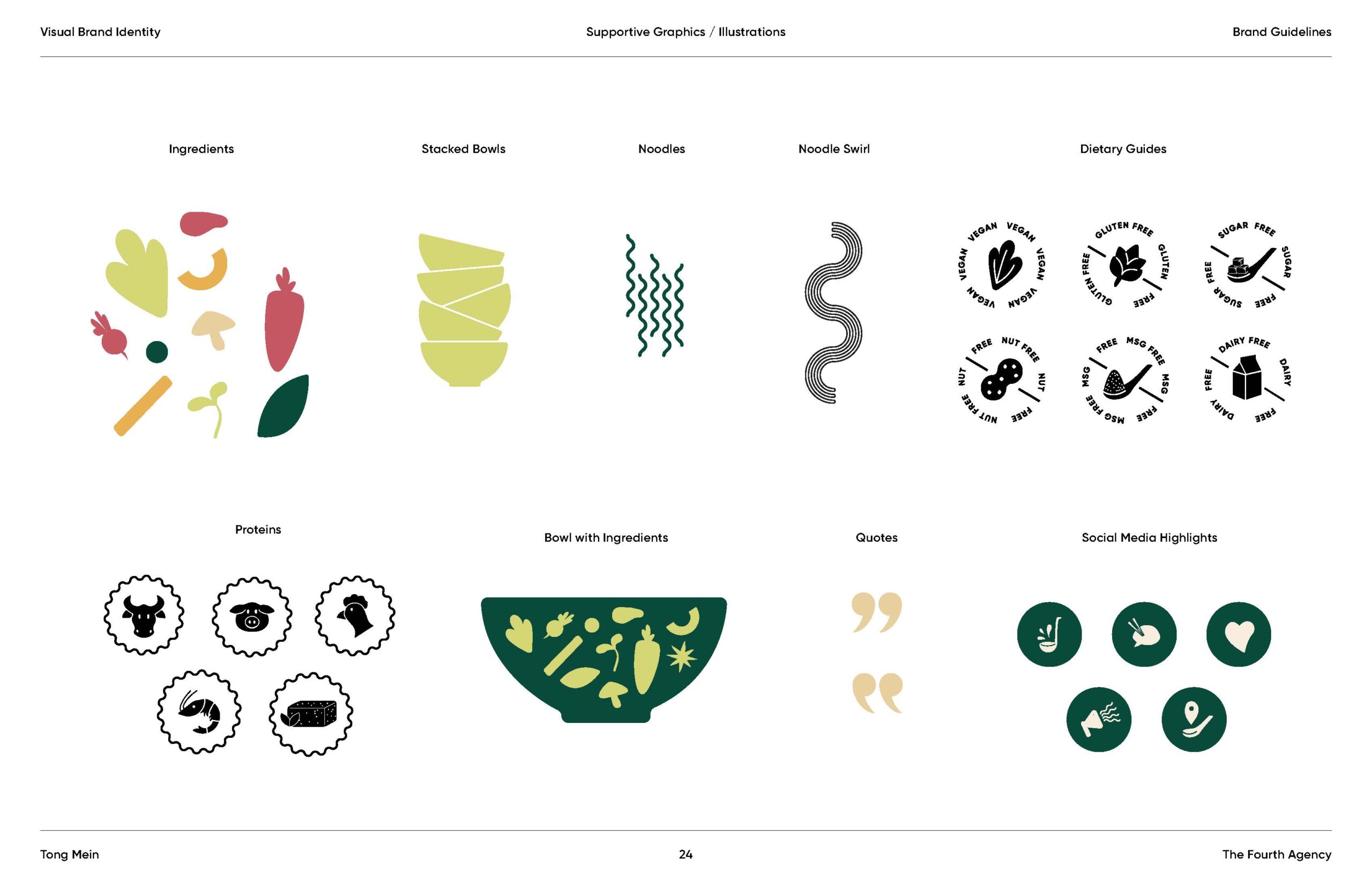
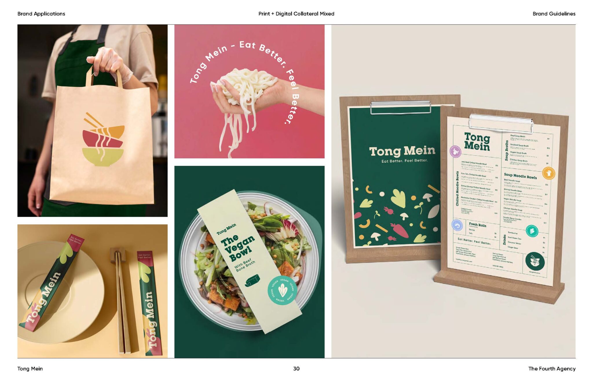
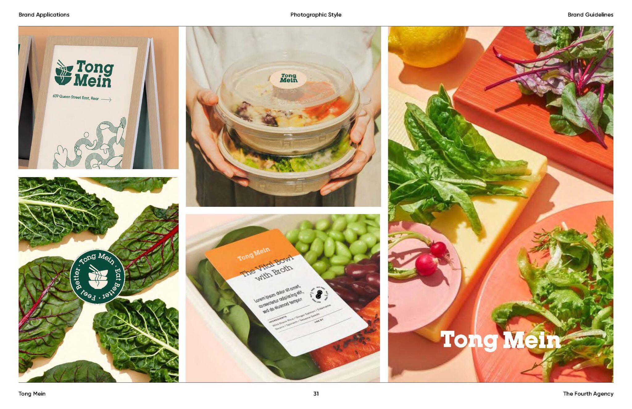
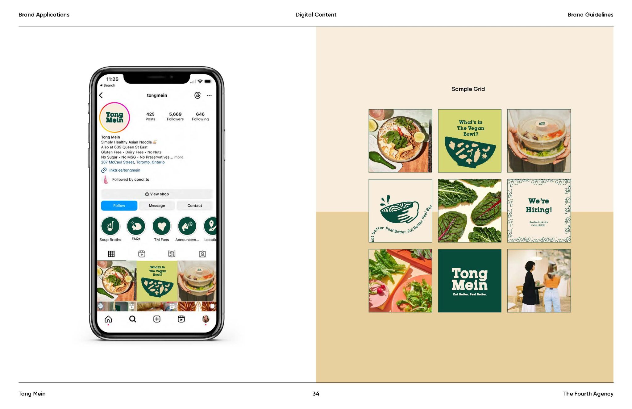
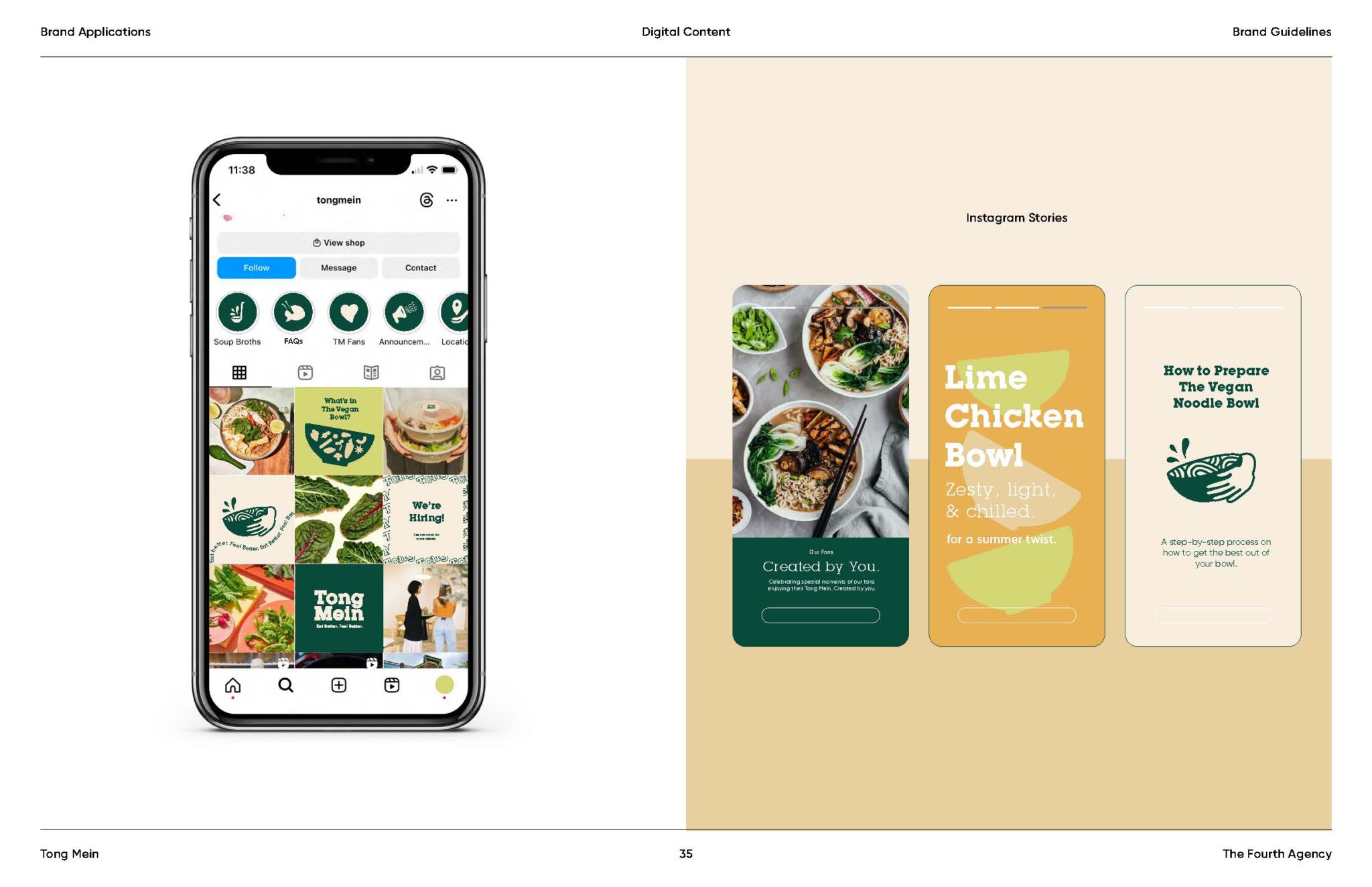
Applications
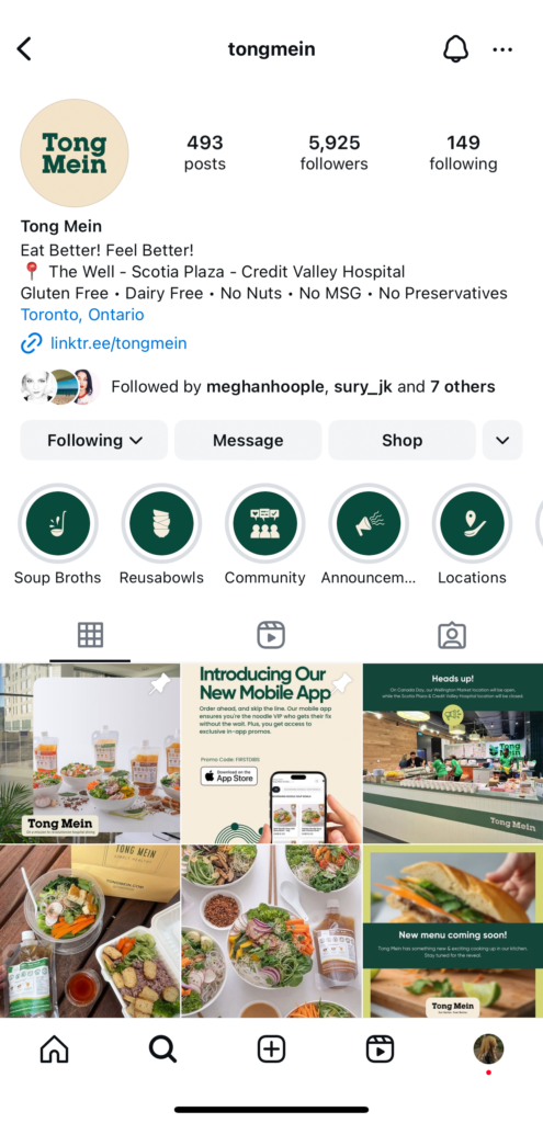
CAMPAIGNS
Avenue Group
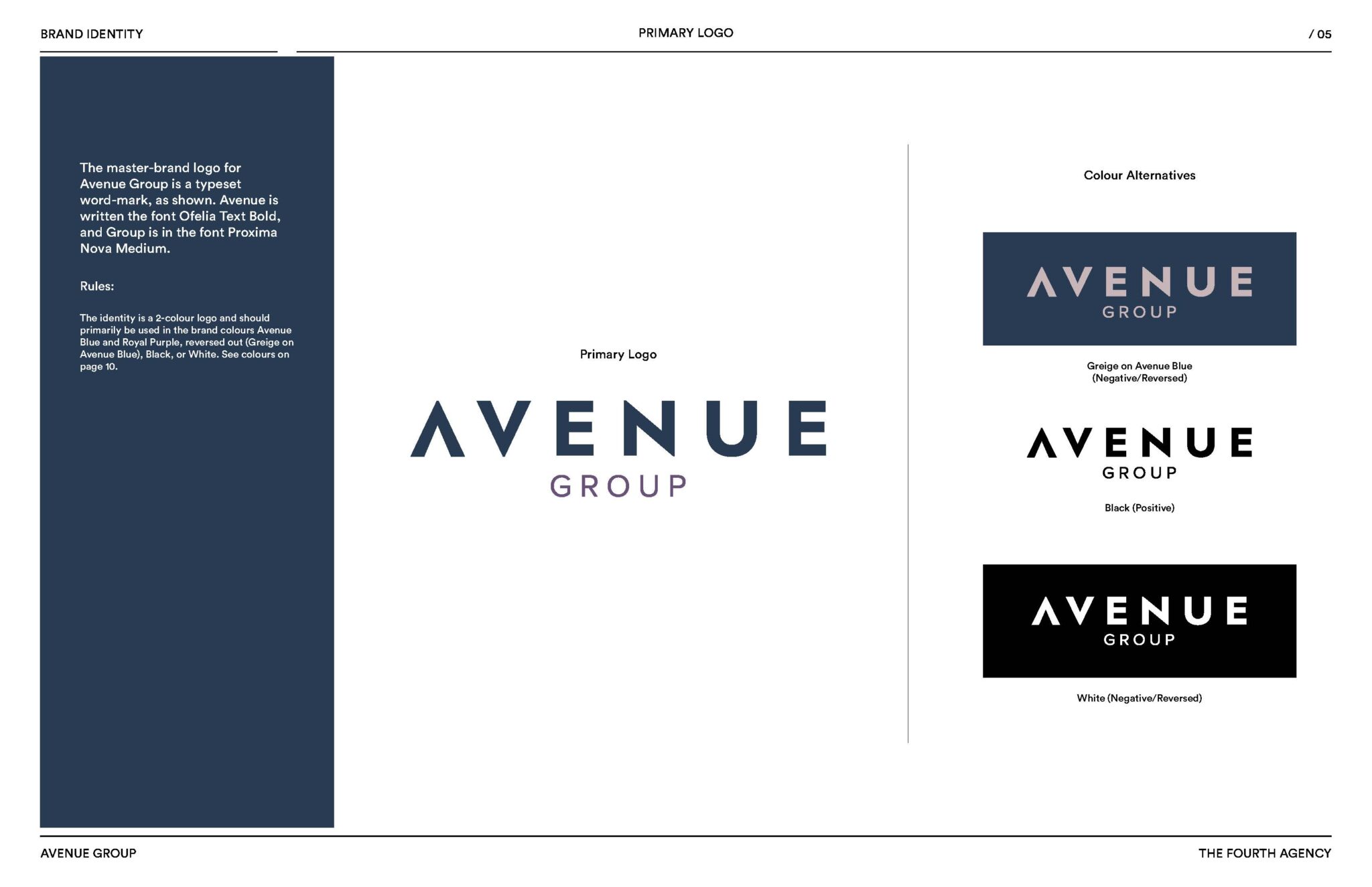
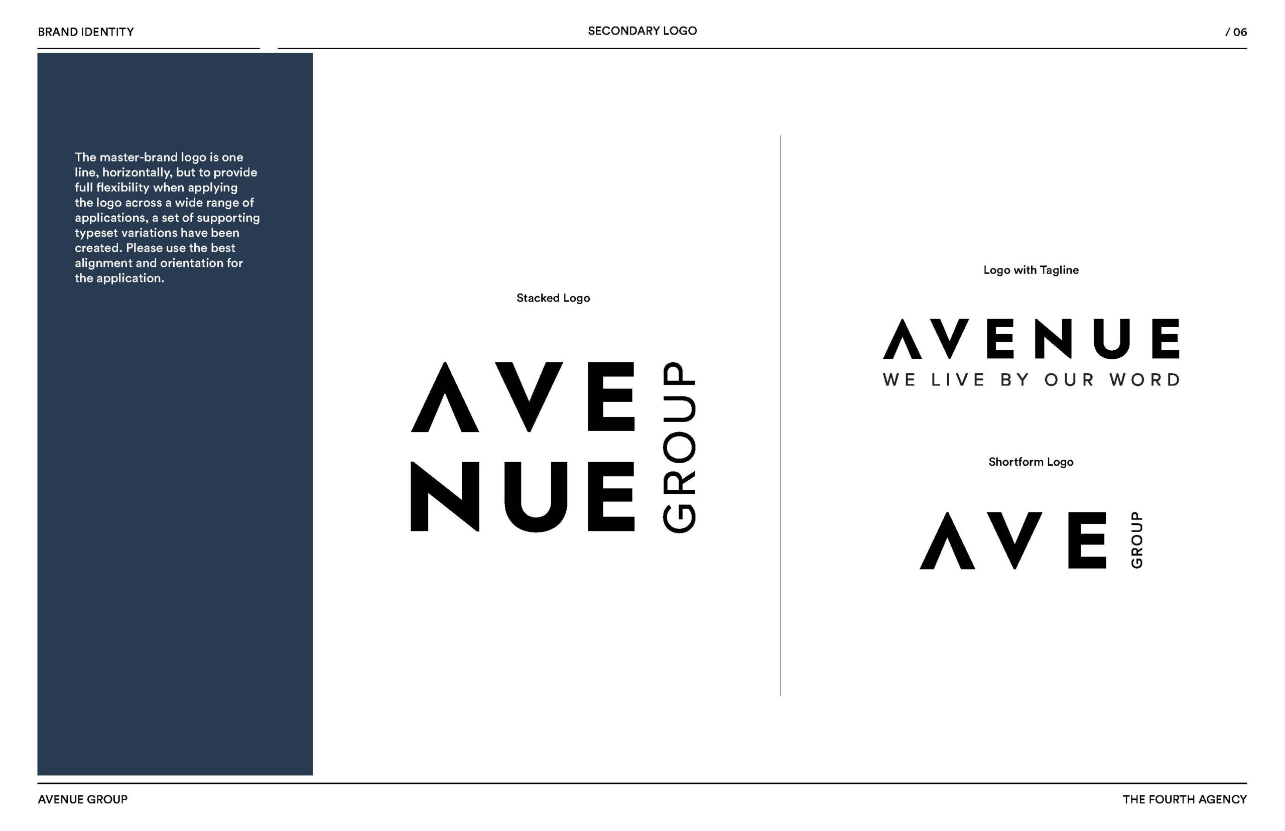
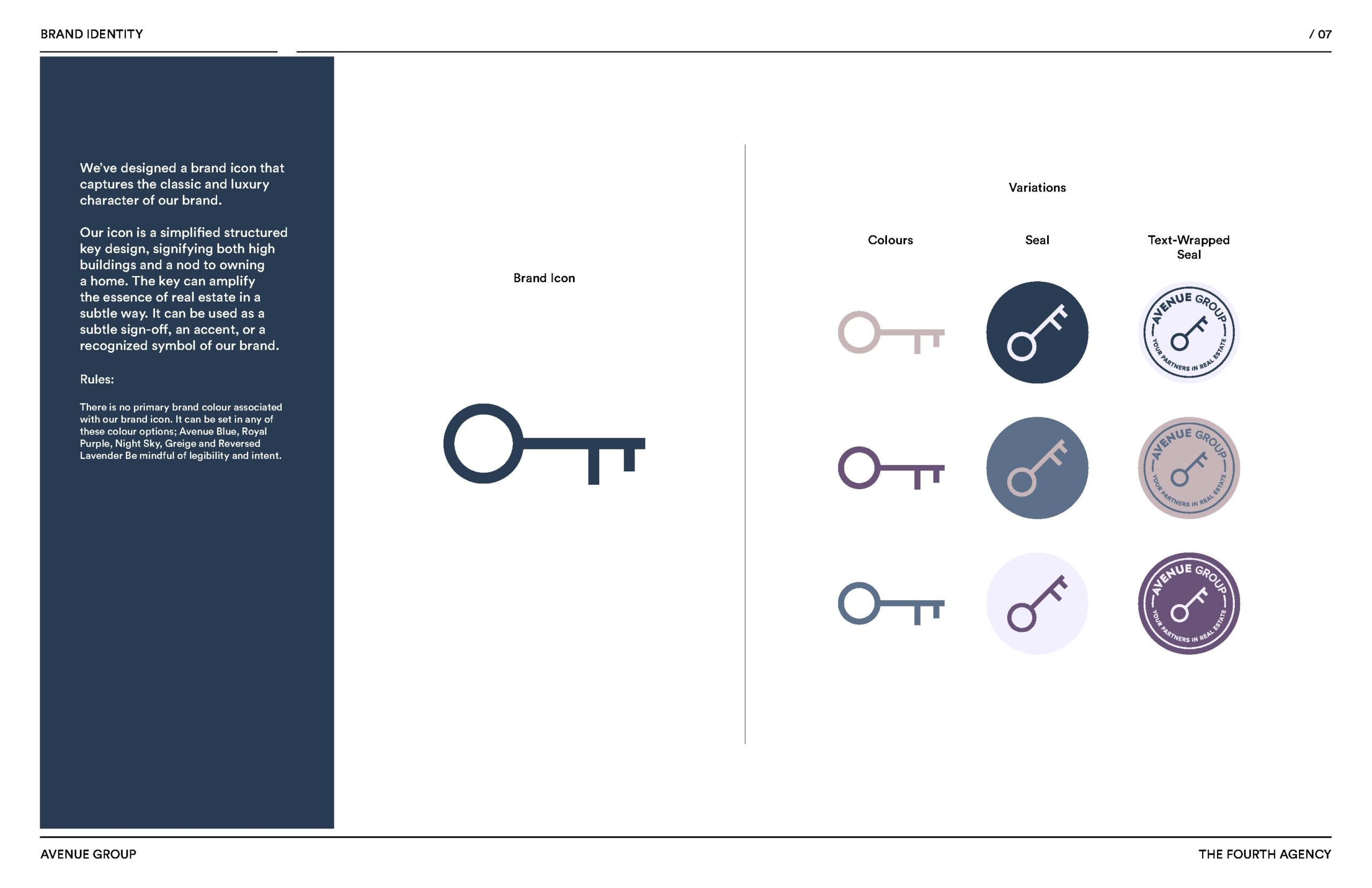
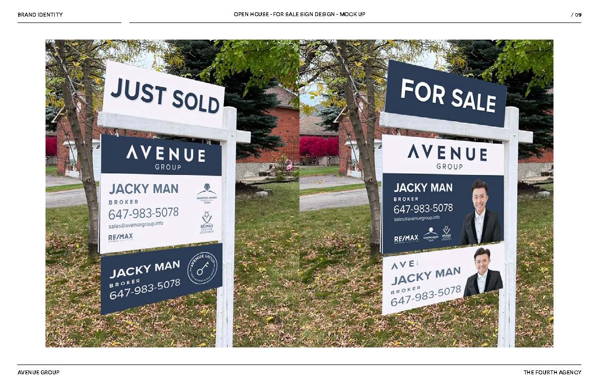
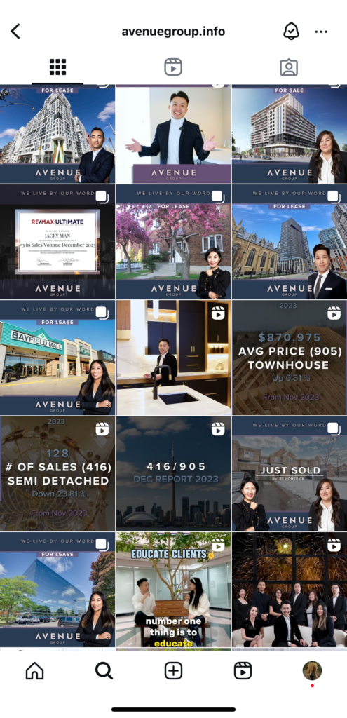
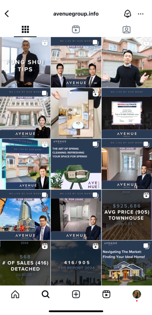
The rebranding process for Avenue Group took place in late 2023, and it was one of our more fascinating projects. The client aimed for a brand image that is both simple and elegant, yet exudes the luxury akin to iconic logos like Chanel or Apple. However, it needed to stand out distinctly among the myriad of real estate companies out there. Avenue Group was the chosen name to replace the former JackyMan, intending to lead the pathway to every home for families in Toronto.
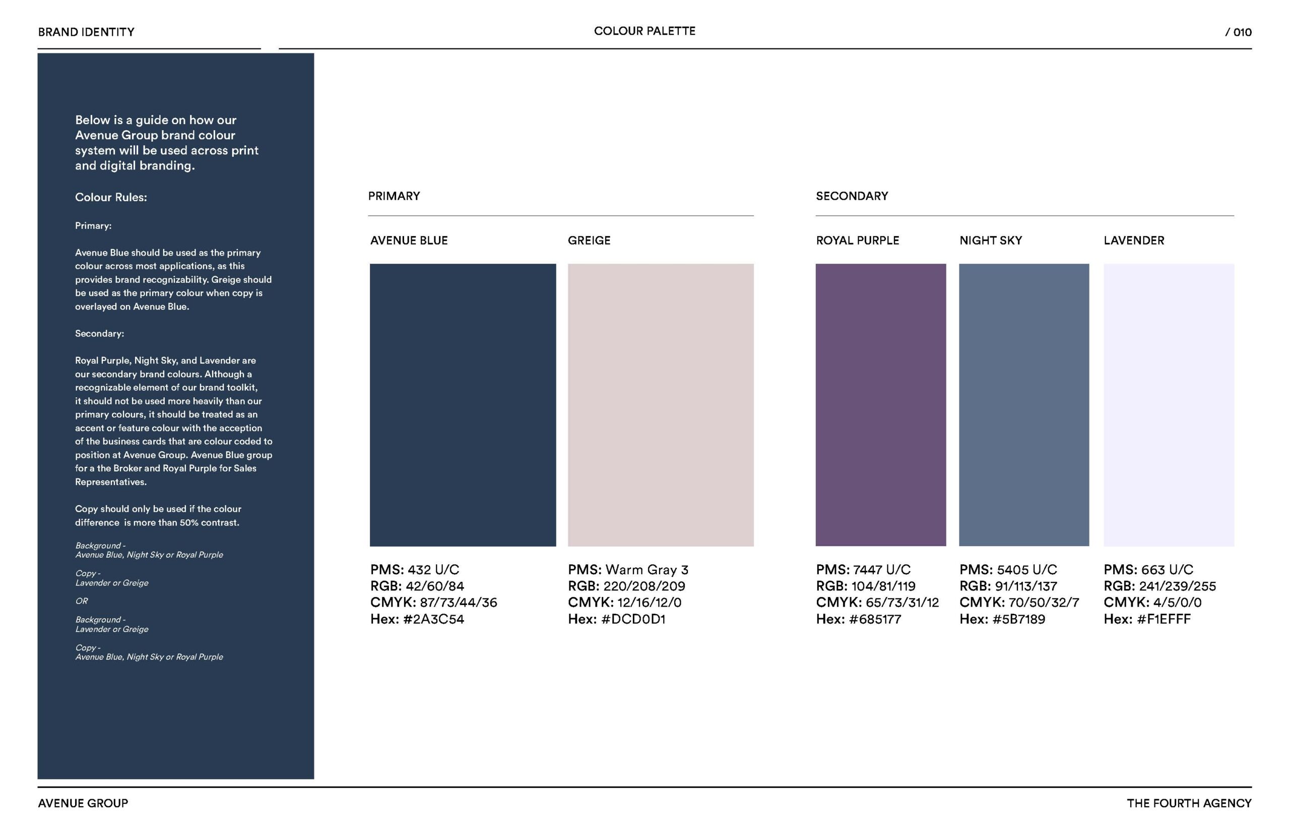
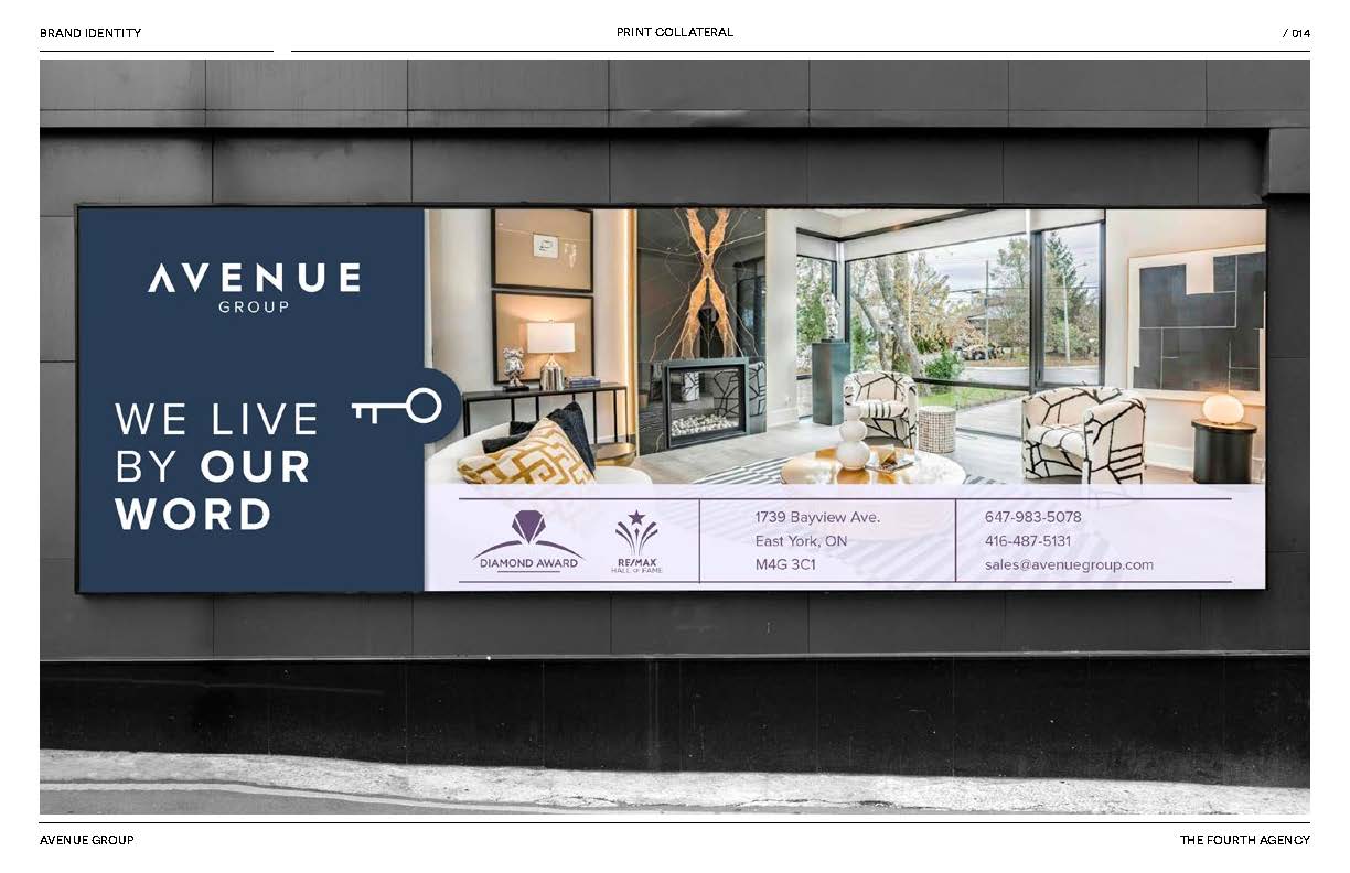
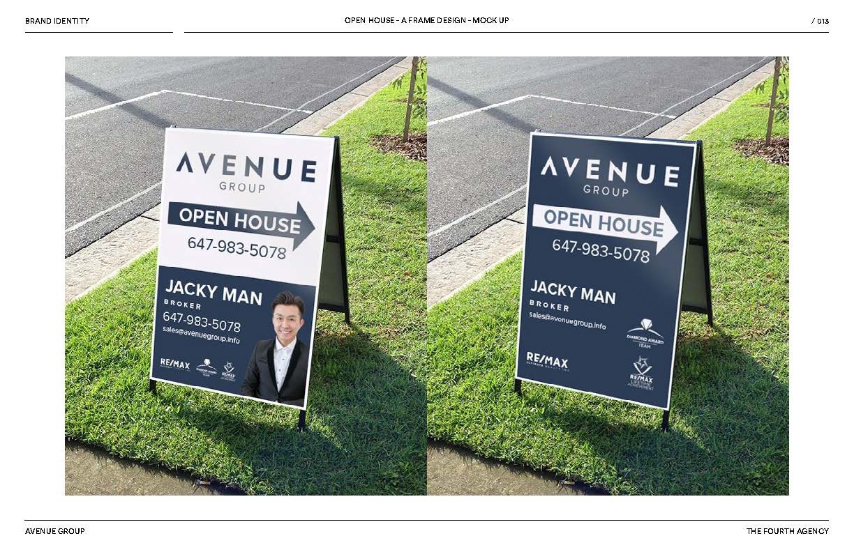
The color palette selected for Avenue is particularly intriguing; it captures the essence of city nights, ideal for real estate and interior design contexts while remaining striking for street-side sales signage.
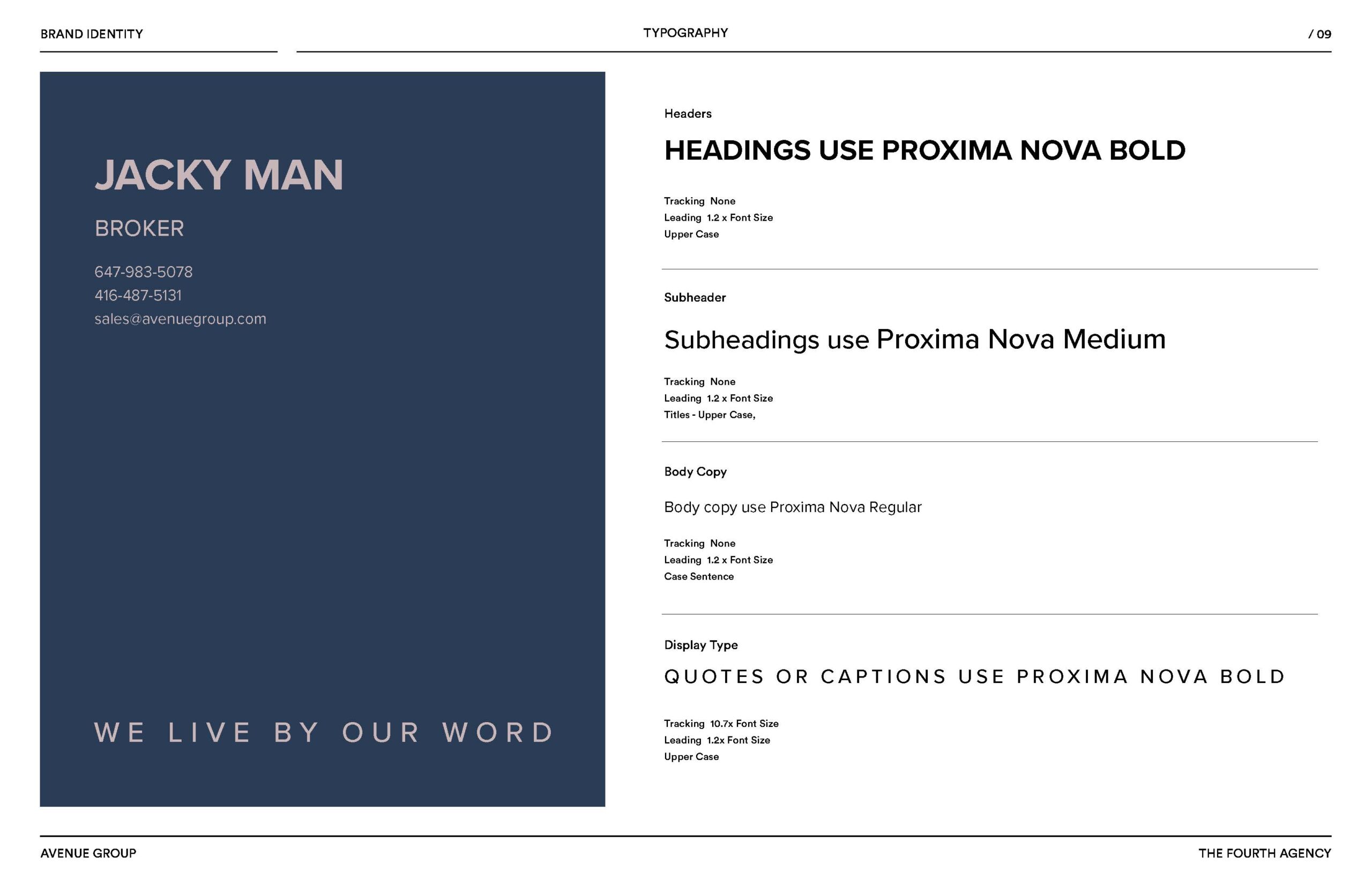
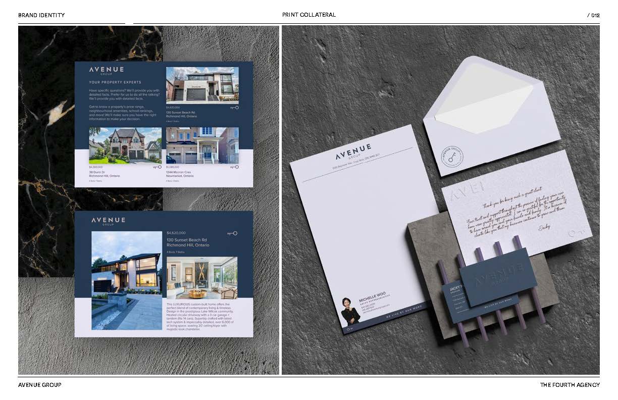
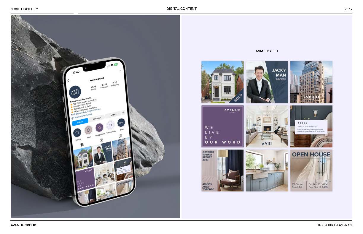
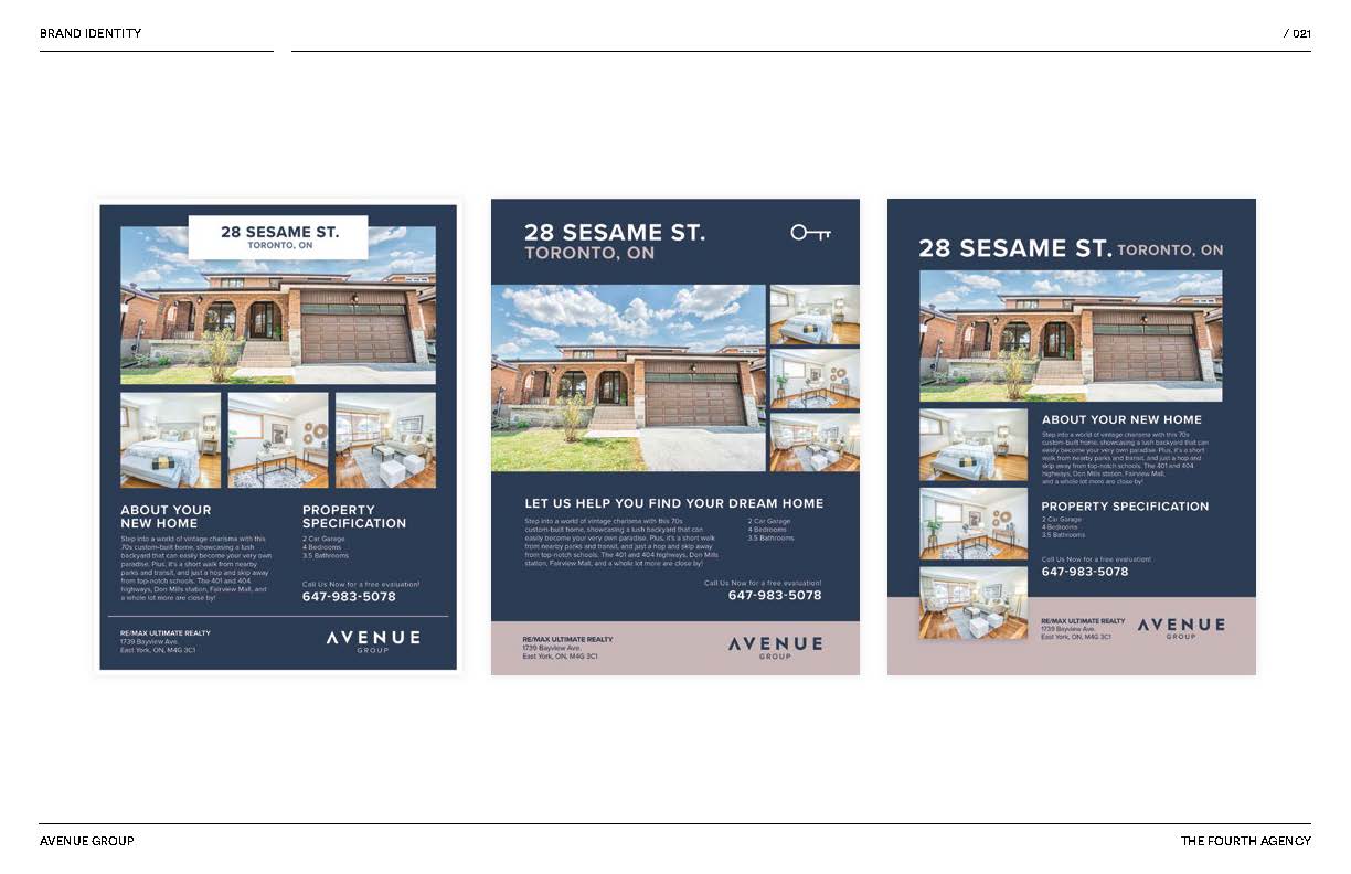
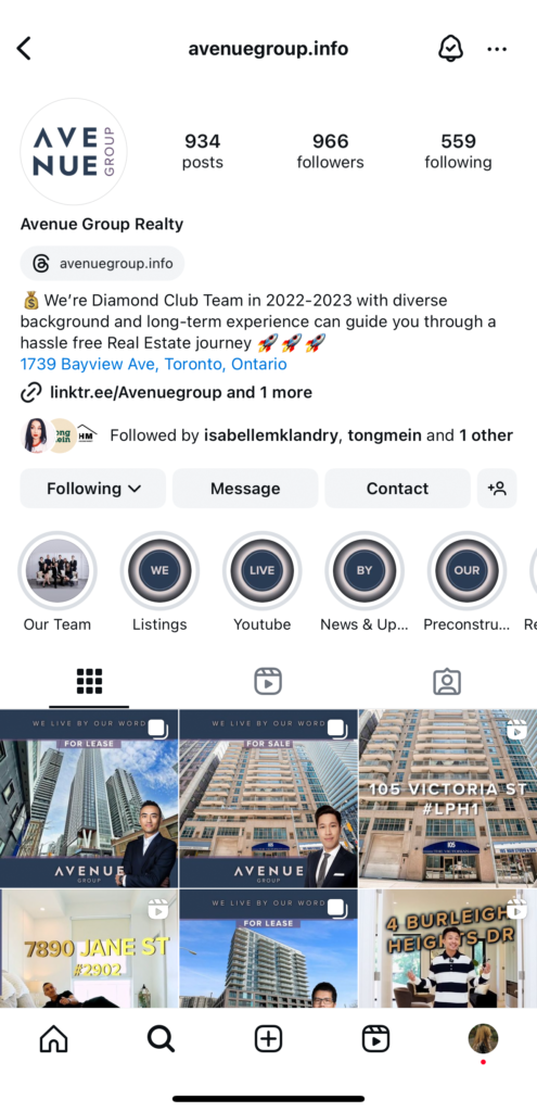
Below are several pages from the brand guidelines we developed, along with images from Avenue Group’s own Instagram.
Our team
CD: Patrick Weir
AD: Isabelle Landry
Brand Guideline
Applications
CAMPAIGNS
Closed Casket
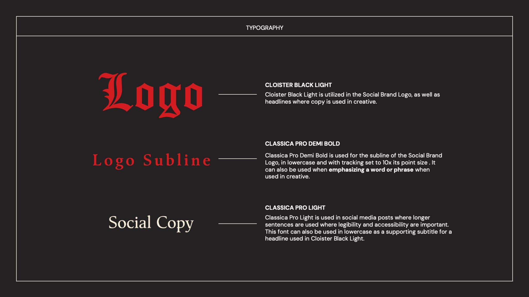
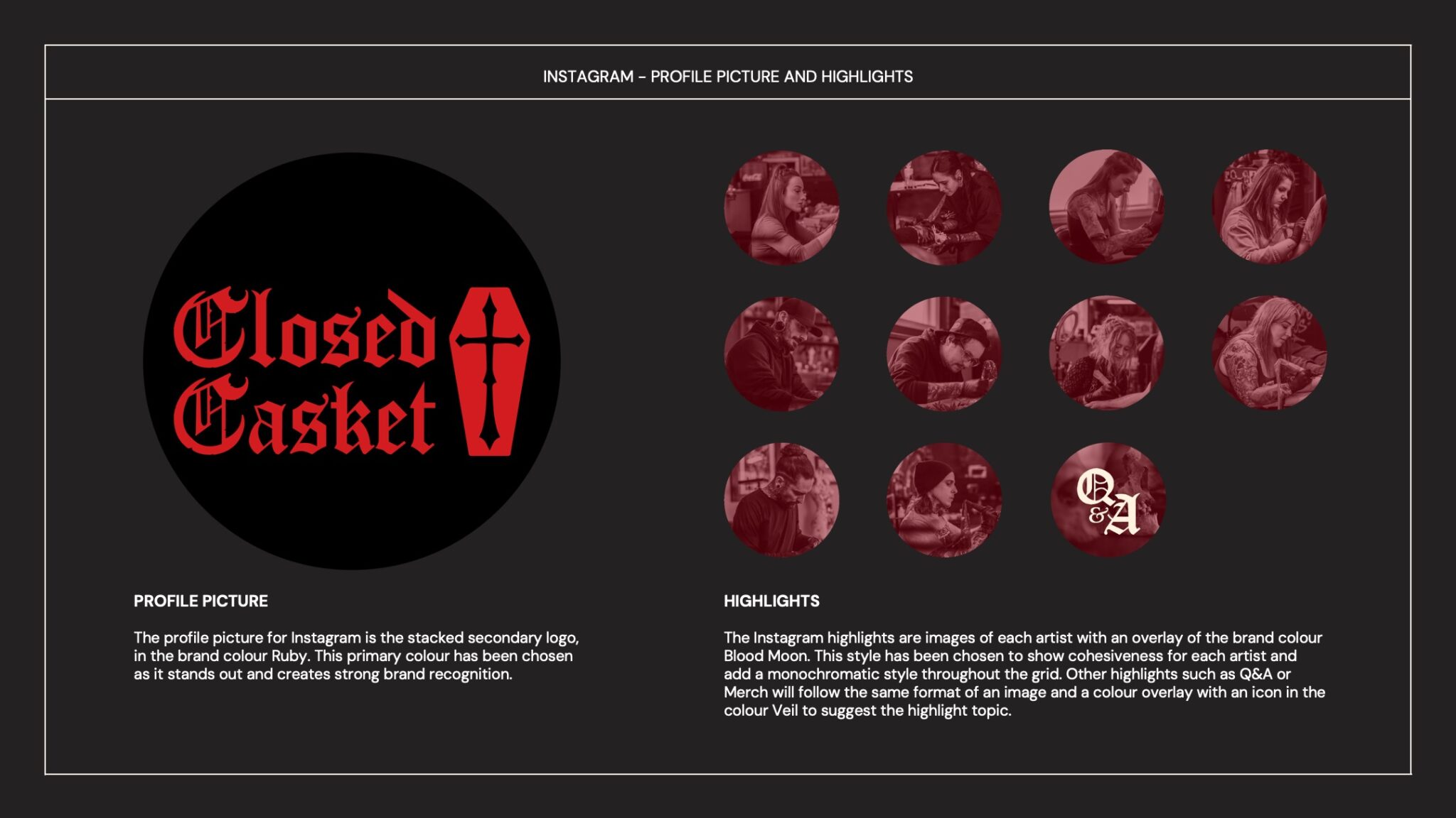
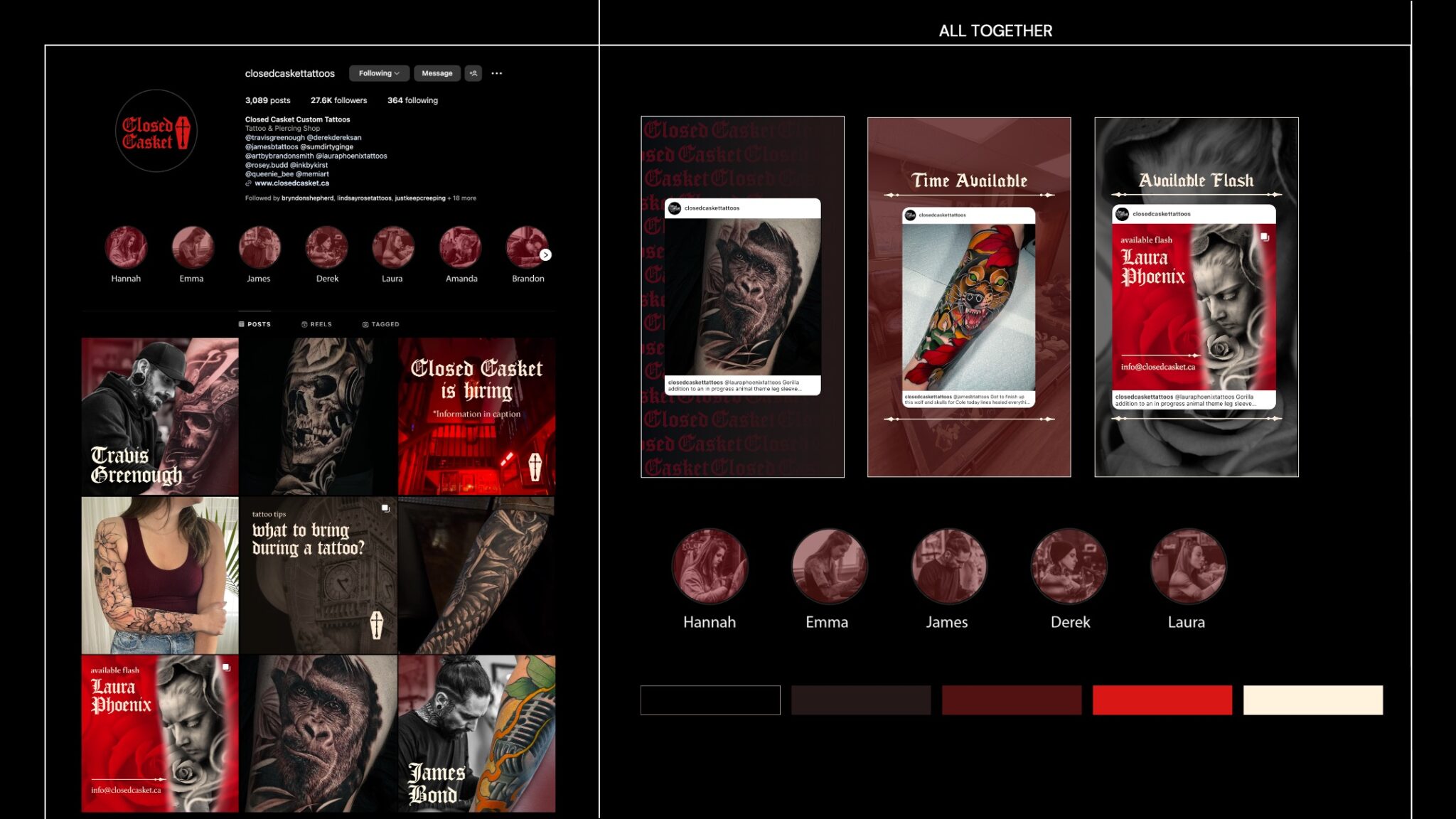
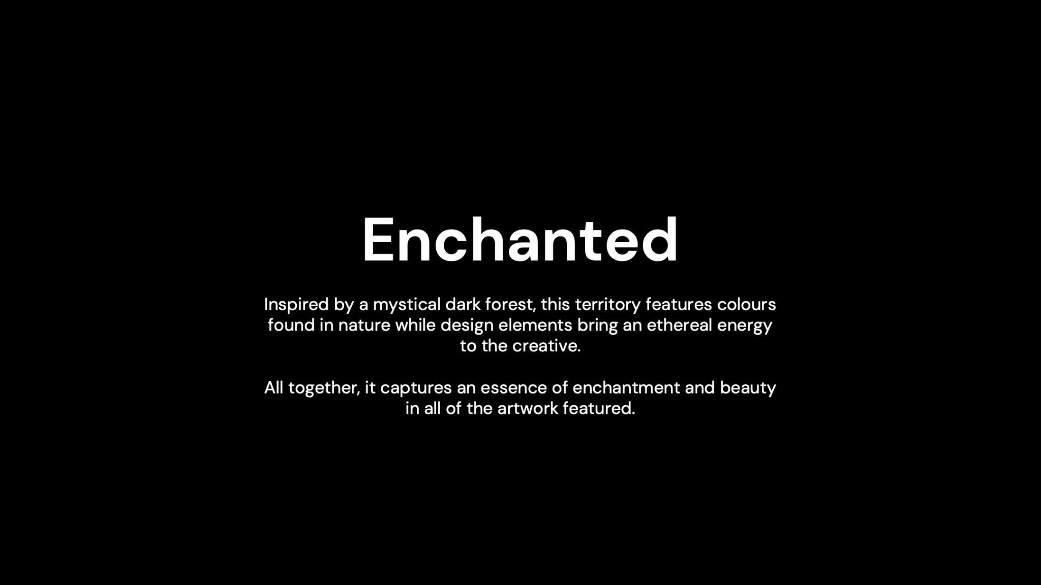
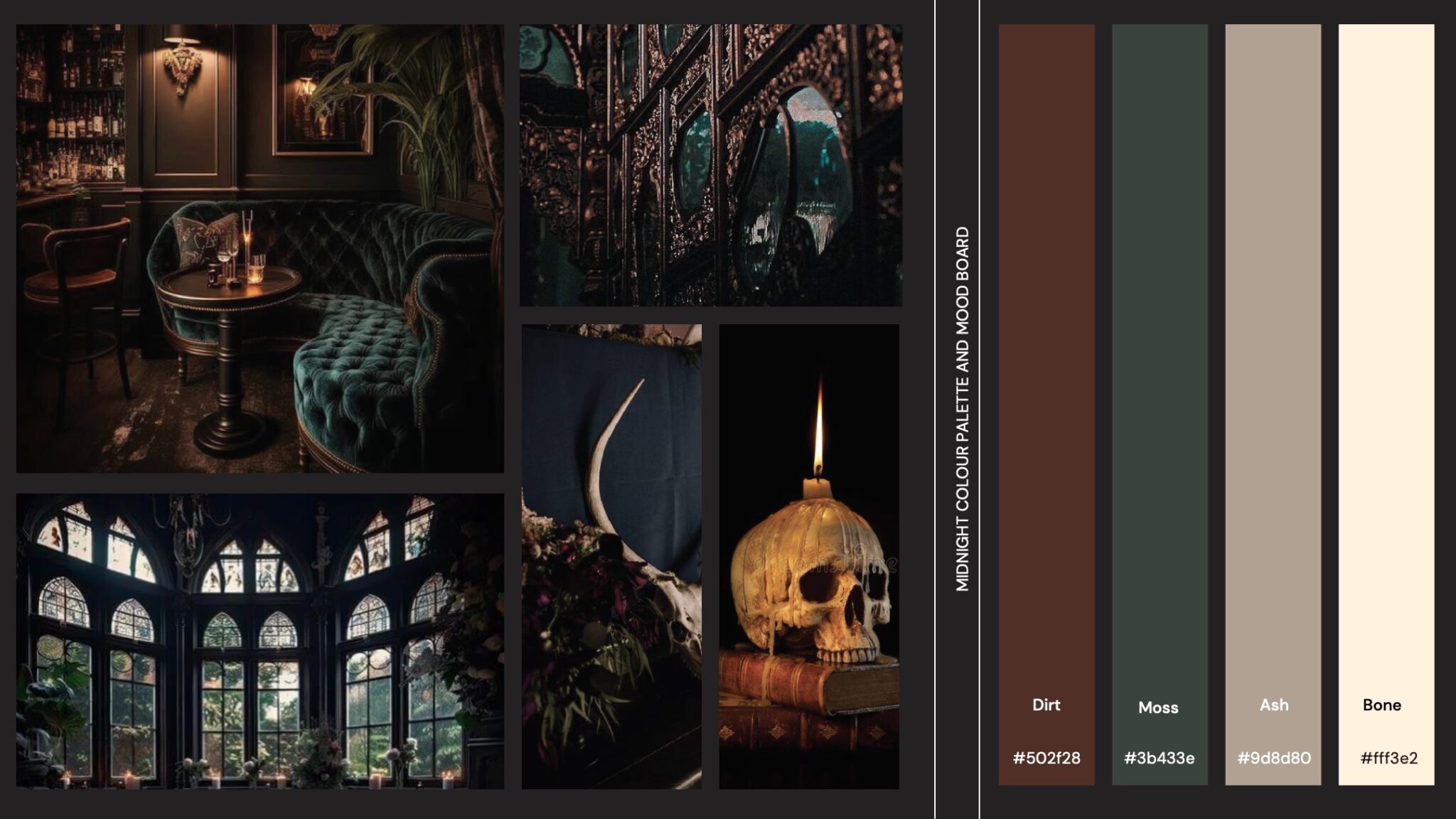
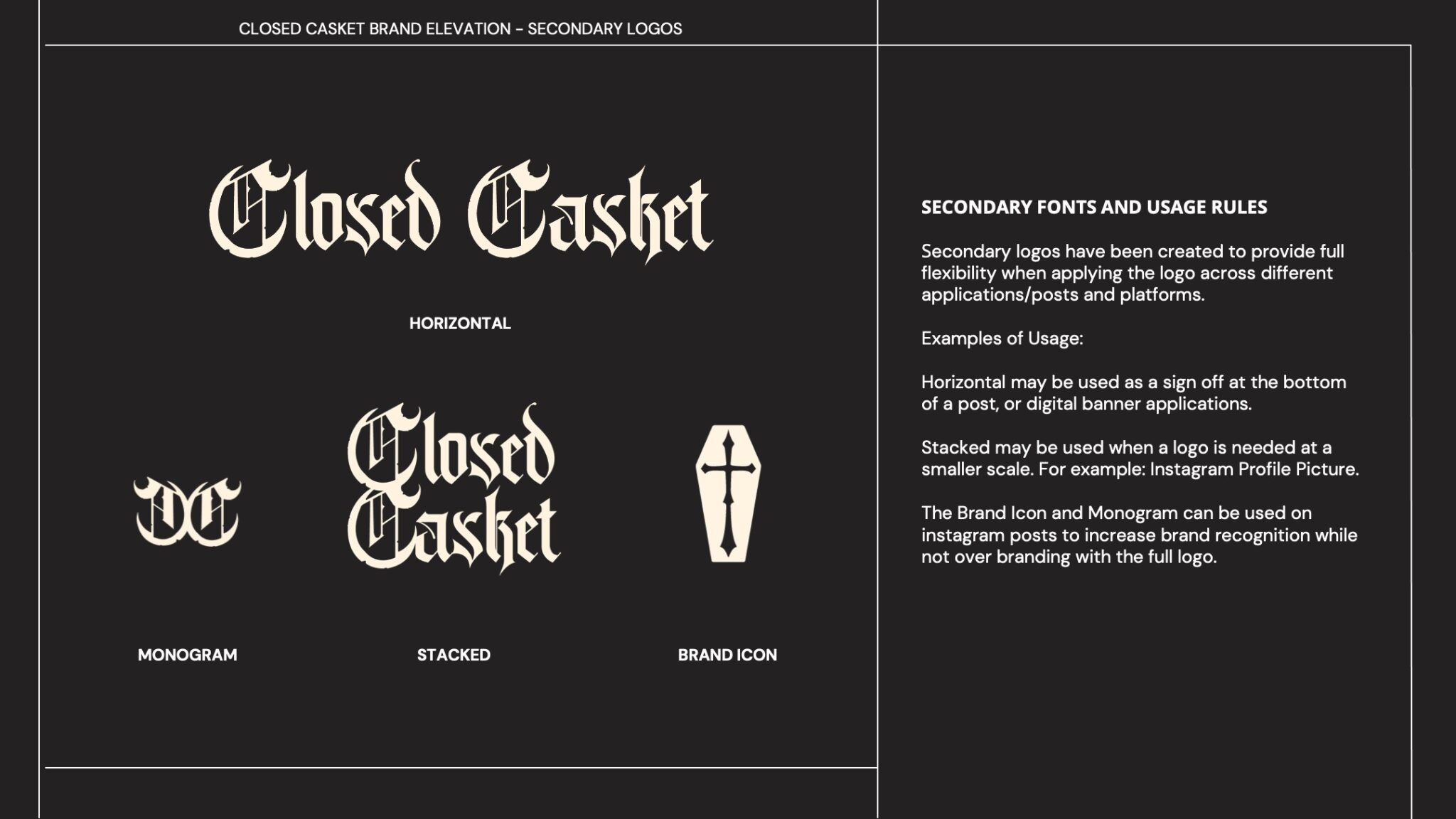
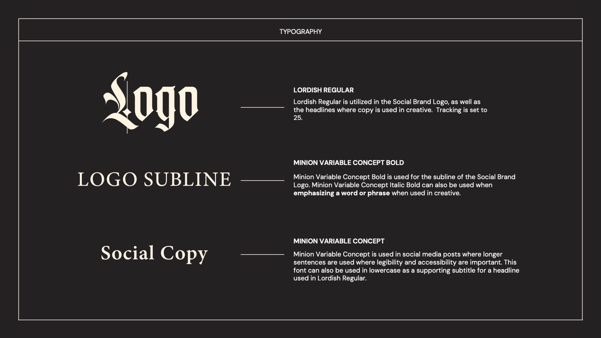
The rebranding campaign for Closed Casket was recently completed in early 2024, marking a vastly different experience compared to my usual focus on food and hospitality brands. Redesigning the brand identity was quite intense for us, given the incredibly talented and uniquely styled artists at Closed Casket. My colleague Izzy and I divided responsibilities: Izzy handled territory 1 while I managed territory 2, each with its own color palette and design style. Throughout the process, we held frequent meetings and collaborated on edits to refine both versions to their fullest potential.
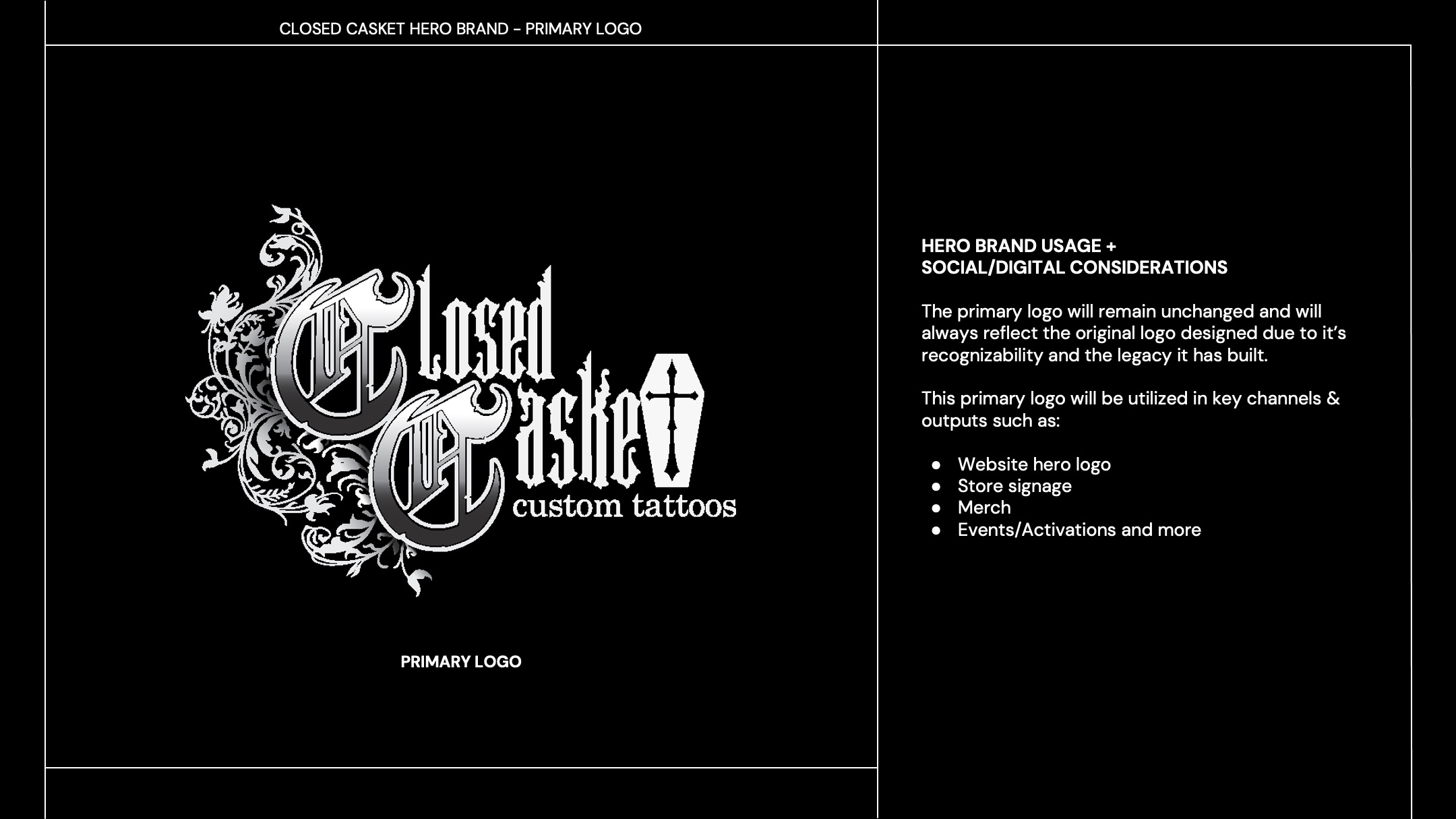
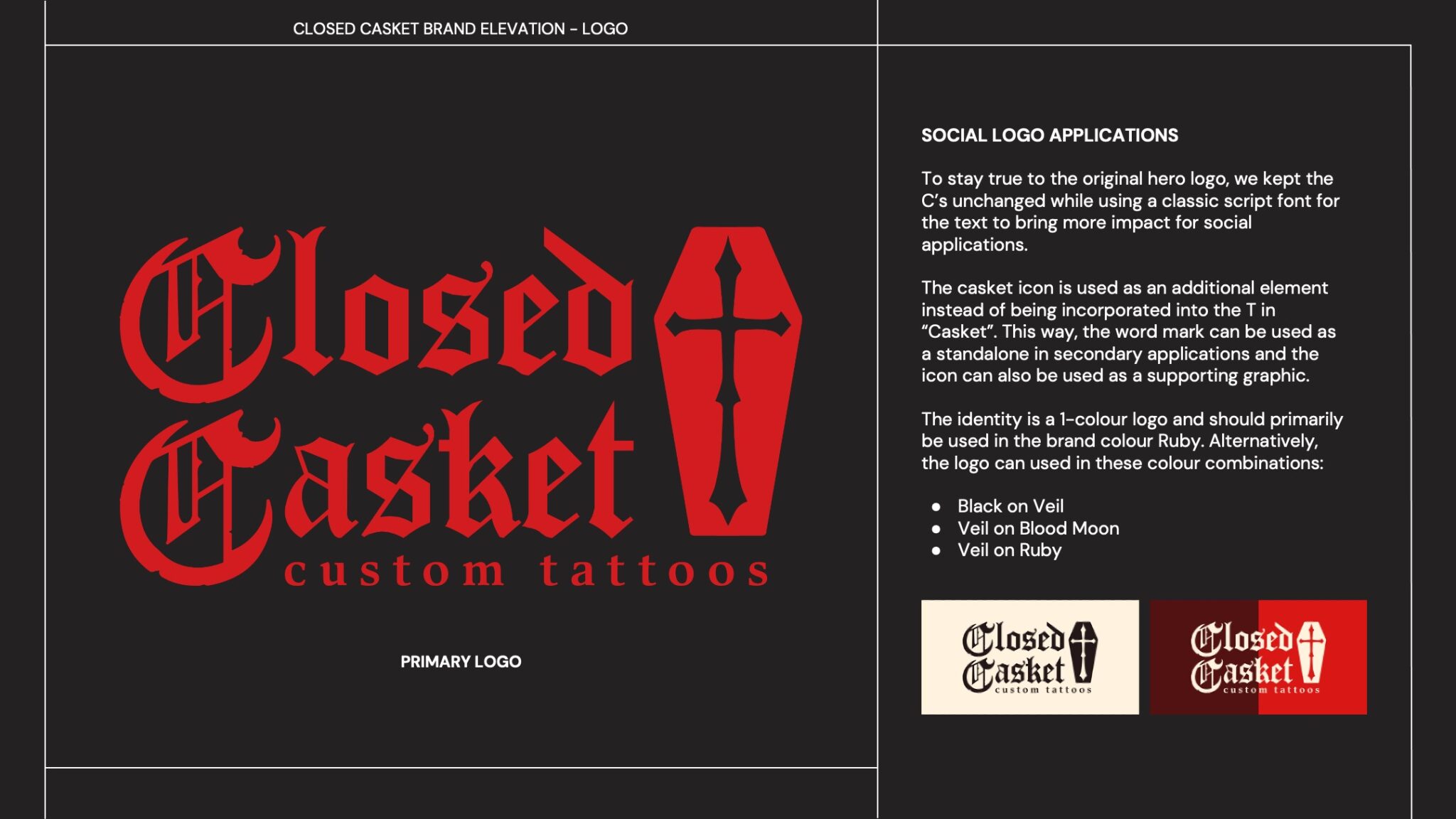
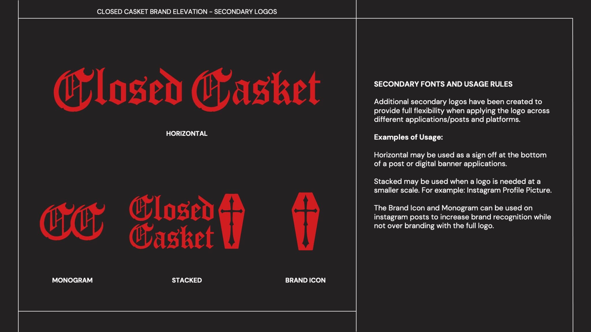
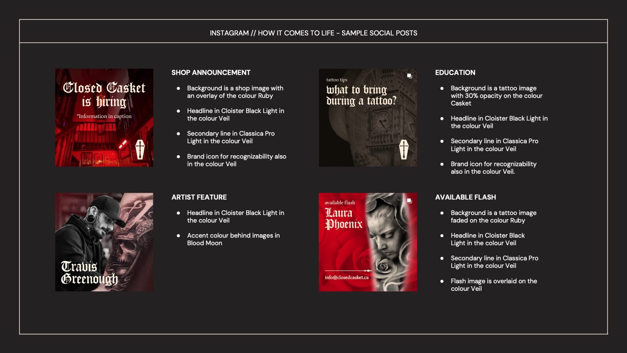
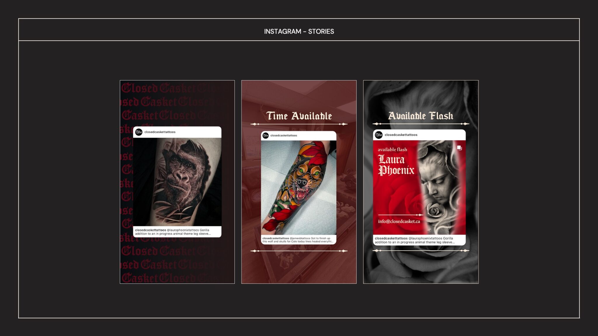
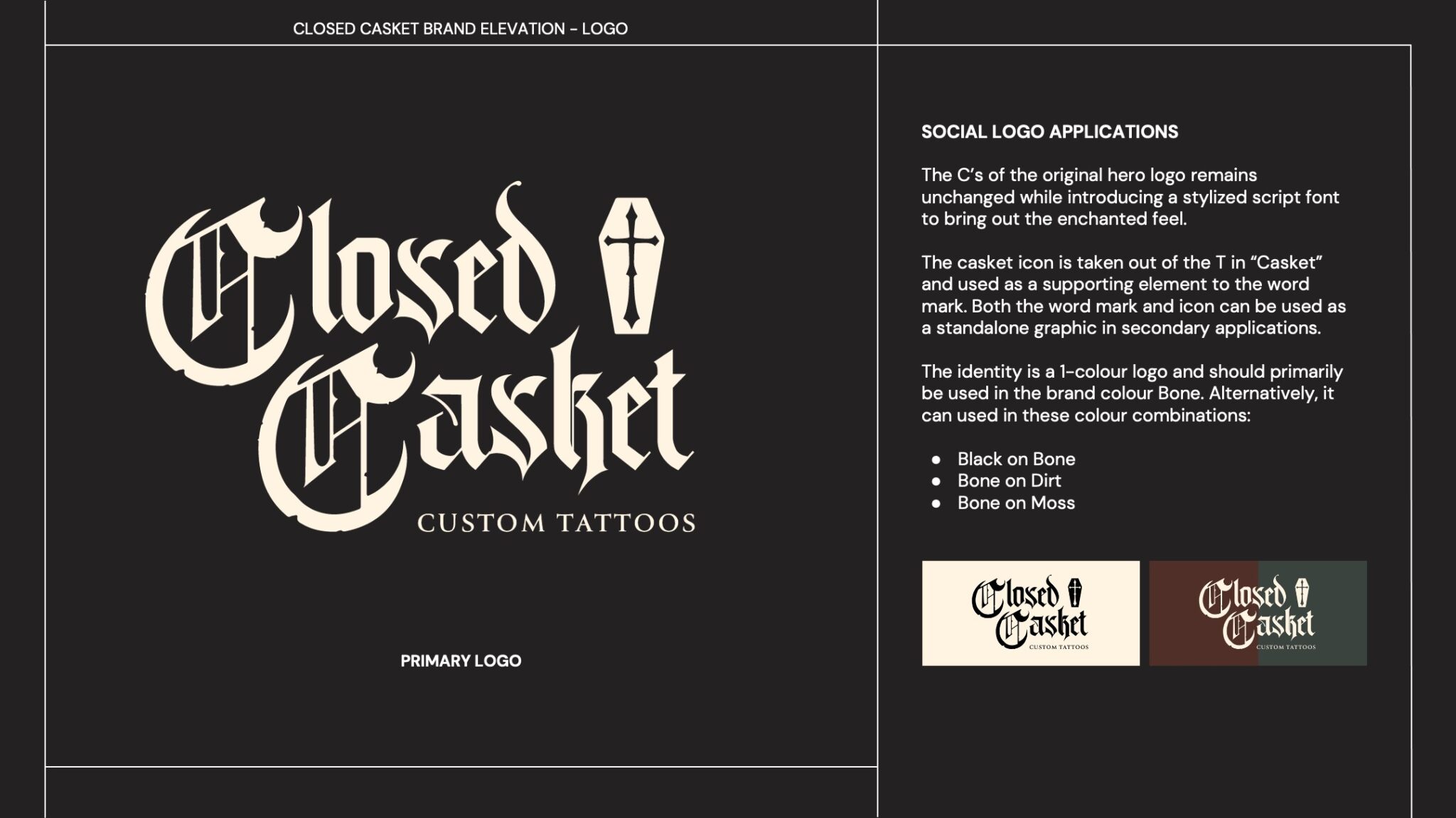
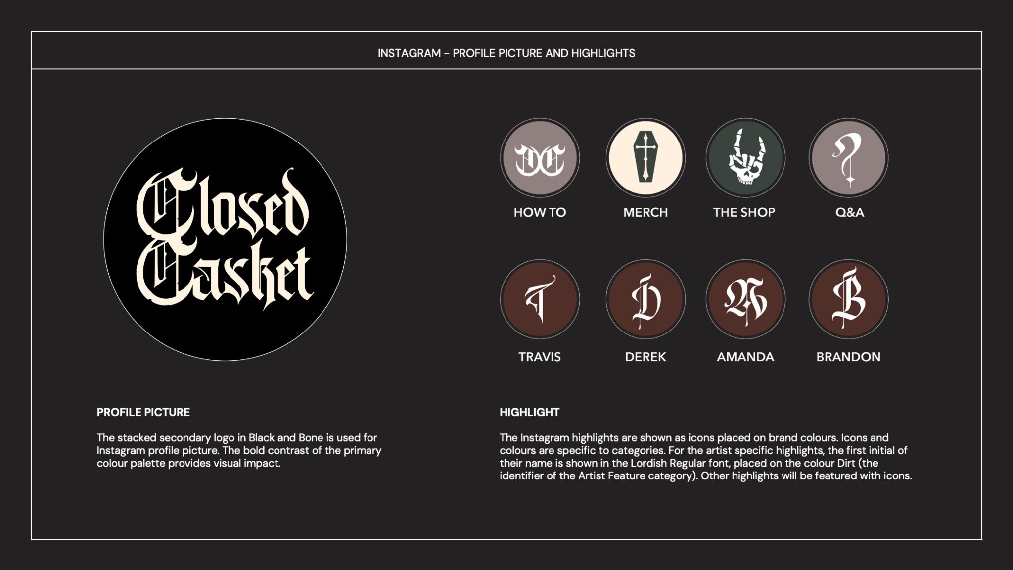
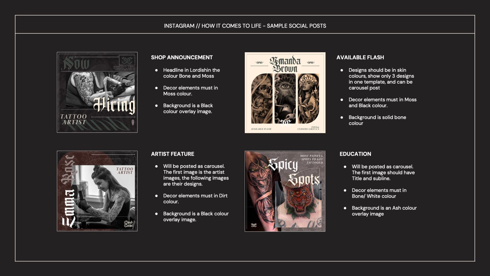
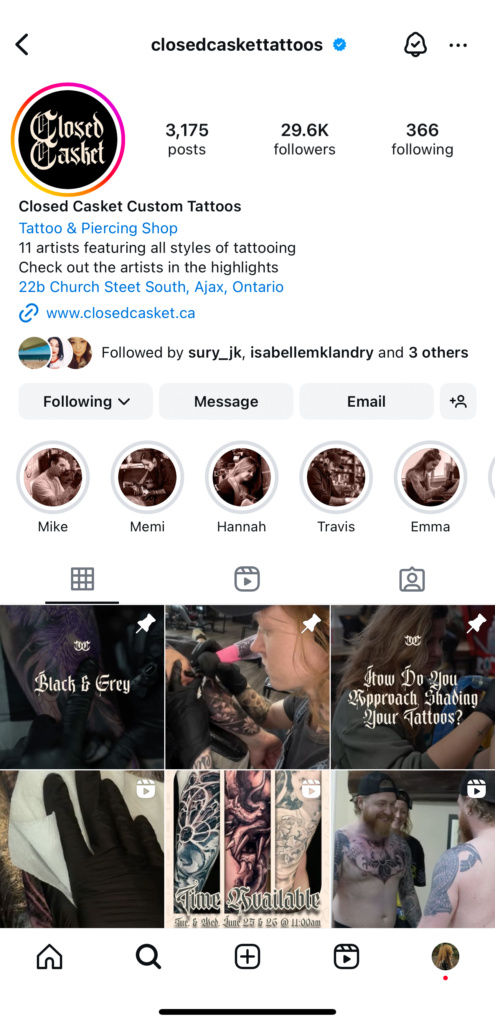
Interestingly, our client liked both approaches, leading us to combine elements from both territories into the final identity. Below, I’ll share some insights into our creative process and how Closed Casket’s in-house designers applied these elements to their social media designs on Instagram.
Our team:
CD: Patrick Weir
AD: Isabelle Landry
The Process
Old logo version
Rebrand Territory 1
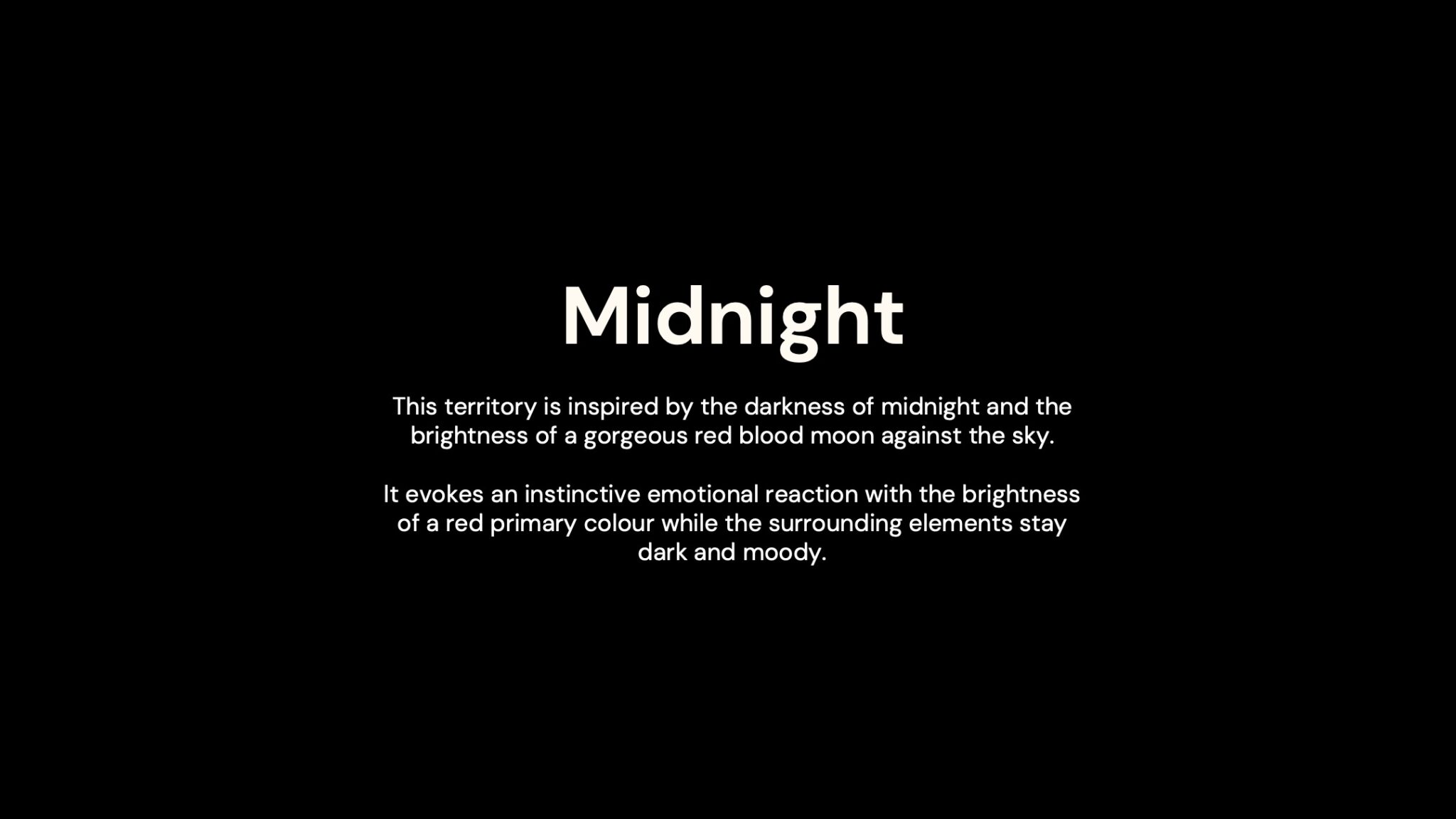
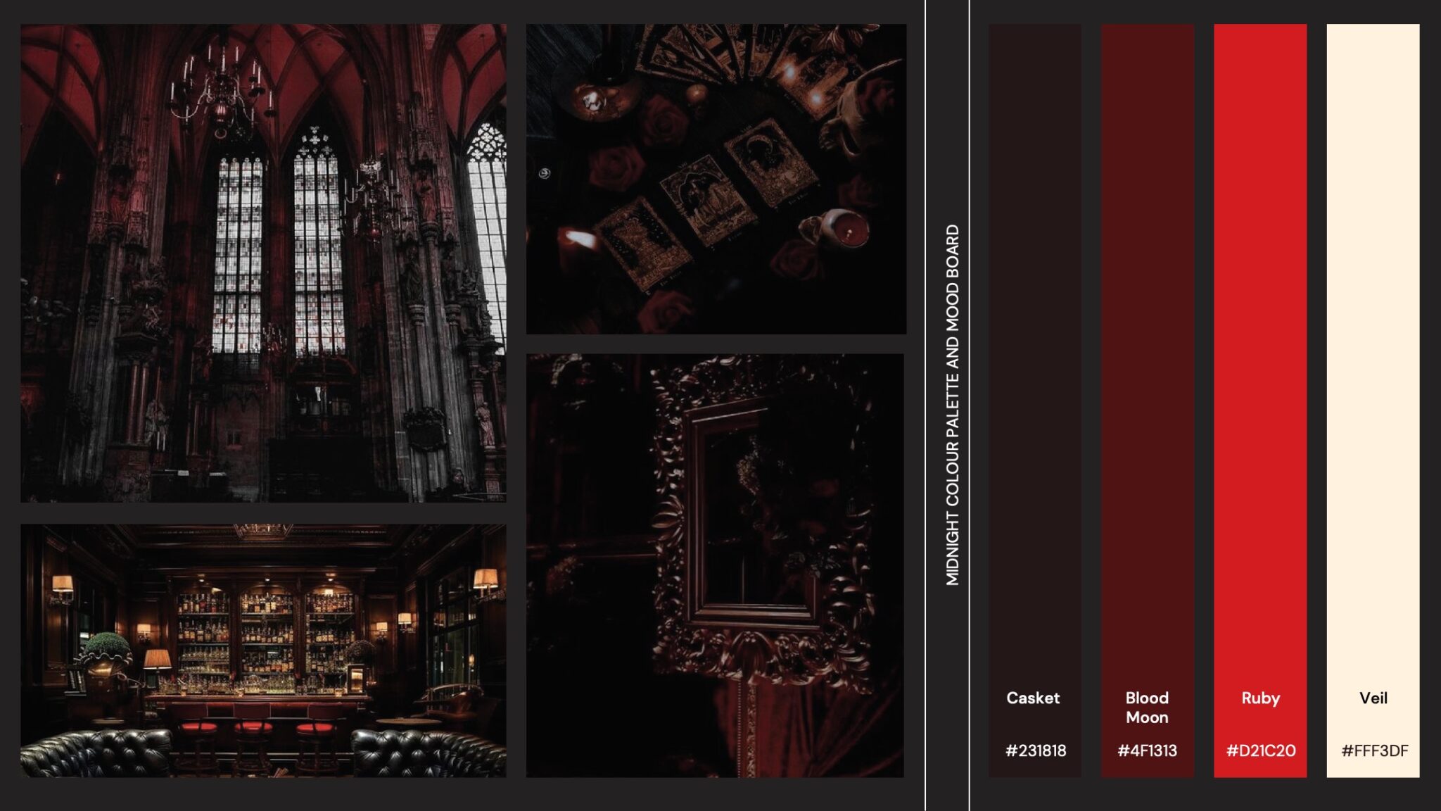
Rebrand Territory 2
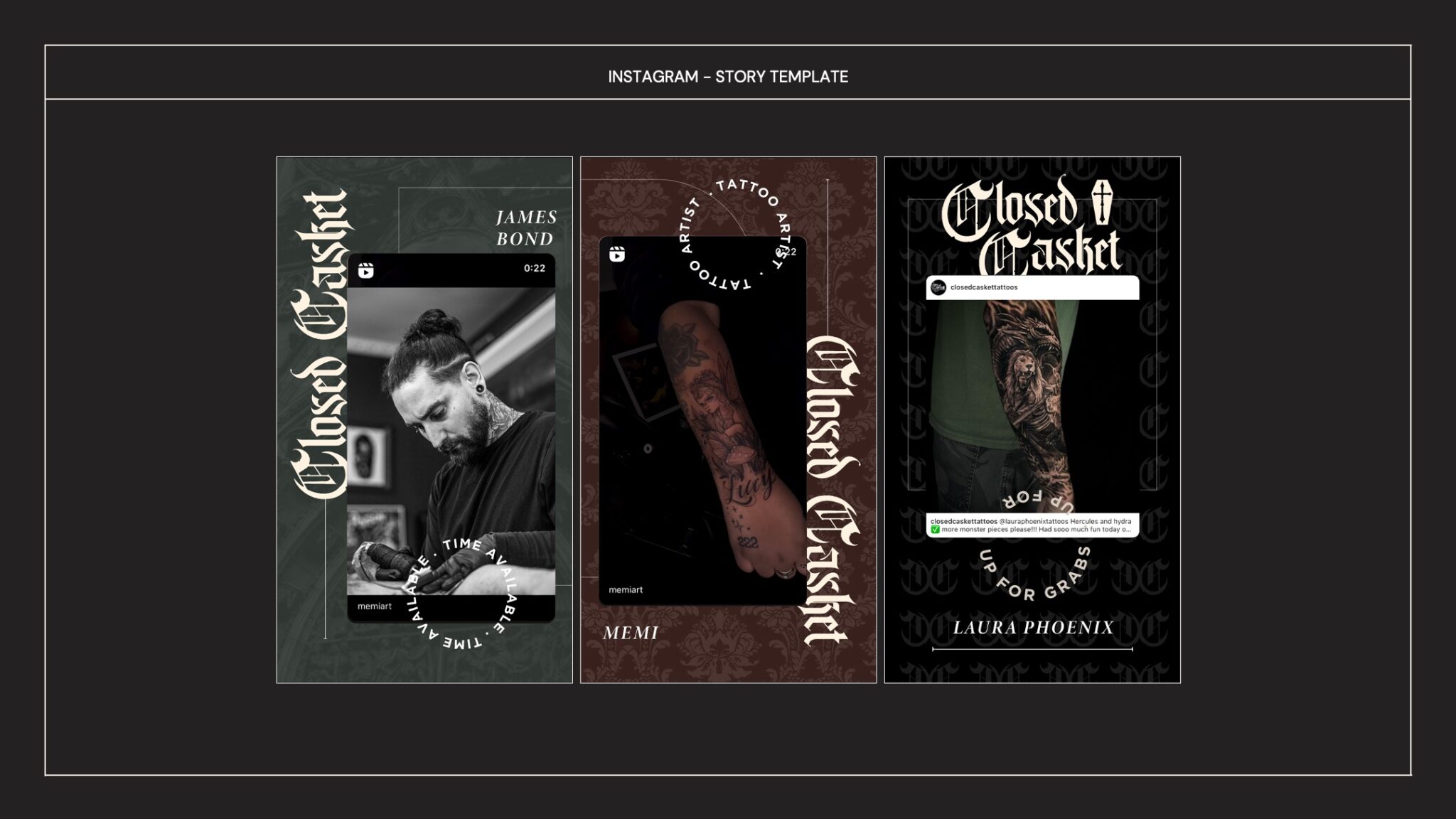
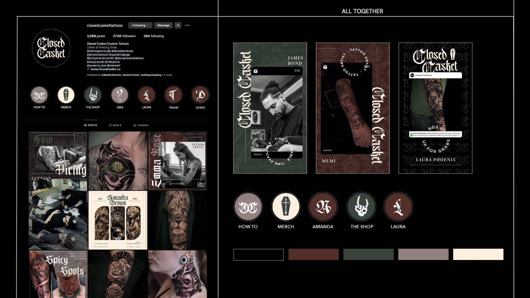
The Chosen One
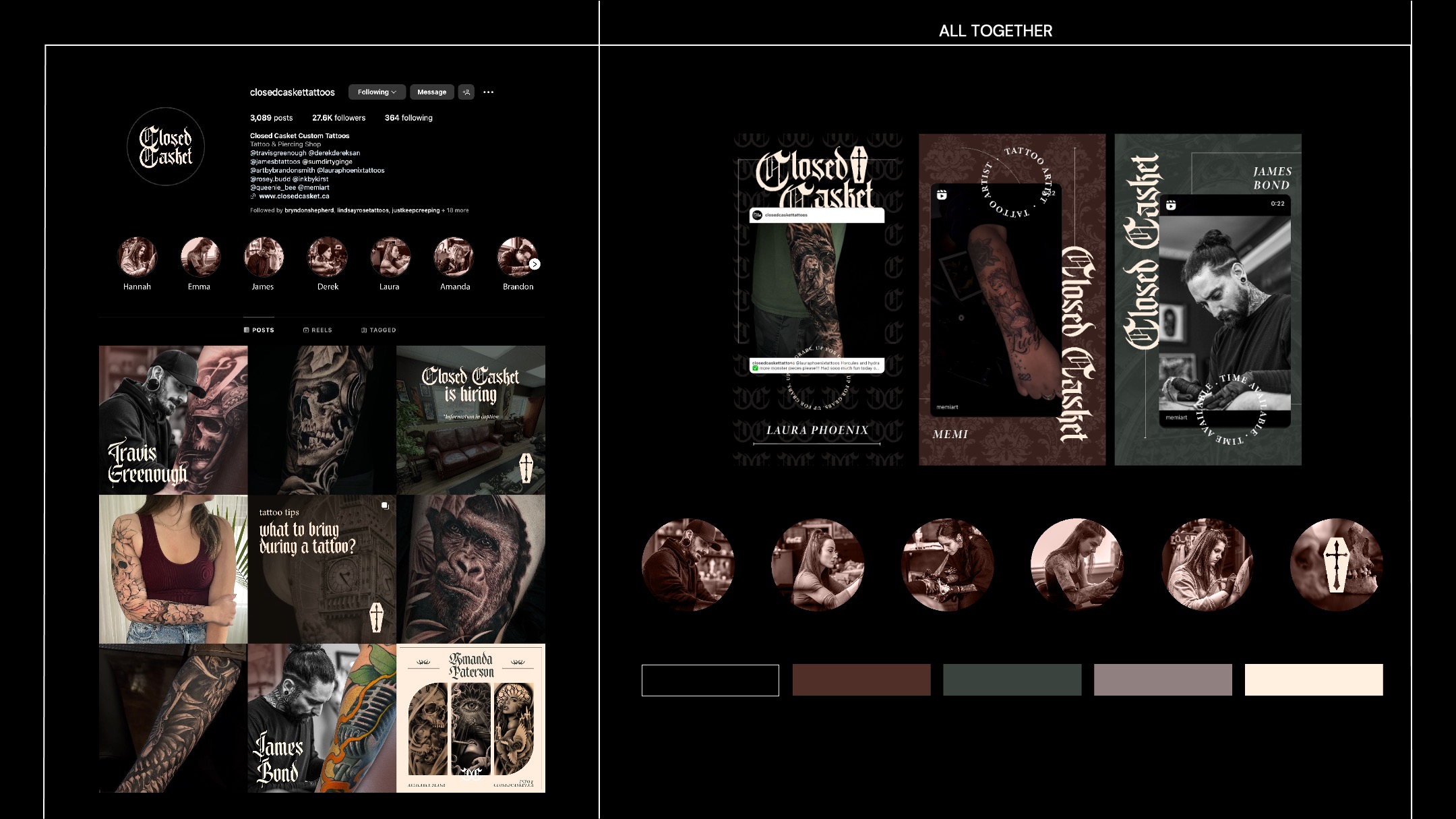
Applications
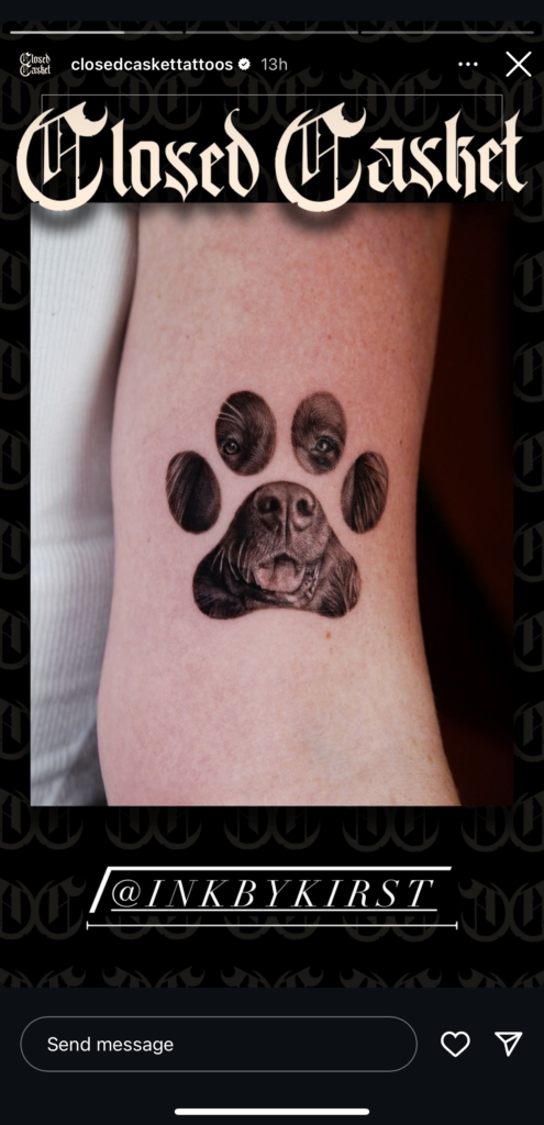
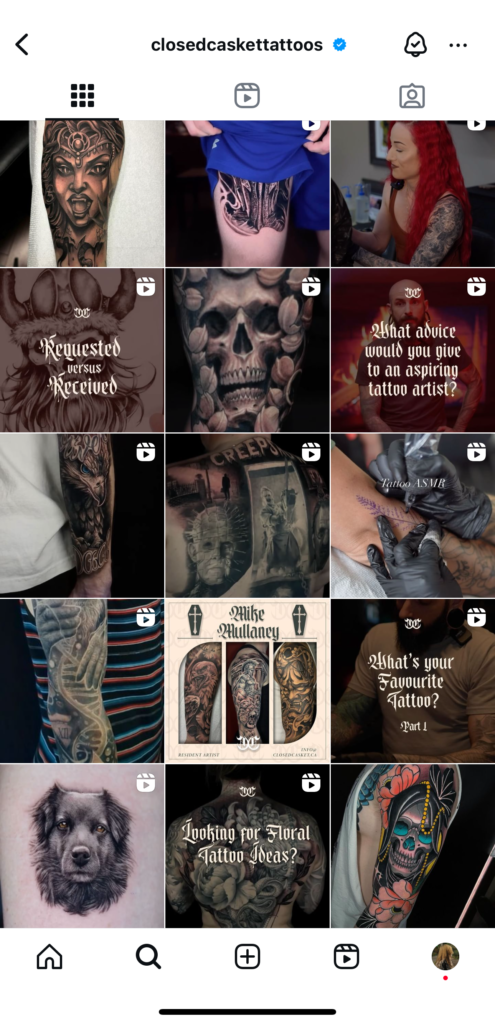
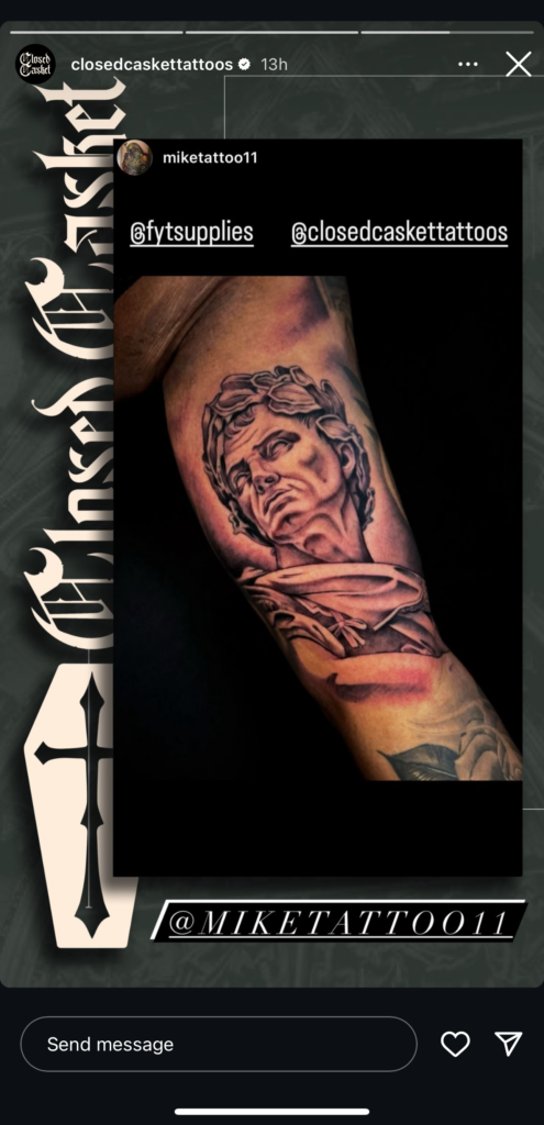
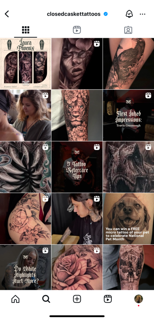
CAMPAIGNS
Cái Mâm
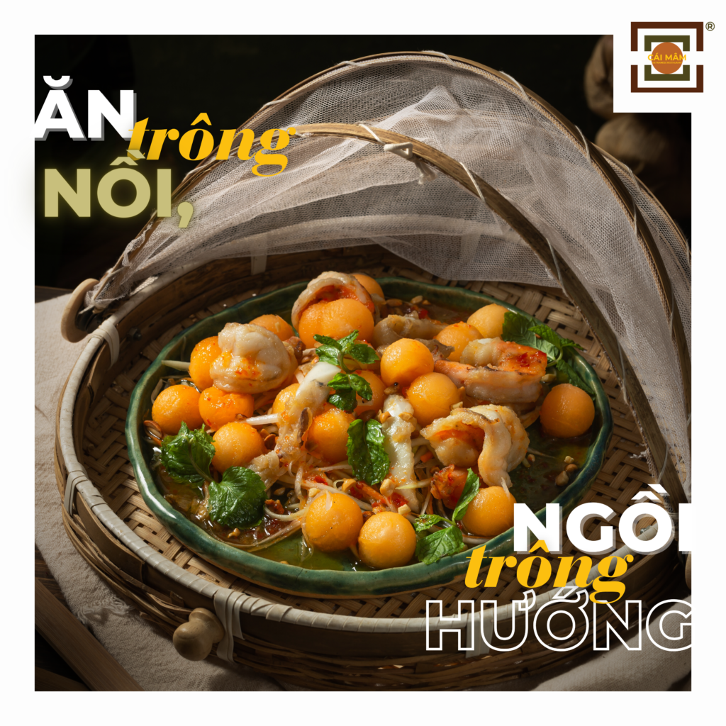
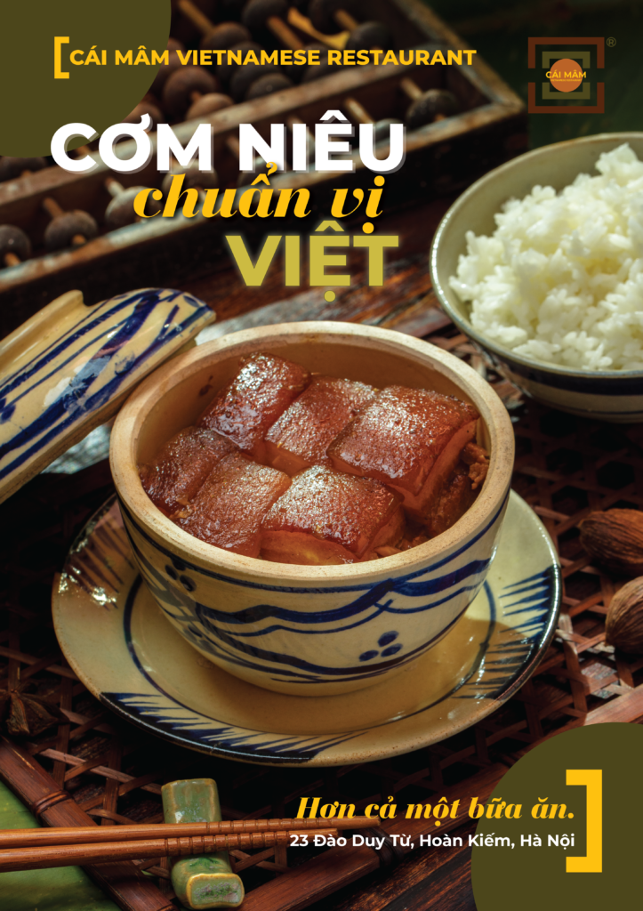
“Cái Mâm” is a highly renowned restaurant among foreign tourists visiting Hanoi’s Old Quarter. In 2022, I collaborated with the Marketing Lead of Cái Mâm to create this Brand Guideline. It was a relatively small project, so I served as the sole Art Director on the team. Subsequently, I applied this Brand Guideline to develop numerous POSM (Point of Sale Materials) and social media ads.
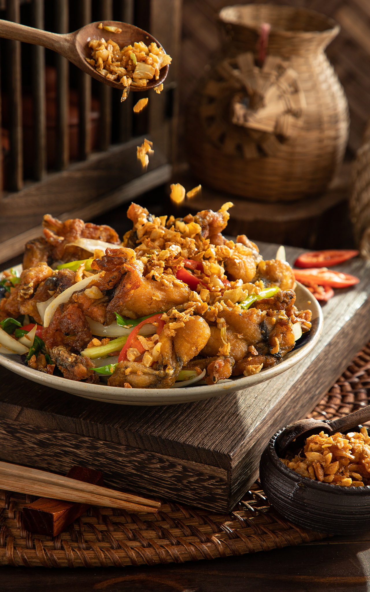
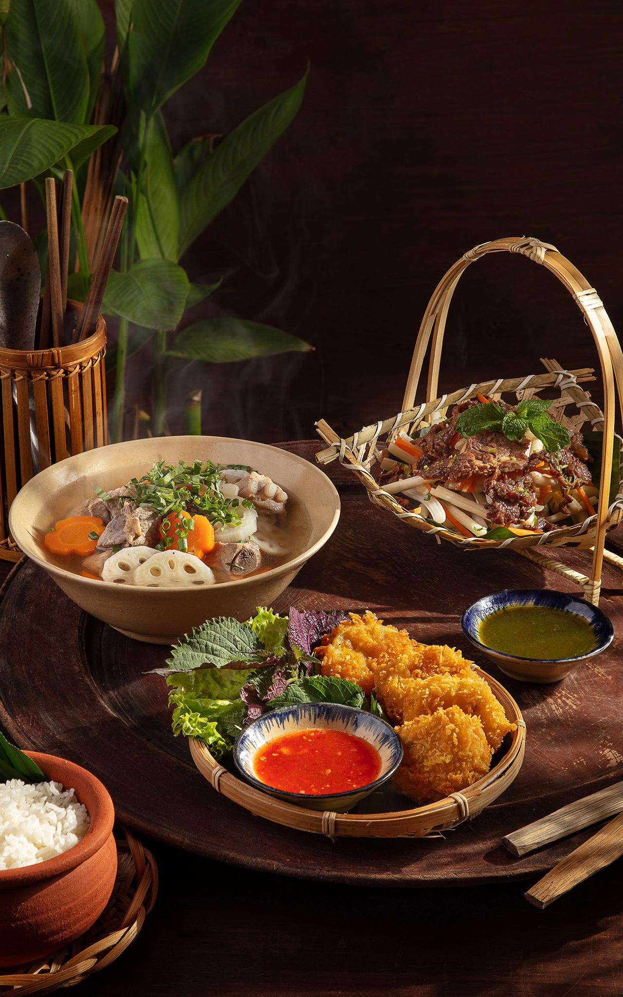
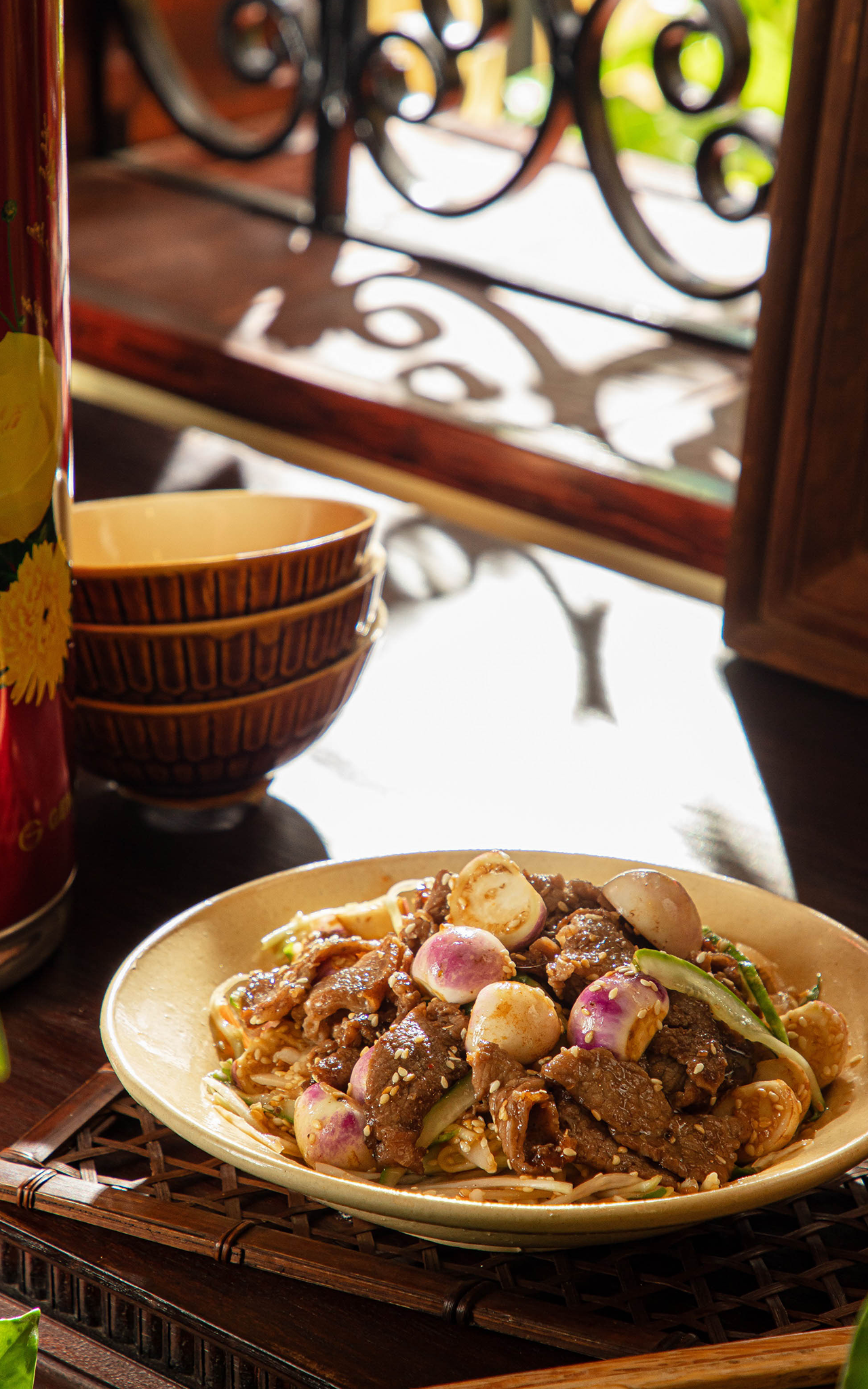
This opportunity also allowed me to collaborate with one of Hanoi’s top photography teams, creating stunning imagery of Cái Mâm’s dishes. Together, we conceptualized, selected props, and meticulously edited the products. We received much praise from producers and readers when we submitted these photos to a culinary magazine in Vietnam.
Below are a few pages from the Brand Guidelines and some of the graphic design products I created.
Brand Guideline


Concepts
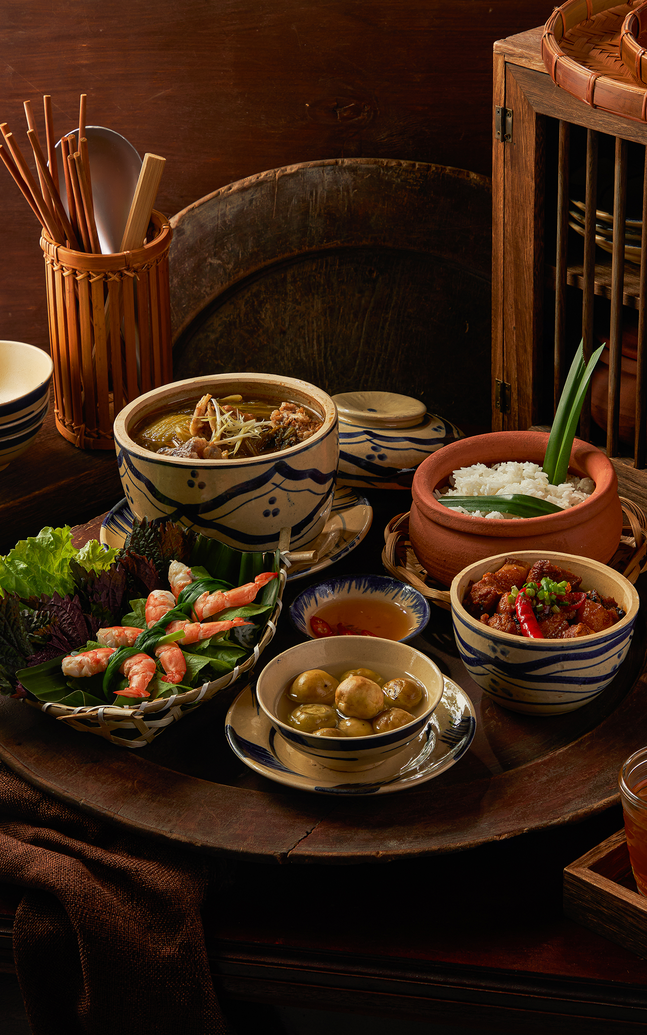
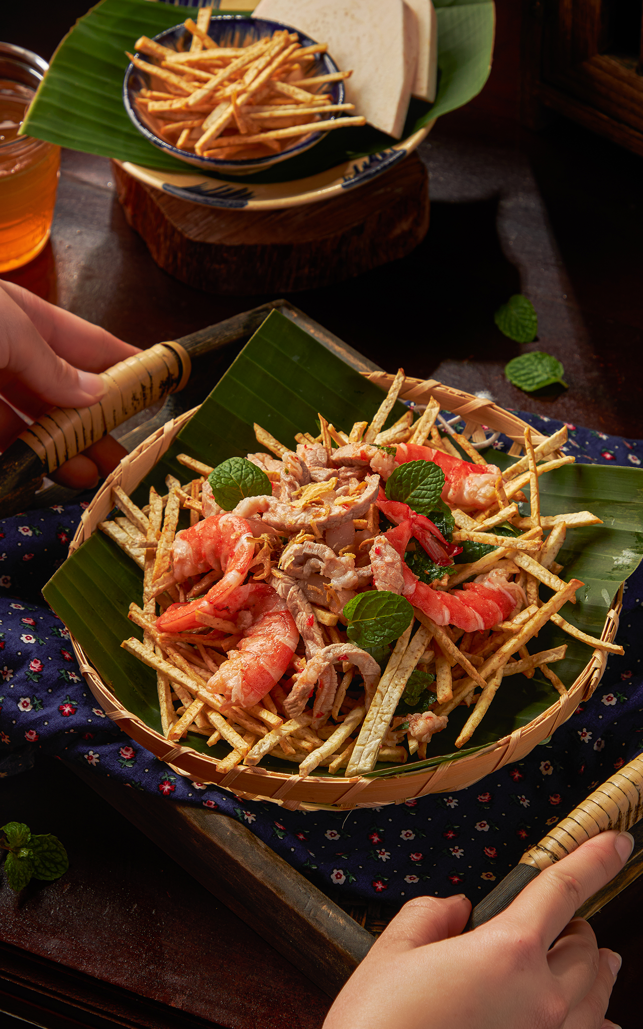
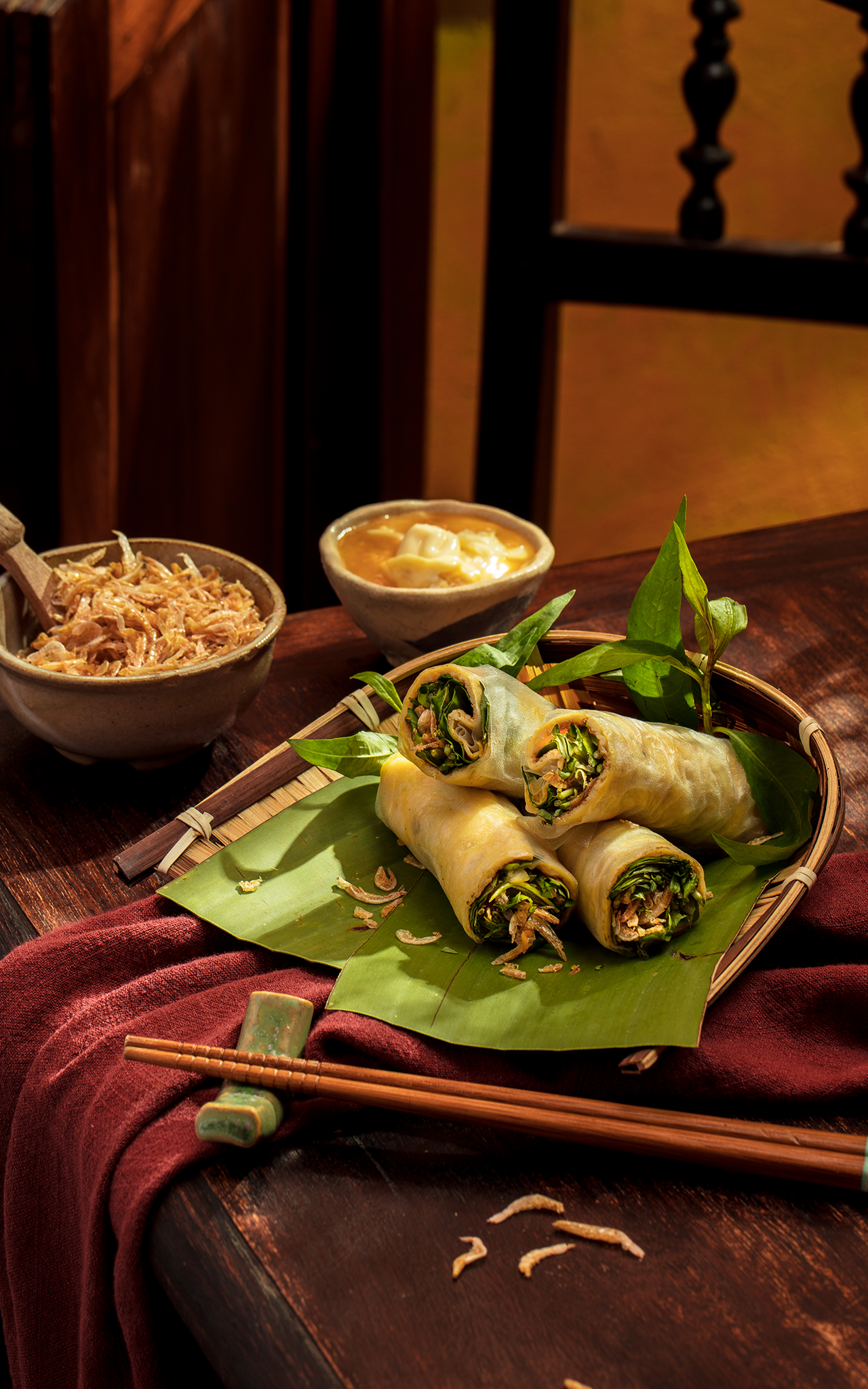
Application
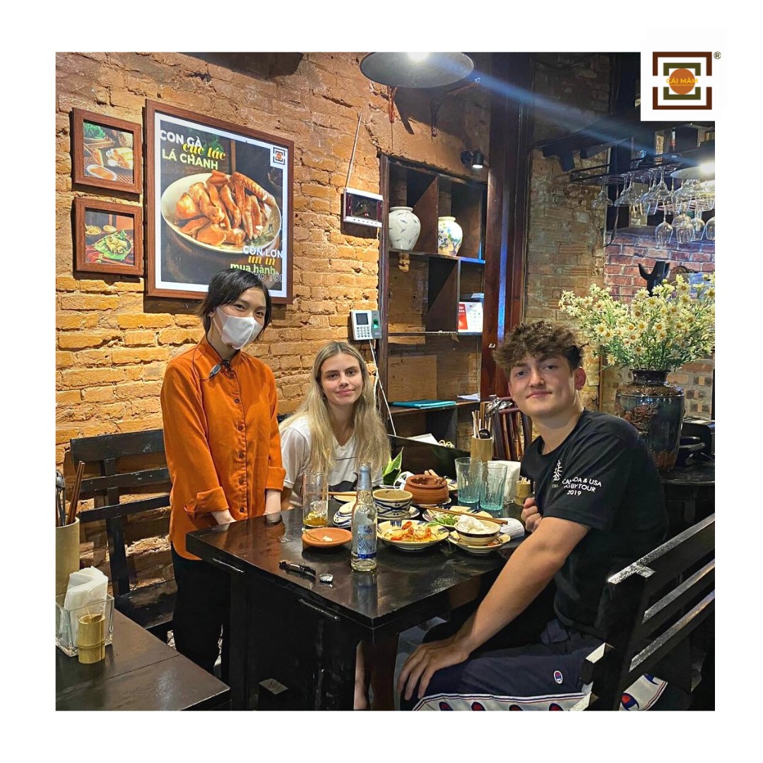
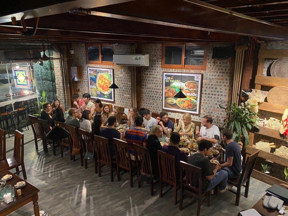
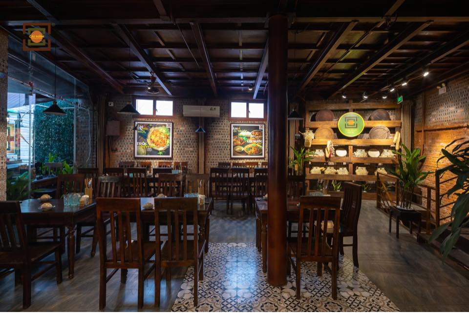
Wall frames
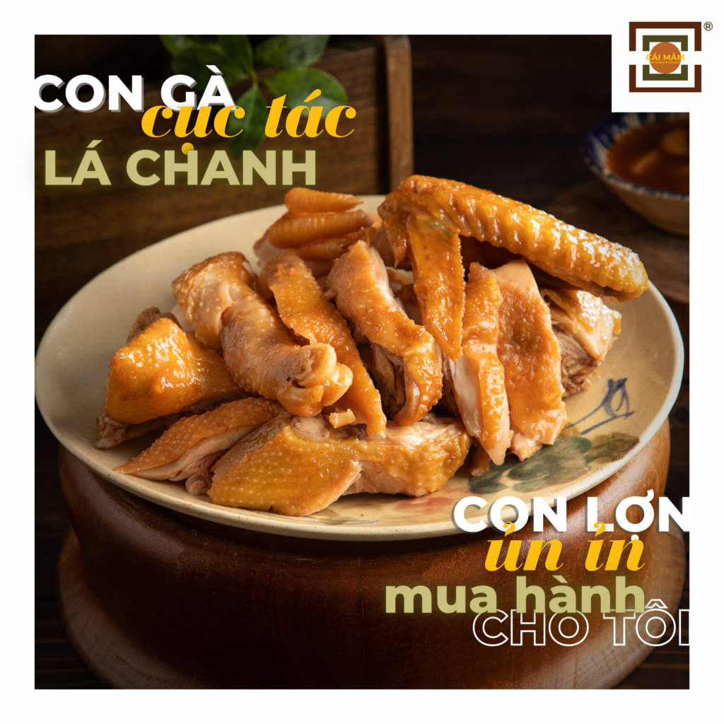
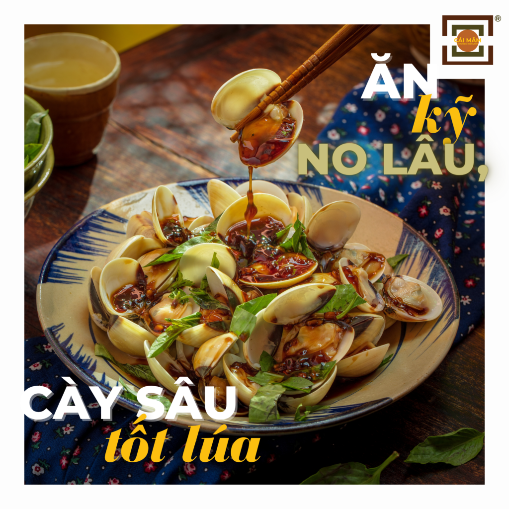
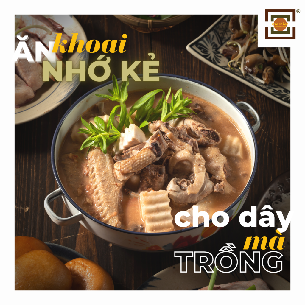
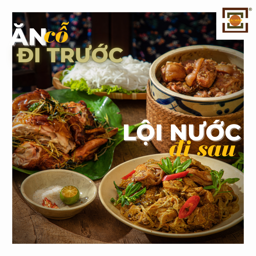
Standee
Wall frames in the restaurant
CAMPAIGNS
Dermafirm Vietnam
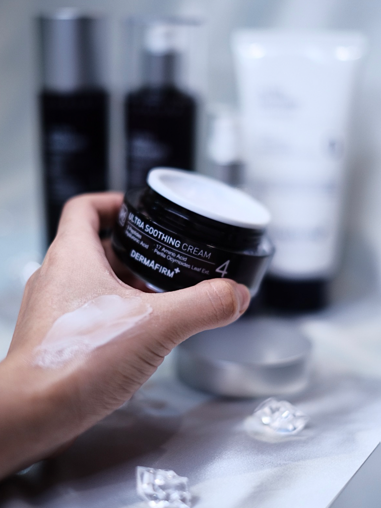
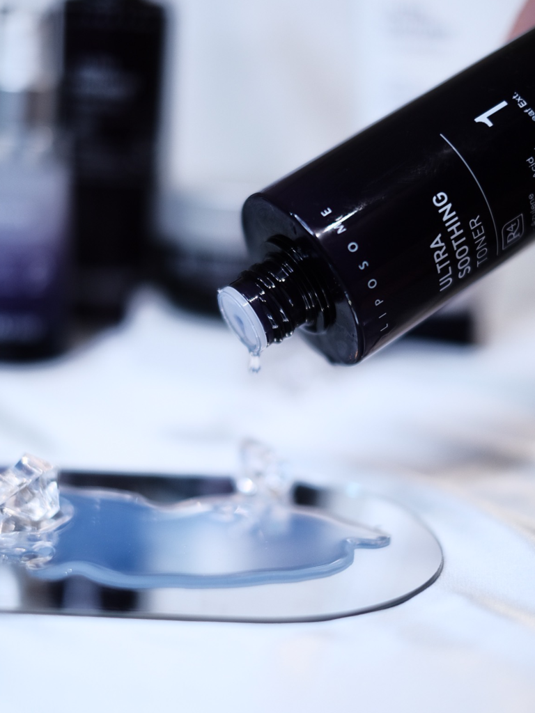
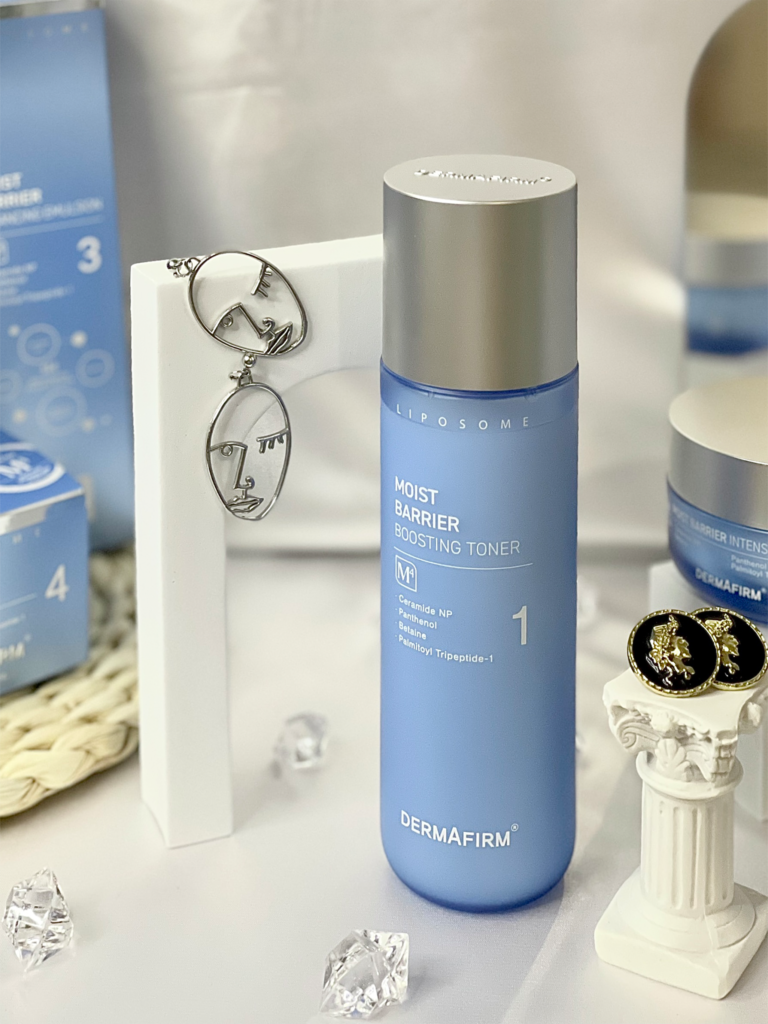
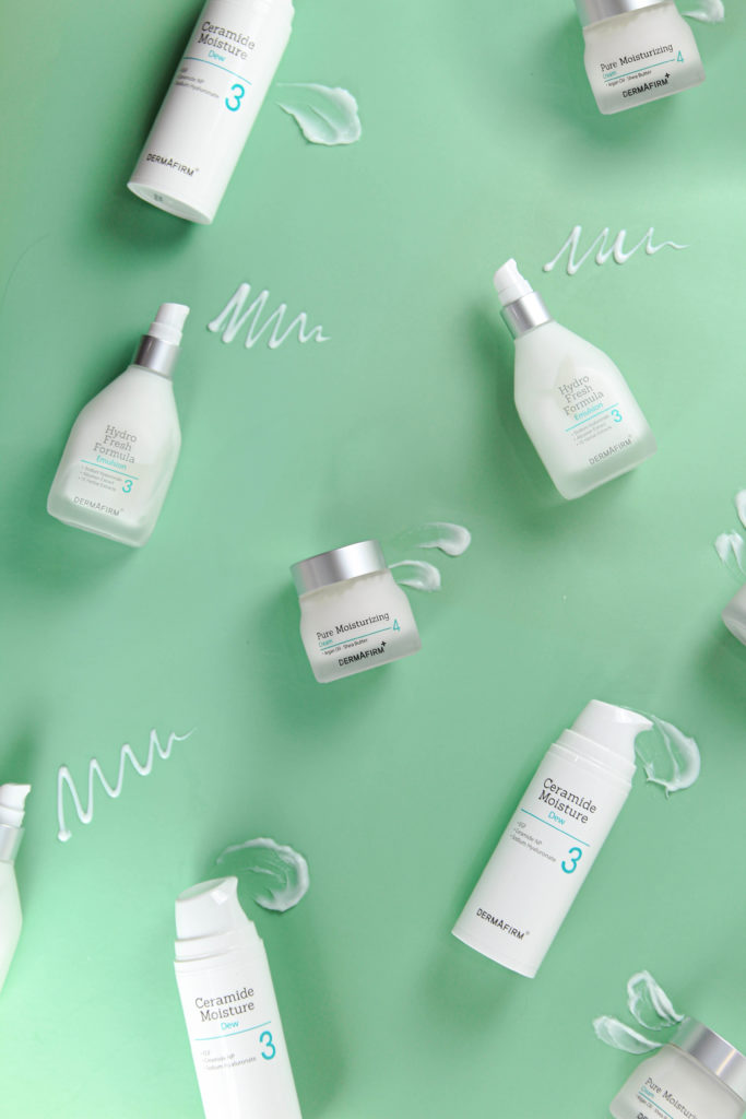
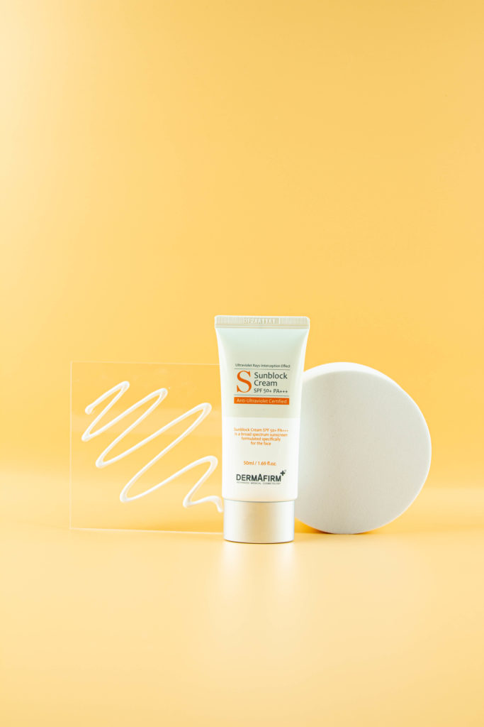
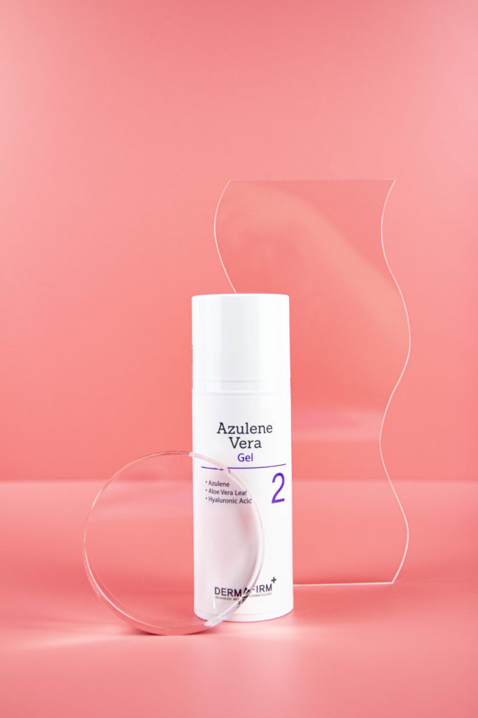
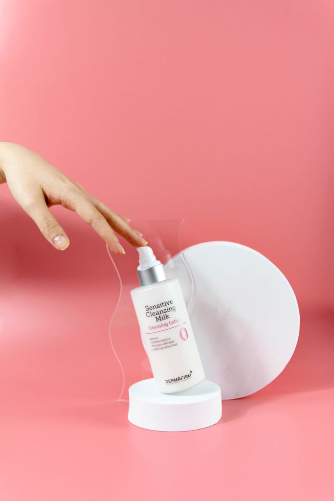
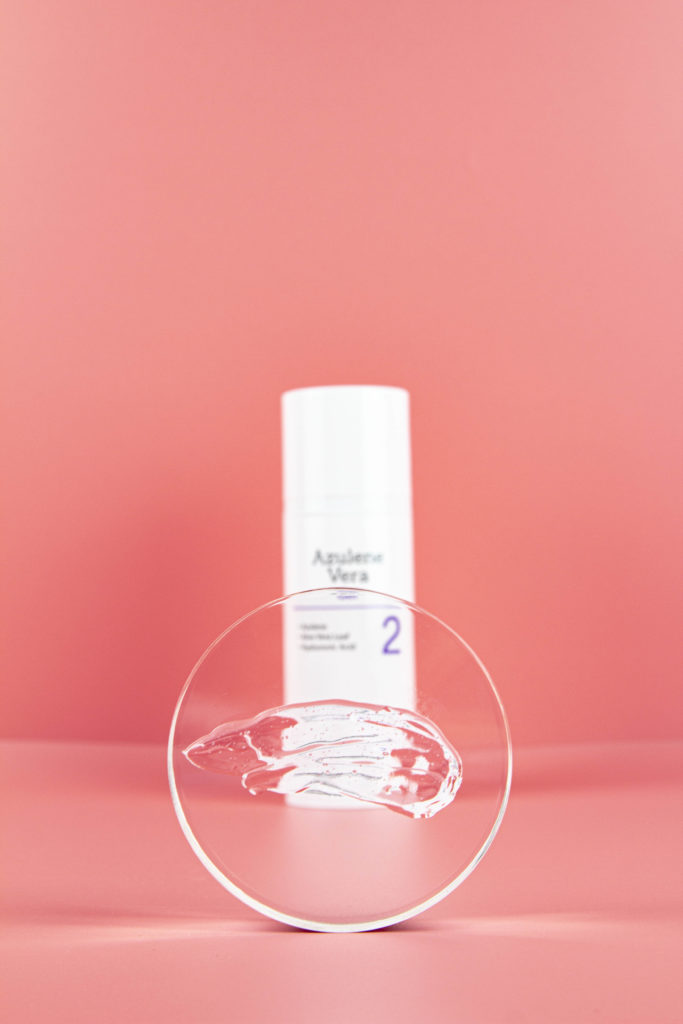
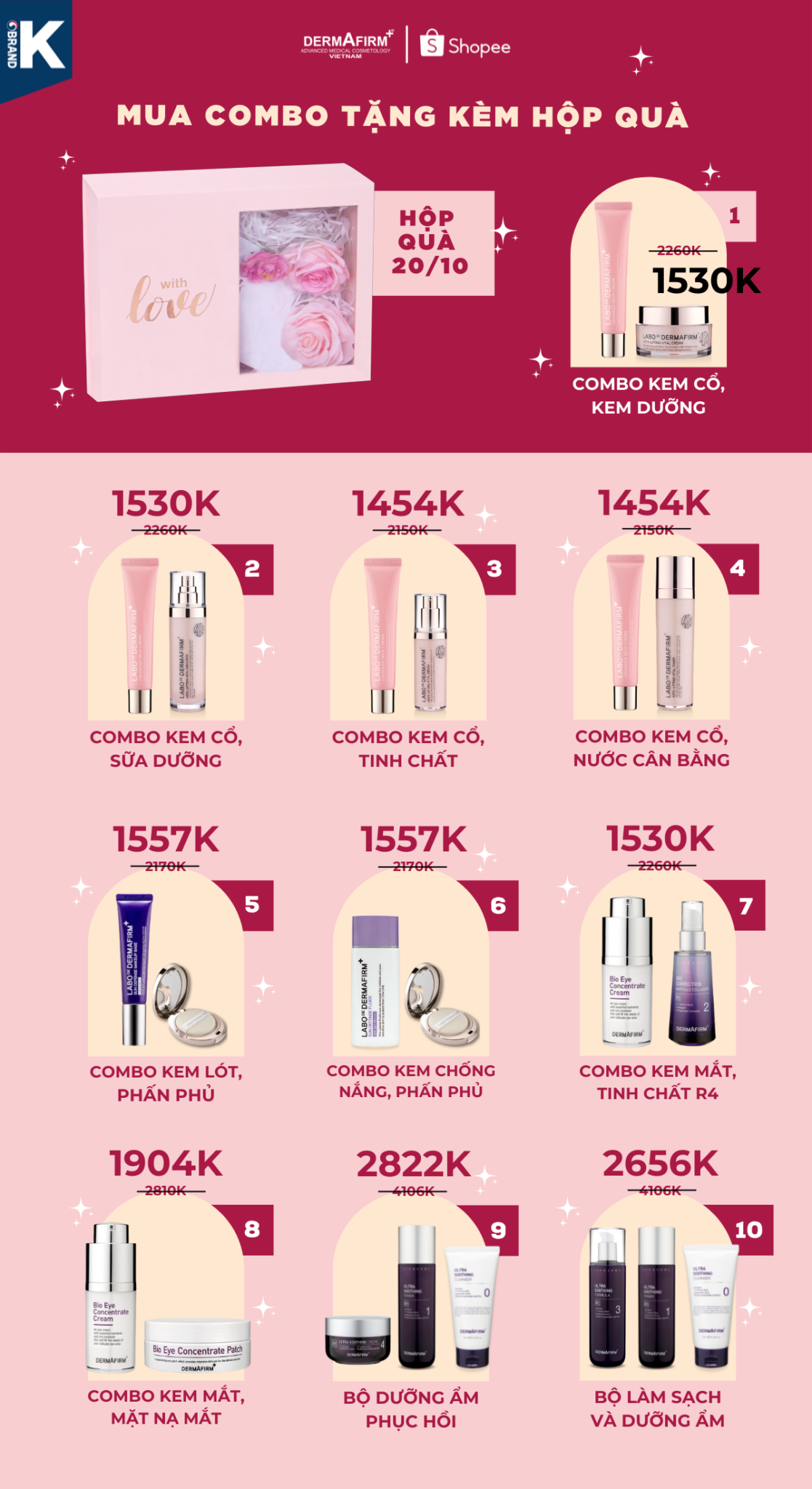
Dermafirm Vietnam, a subsidiary of the Korean cosmetics group Dermafirm, debuted in Hanoi with a campaign in 2021 across all social media platforms, the website, and e-commerce platforms like Shopee and Lazada. At that time, I served as the Graphic Designer Lead in the Marketing team, and we decided to revamp the brand concept to better resonate with Vietnamese preferences.
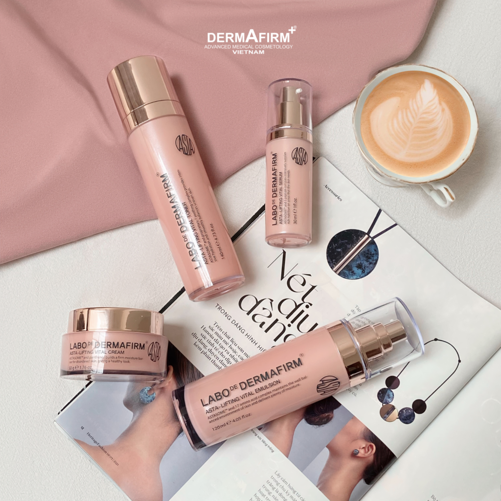
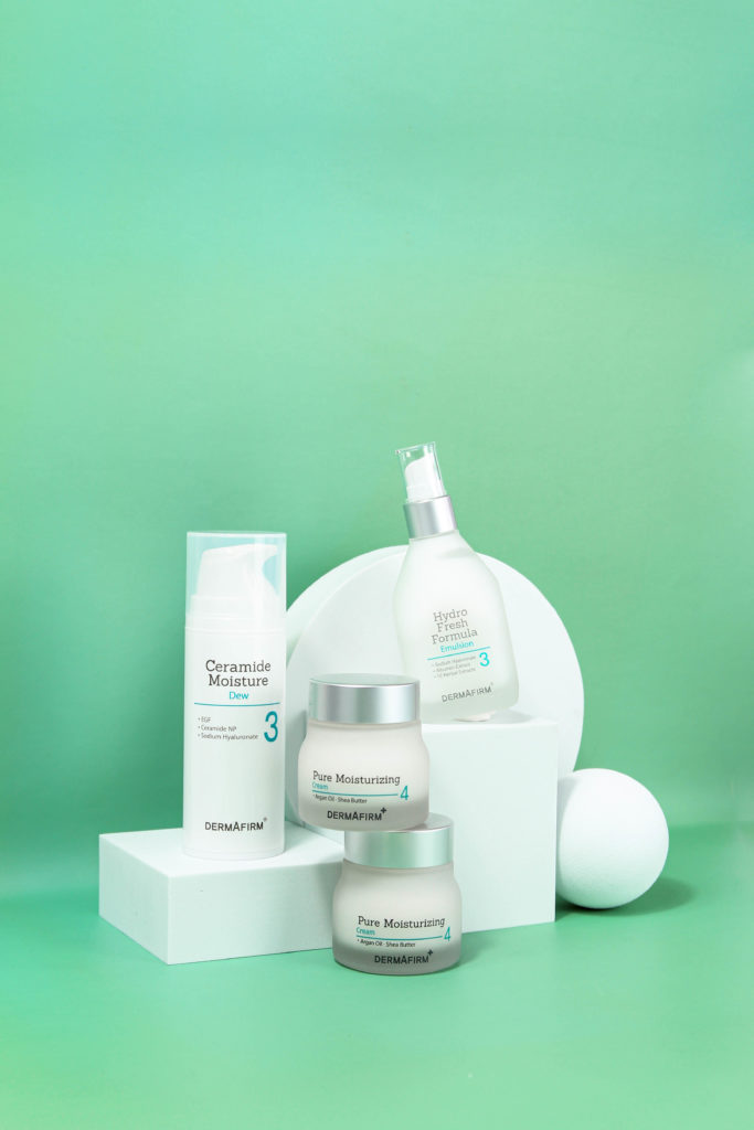
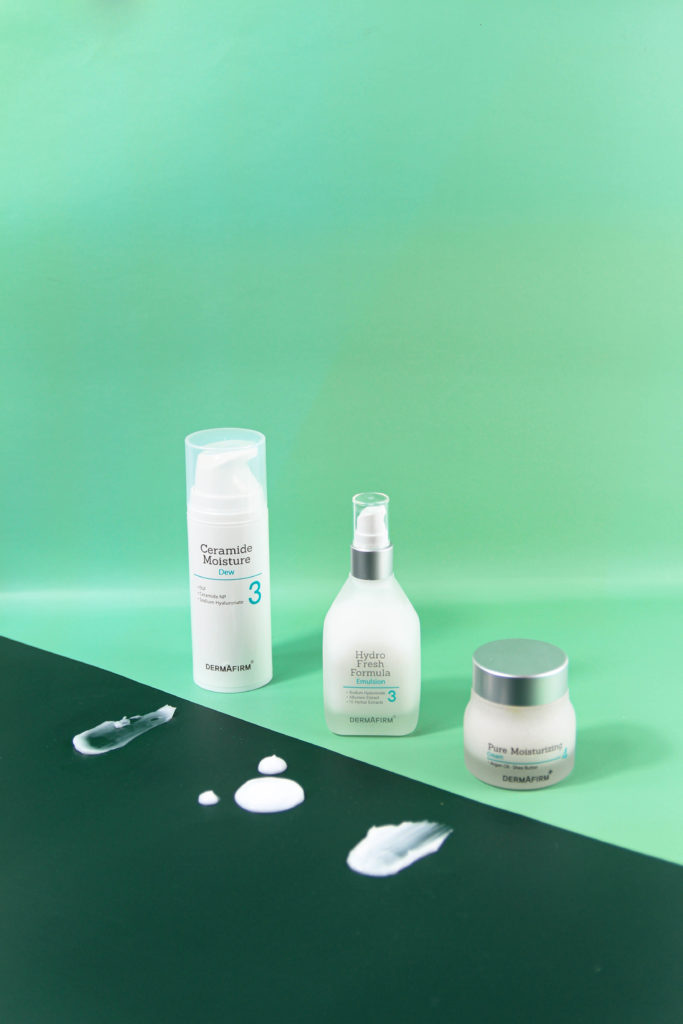
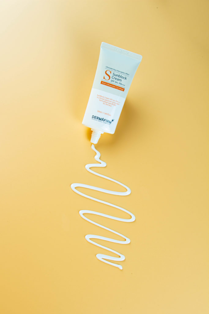
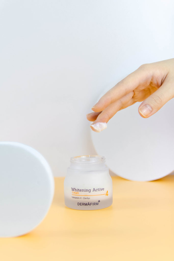
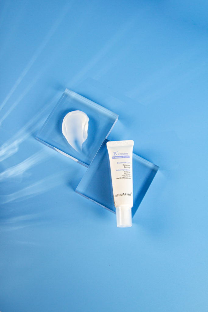
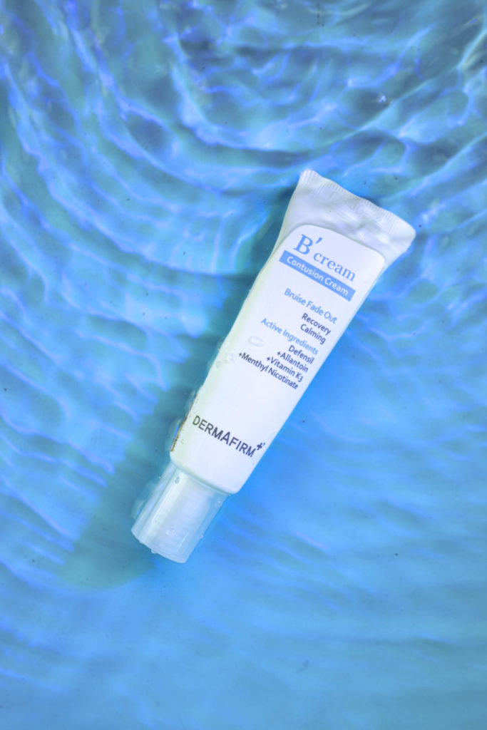
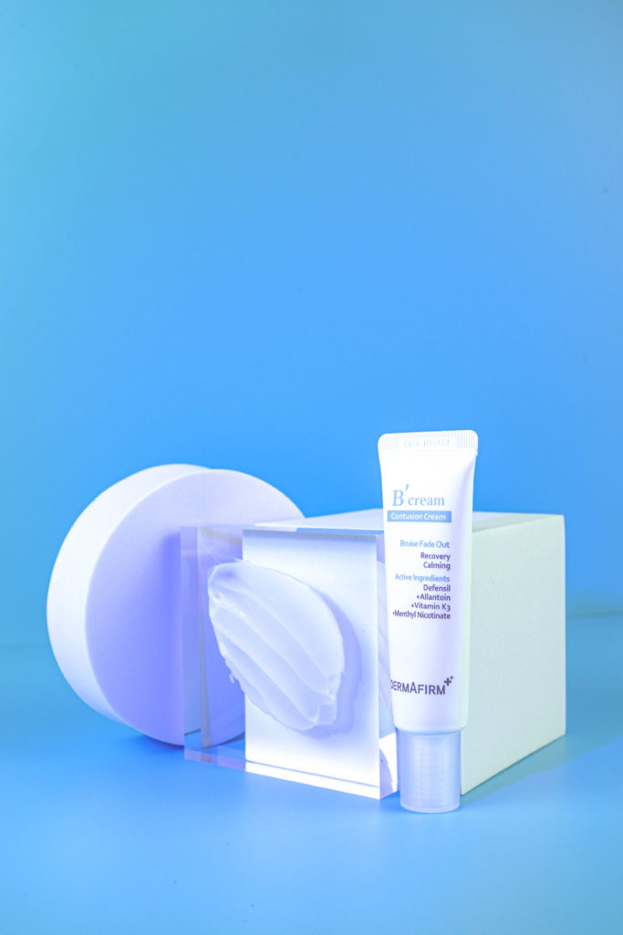
For Vietnamese consumers, high-quality cosmetics are associated with glamour, vibrant colors, and a touch of sweetness. Therefore, my team and I independently developed concepts and captured 3 photoshoots below in our home studio setting. Additionally, I designed the website, social media ads, and e-commerce ads.
This campaign aimed to enhance Dermafirm Vietnam’s brand presence and appeal in the Vietnamese market, aligning our visuals with local tastes and expectations.

Social Media Ads
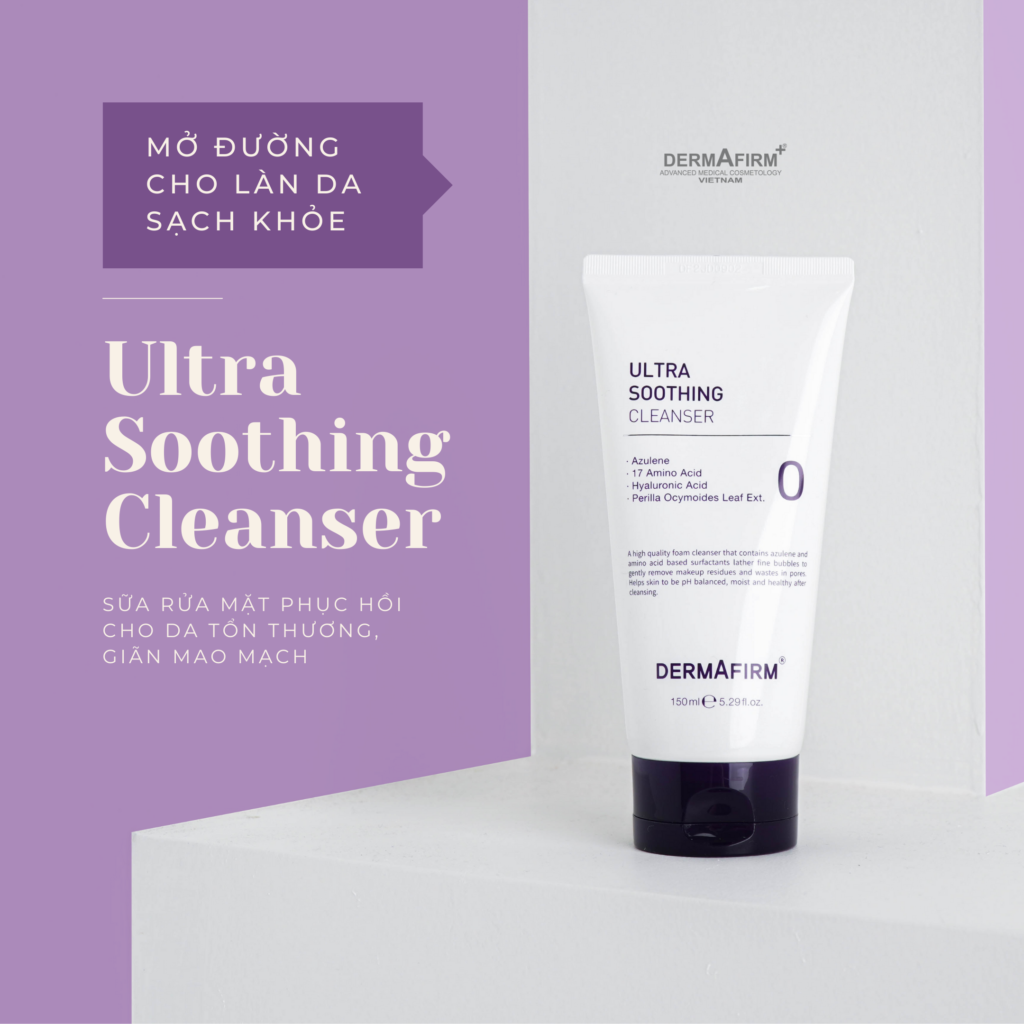
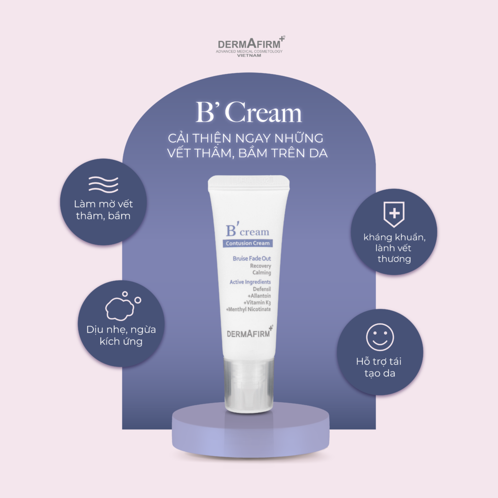
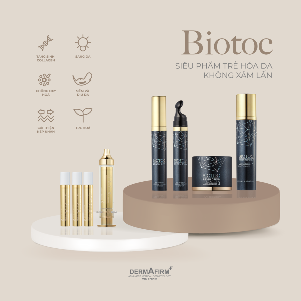
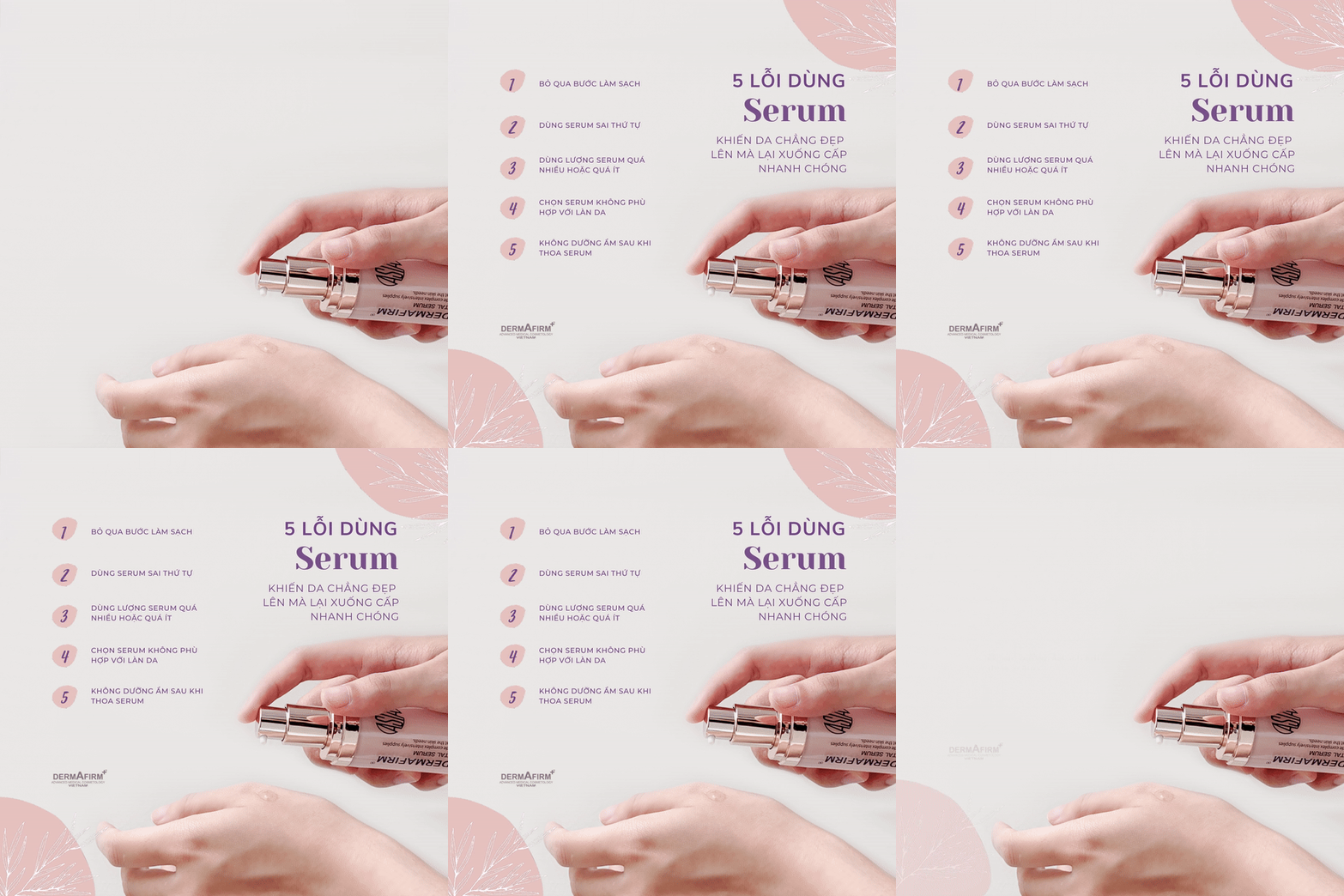
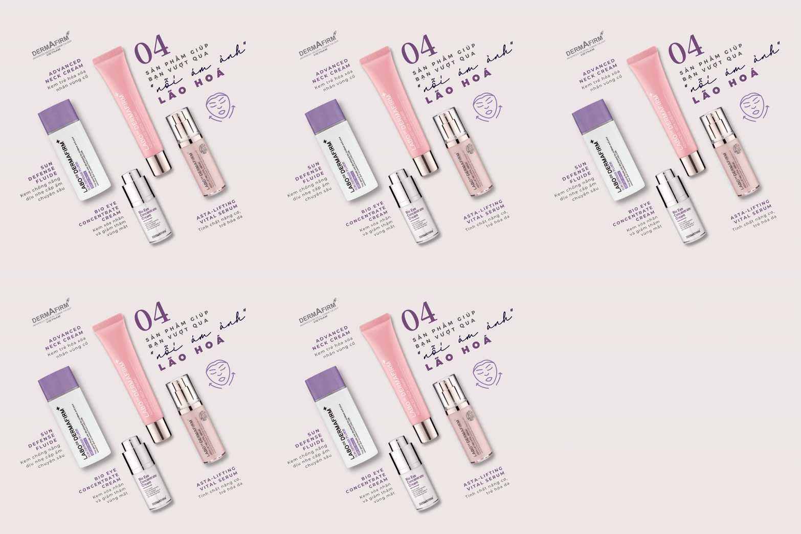
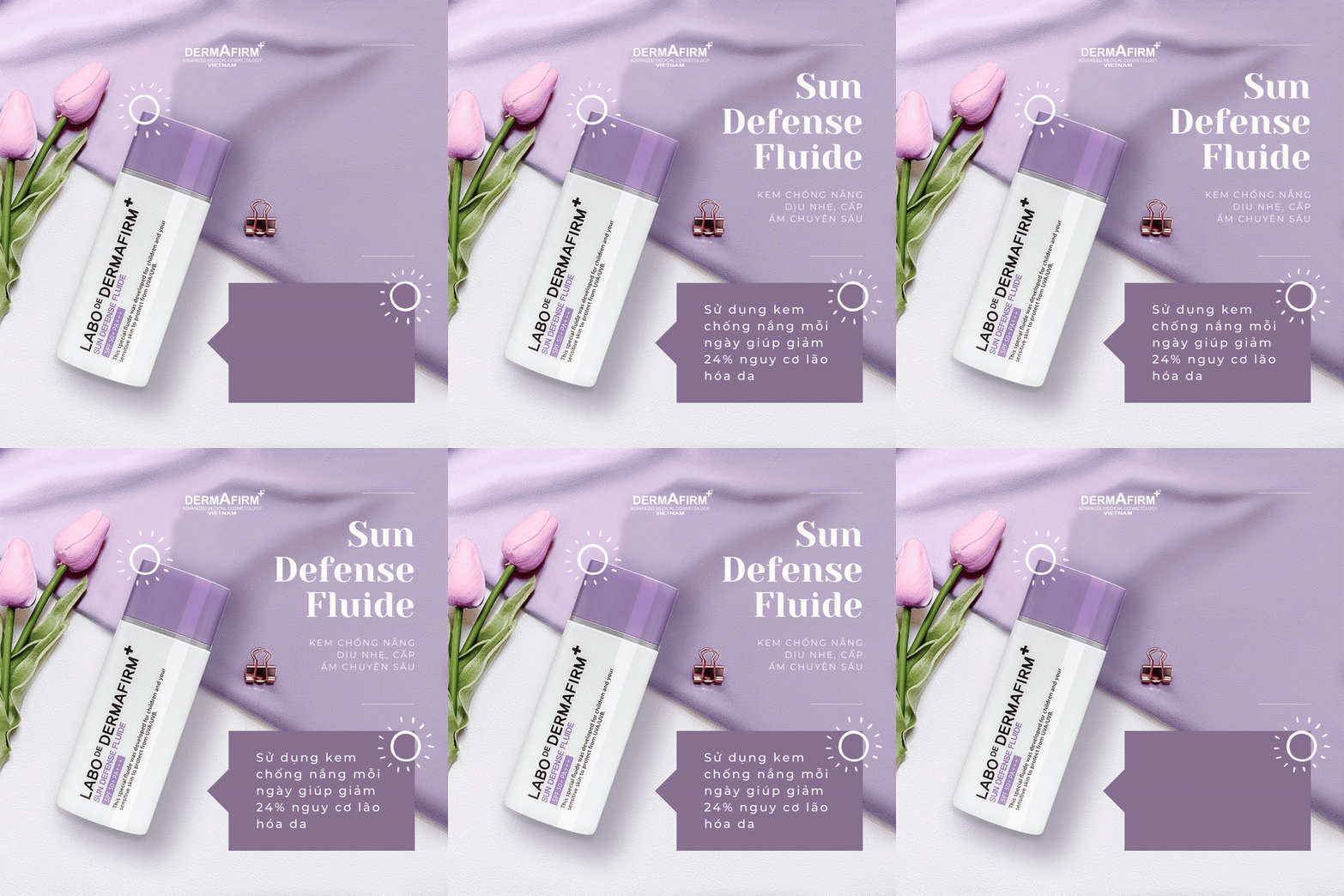
Photo Concepts
Concept 1
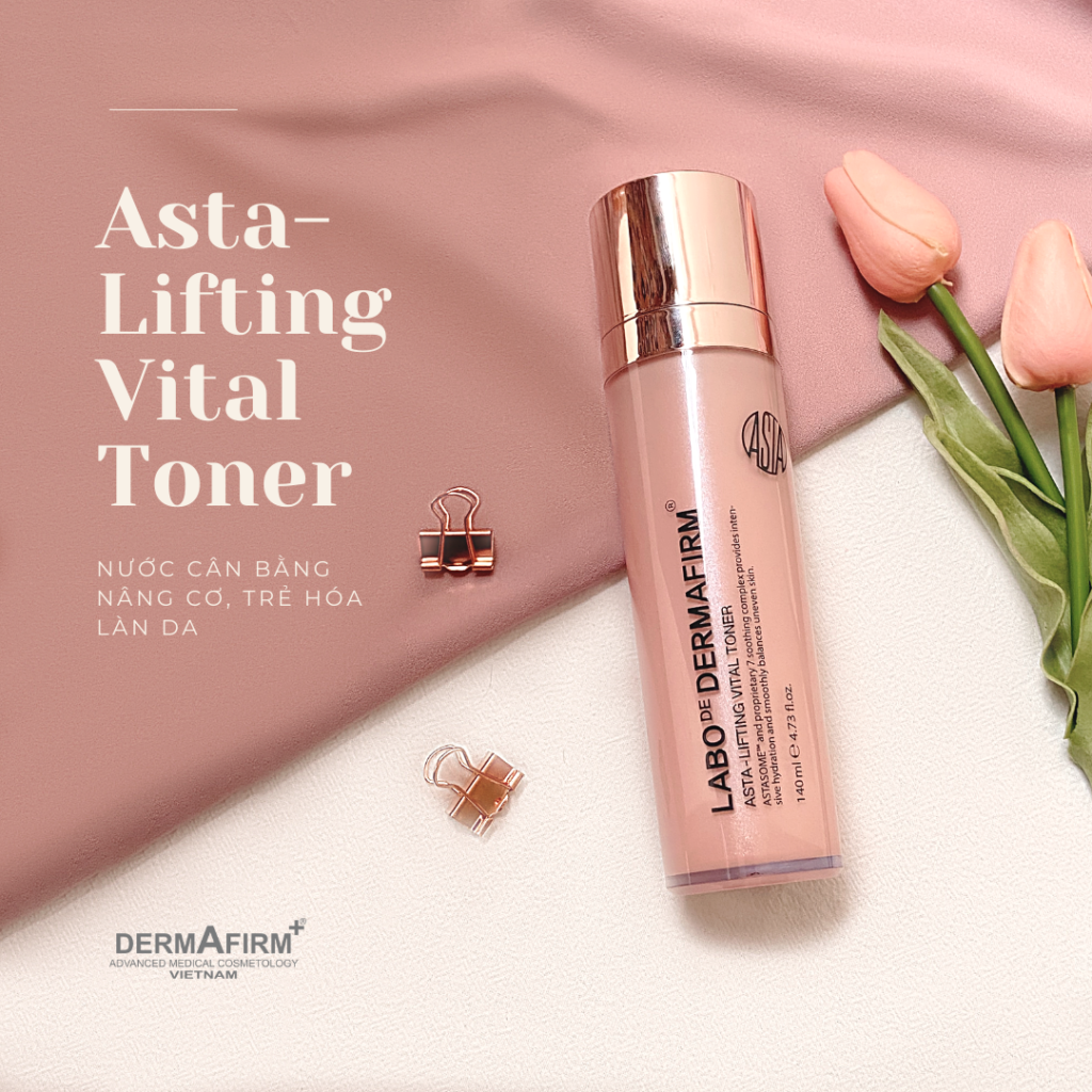
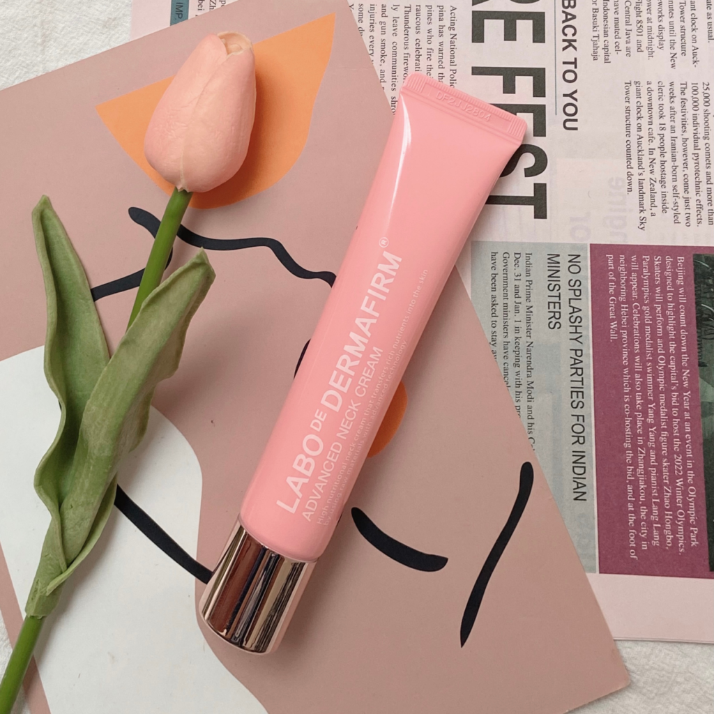
Concept 2
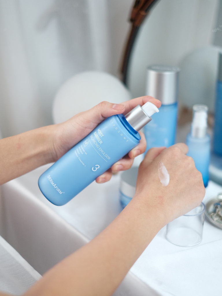
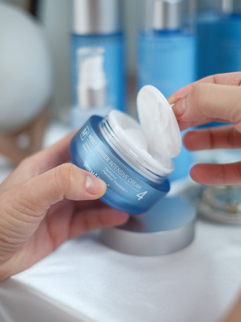
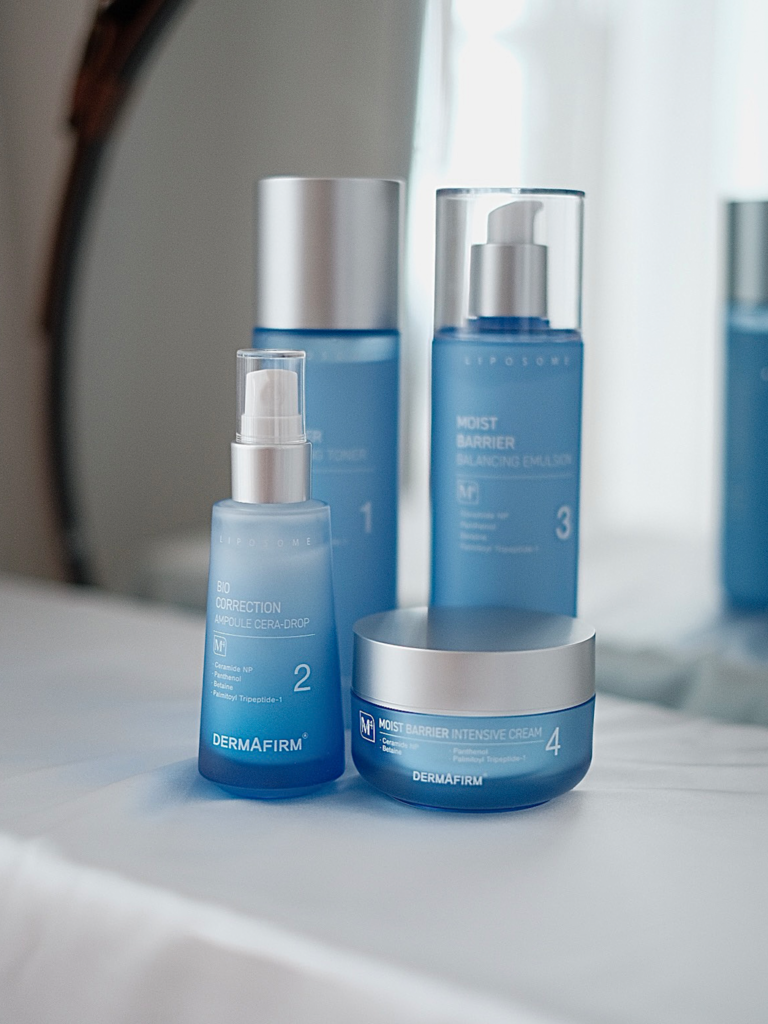
Concept 3
E-commerce Ads


CAMPAIGNS
VSLAND.
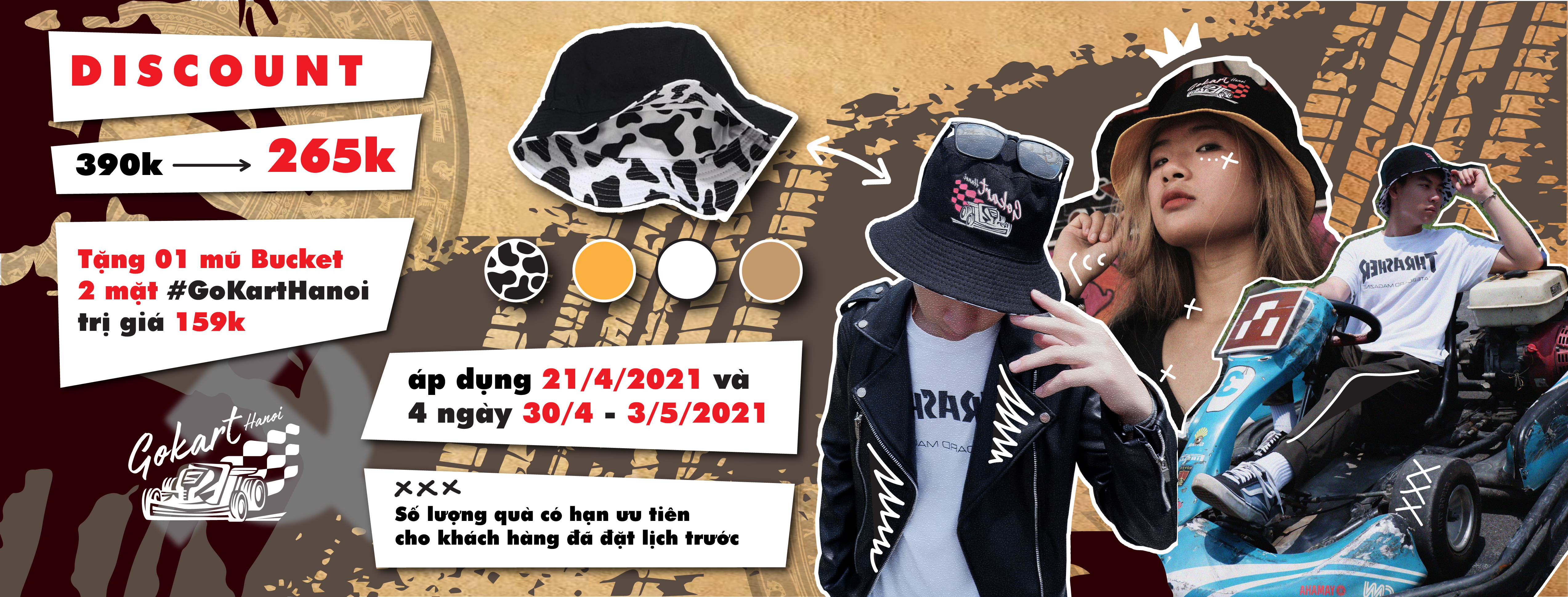
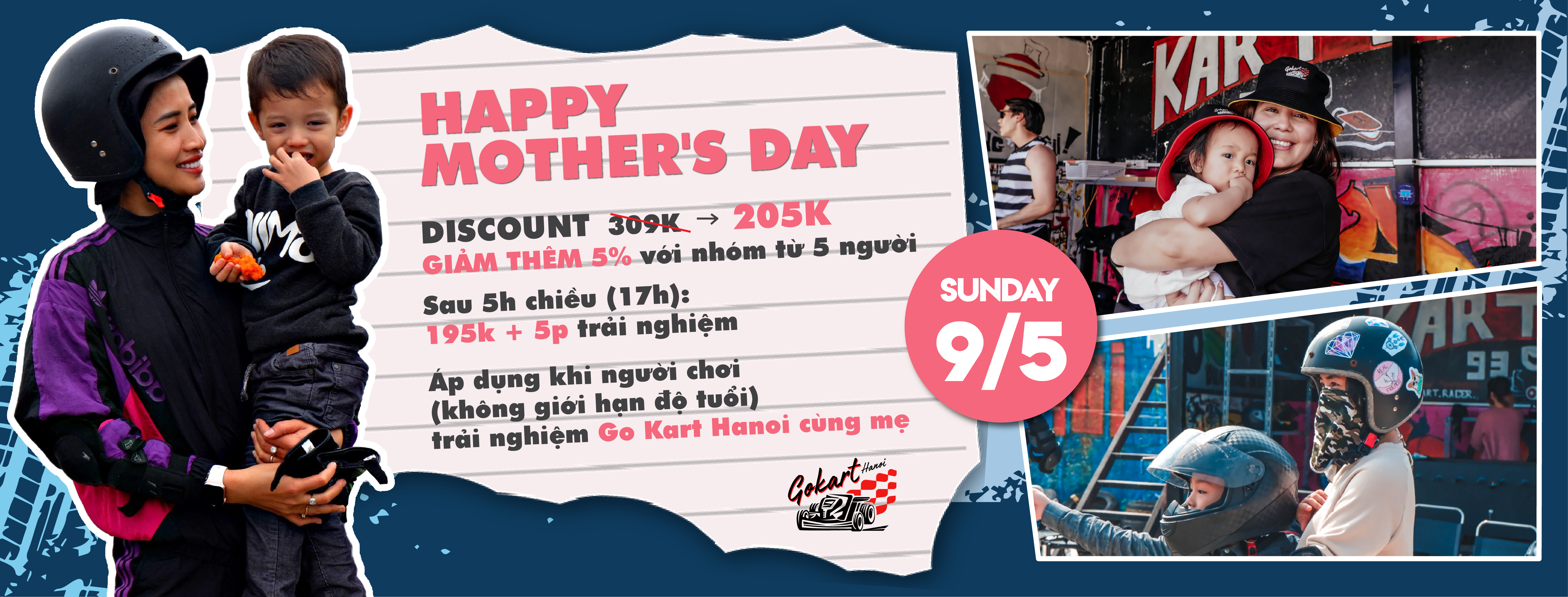
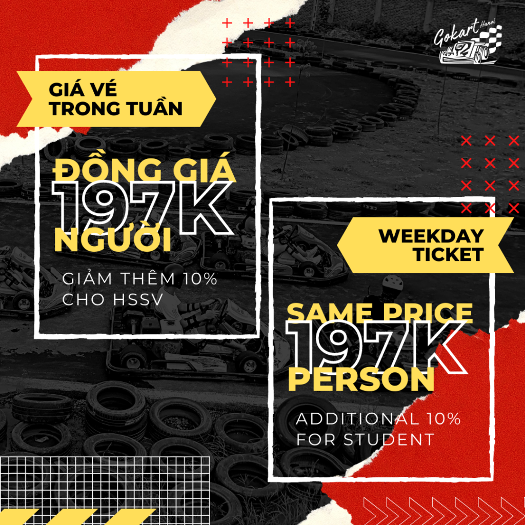
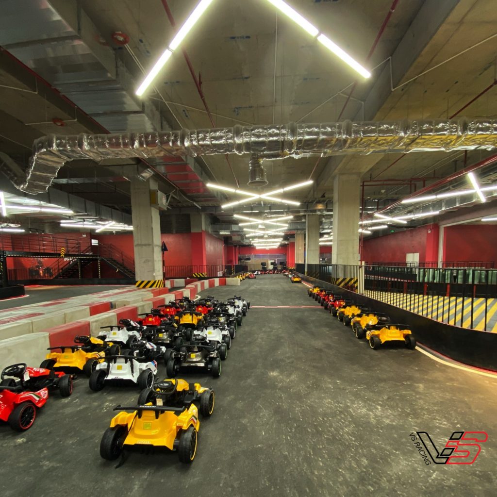
Go Kart Hanoi is the first Kart Racing venue in northern Vietnam, and I was fortunate to accompany them in their final months before they rebranded and expanded to a new location. We created campaigns in both Vietnamese and English to attract customers, as this sport was entirely new to the Vietnamese. It was a challenging campaign, during which we collaborated to organize numerous events, promotions, discounts, vouchers, and gift campaigns. The impact of Covid significantly decreased Go Kart Hanoi’s revenue in the first half of 2021.
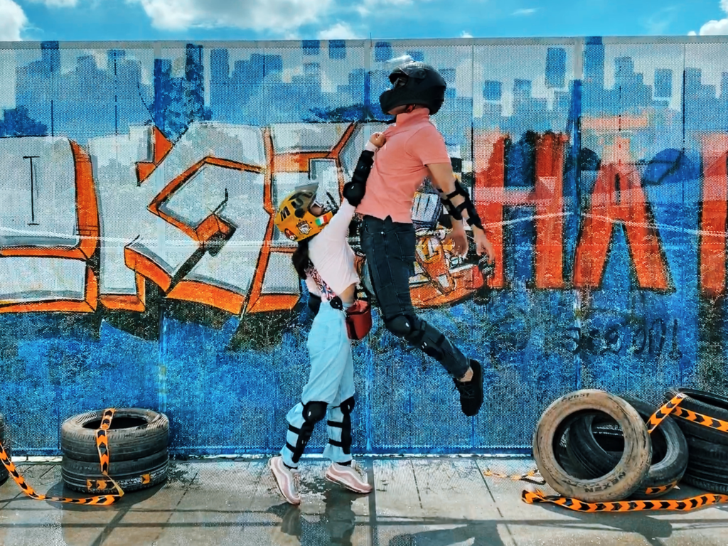
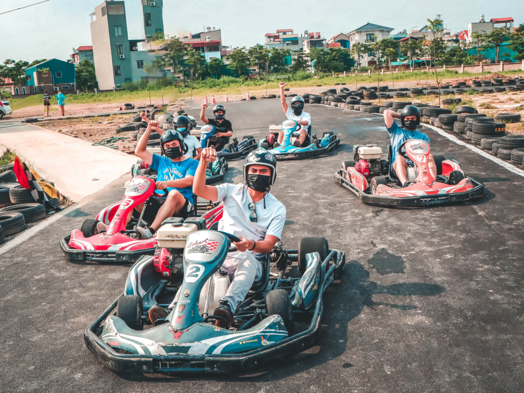
To appeal to young people, we worked hard to portray our kart racing track as a fun place—a gathering spot for energetic groups of friends who enjoy sports and photography—more than just a professional racing venue.
Below are my designs for social media ads: Facebook covers and posts, event covers, promotion posts, website ads, and also some moments of our customers that I took and edited at the racing track.
Social Media Posts
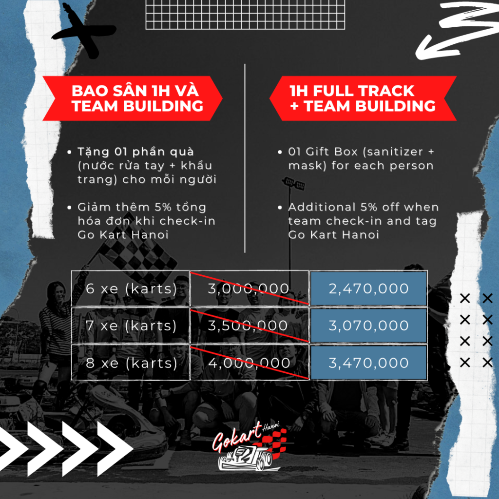
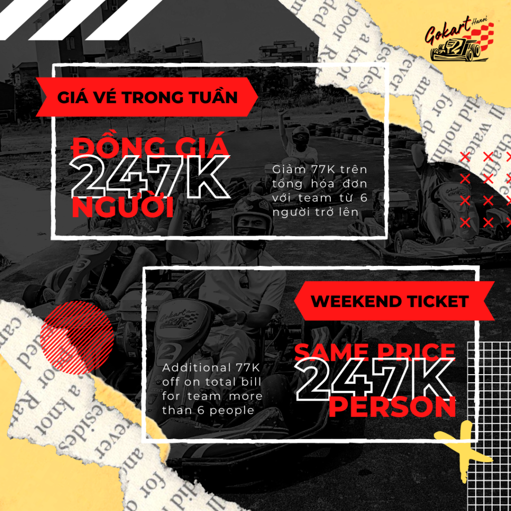
Re-branded
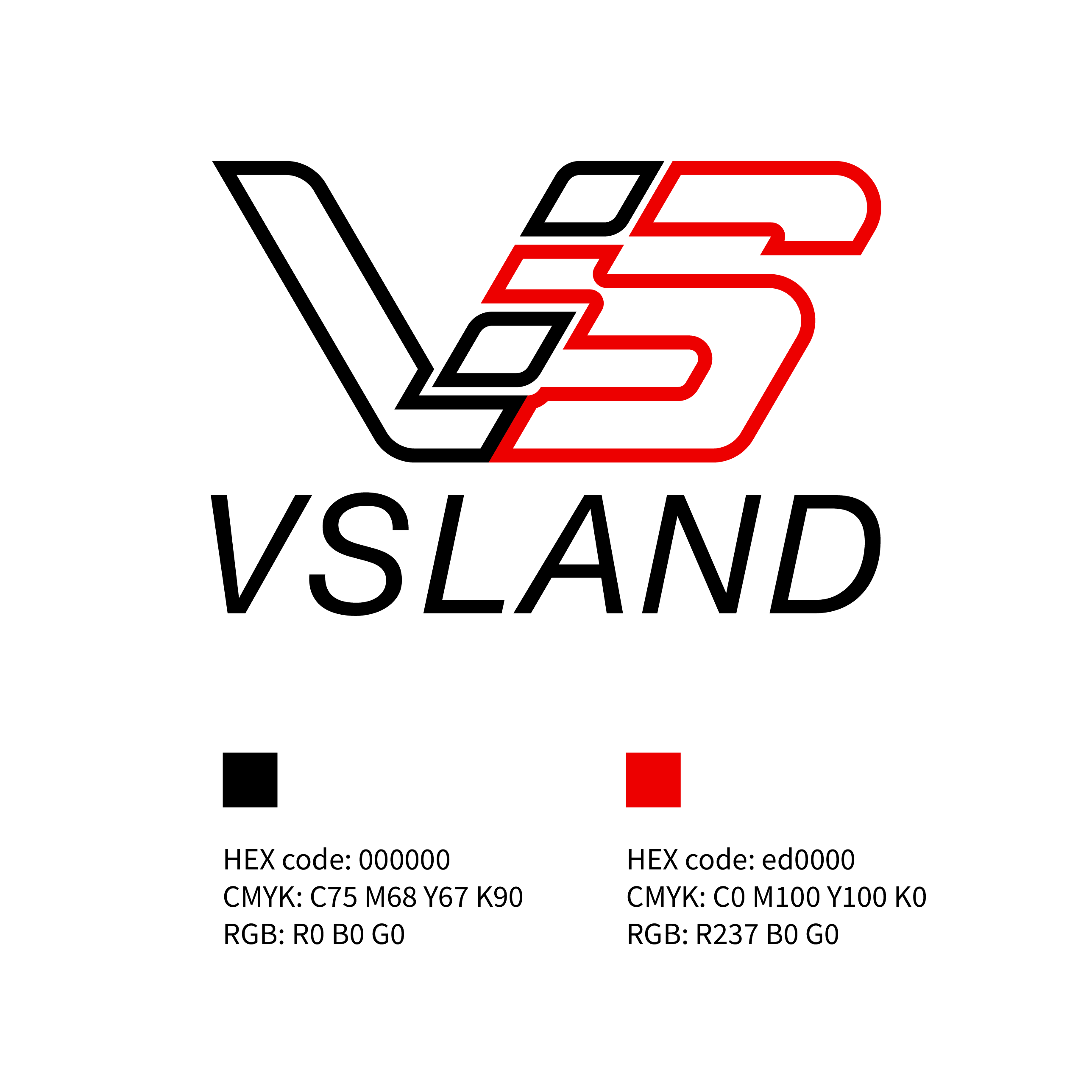
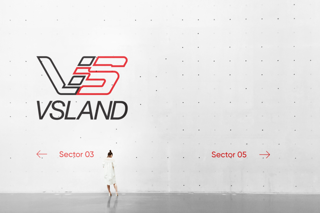
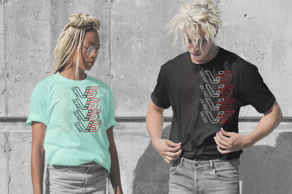
The rebranding process for Go Kart Hanoi was particularly challenging because we had only one week in March to complete the new logo, color schemes, and designs for timely implementation. After careful consideration, we settled on the name “VSLand,” with “VS” stands for Vietnam-Speed and “Land” symbolizing a leisure complex comprising karting, indoor climbing, arcade gaming, a food court, and a store. Both the name and English-language designs had to be straightforward for easy understanding and readability by Vietnamese.
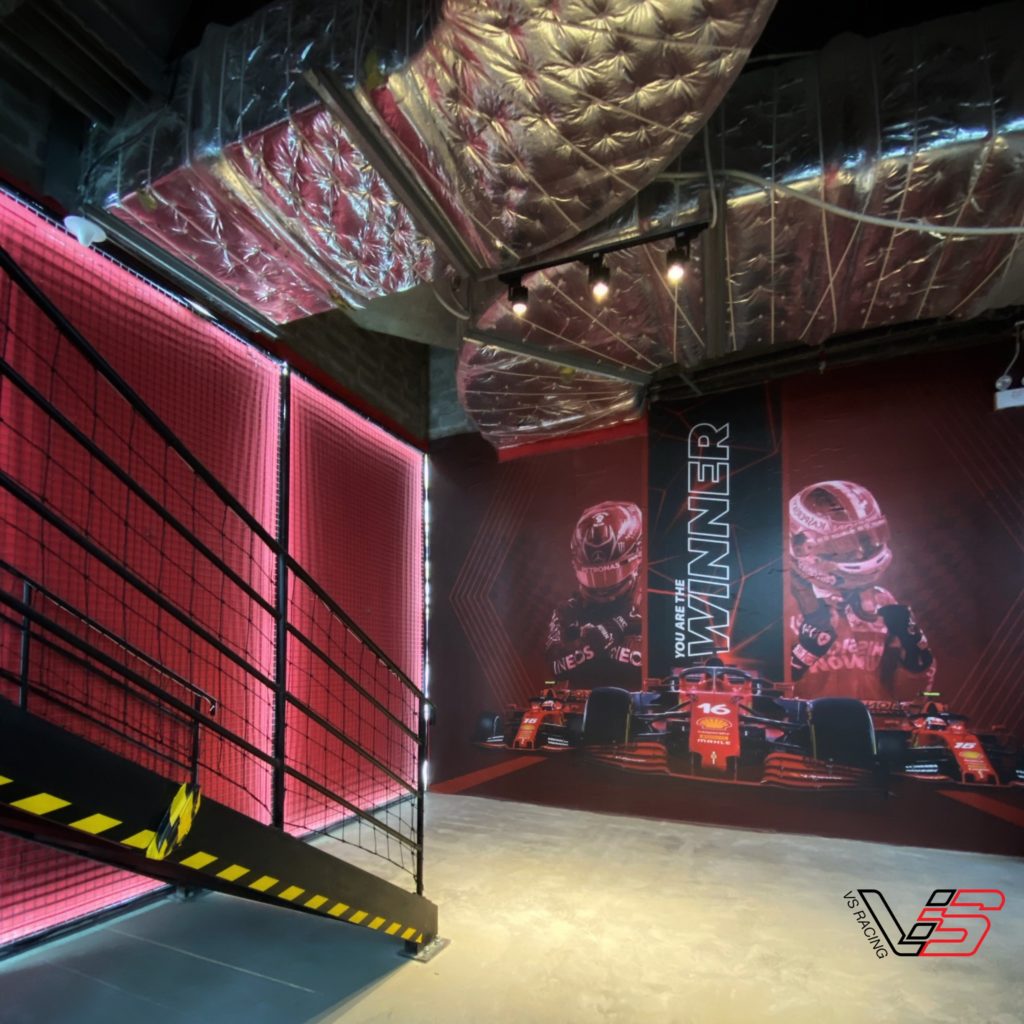
We pushed forward with the rebranding and the opening of a new branch due to plans for the international F1 race in Hanoi, Vietnam, scheduled for late autumn 2021. We intended to host the first K1 (karting) race in Vietnam in August, which would have been a significant event to promote the brand and the VSLAND entertainment complex at AEON MALL, the largest shopping center in northern Vietnam at the time. However, due to COVID-19, Vietnam entered a complete lockdown from July to the end of September, leading to the cancellation of our plans, including the international F1 race.


Barricade

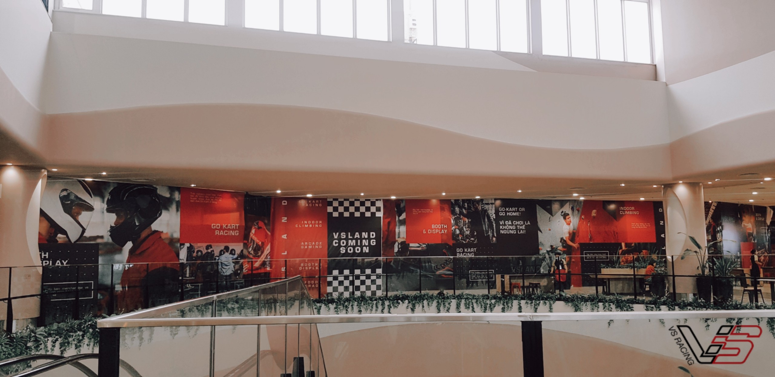
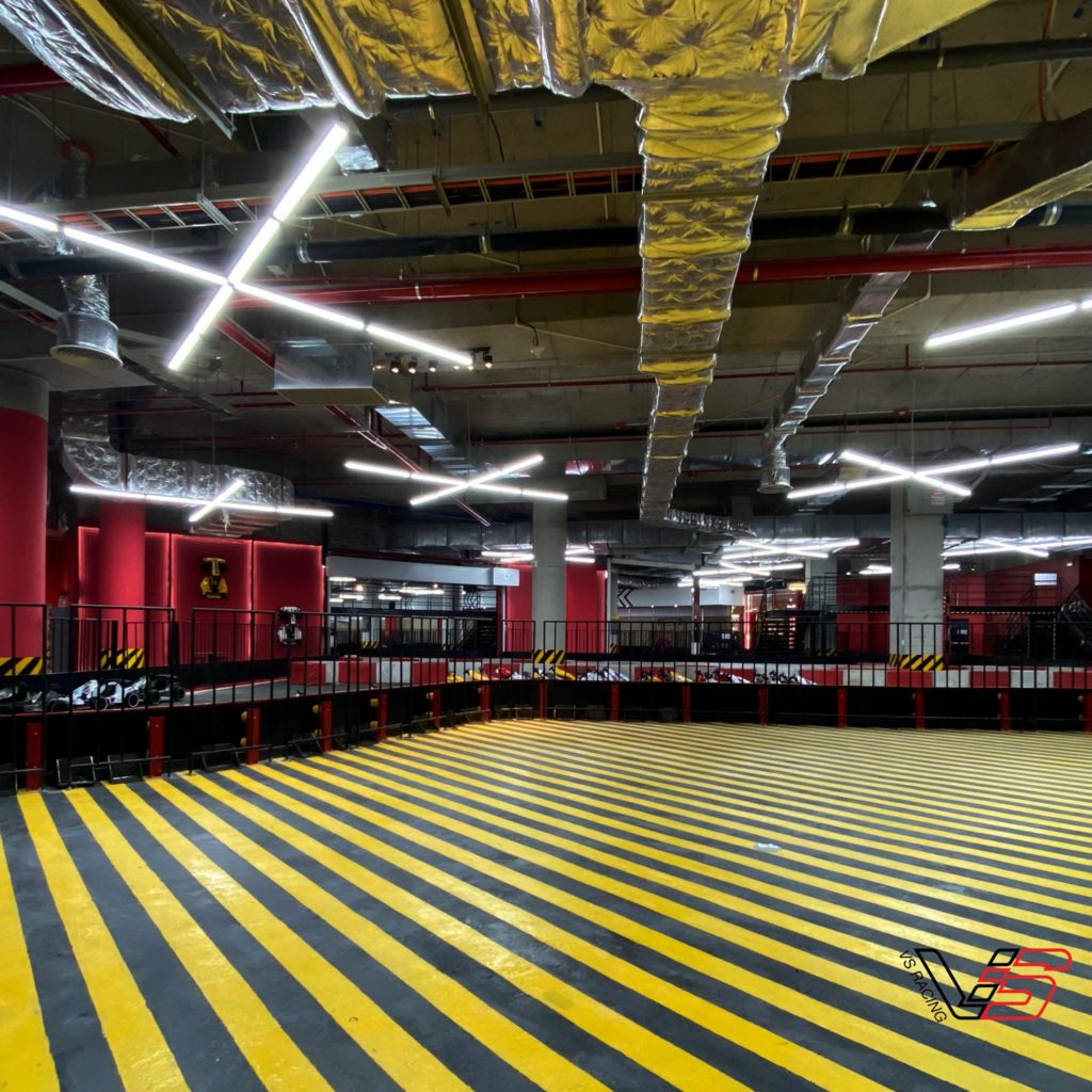
The VSLAND karting and entertainment complex is located on the 3rd floor of AEON MALL HA DONG, Hanoi. We need an outer wall surrounding the entire complex that spans up to 5000 square meters, with walls reaching a height of 1.8 meters. The total length of the wall I have designed reaches 87 meters. This is also the largest printed advertisement I have ever executed in my career till now.


Karting Track
CAMPAIGNS
Mijor Agency
By the end of 2022, I worked as a freelance AD Lead for Mijor Agency, a specialist in hospitality and lifestyle brands based in Ho Chi Minh City and Phu Quoc Island. One of their notable clients, Mango Bay, was ranked among the top 10 most beautiful resorts in Southeast Asia by The Guardian in 2019. The team at Mijor is youthful, mostly composed of interns from various universities, yet they are dedicated, and we’ve gleaned valuable insights from our managers.
In my role at Mijor, I led a team comprising a photographer and two designers. Together, our focus was on managing visual aspects for three distinct brands: The Home Pizza, Origin 1982 Bar, and Chuon Chuon Bistro. Each brand had well-defined unique selling points, and we delicately infused Vietnamese culture into their identities. Currently, all three establishments are thriving and highly regarded on TripAdvisor’s rankings for Phu Quoc Island, Vietnam.

The Home Pizza
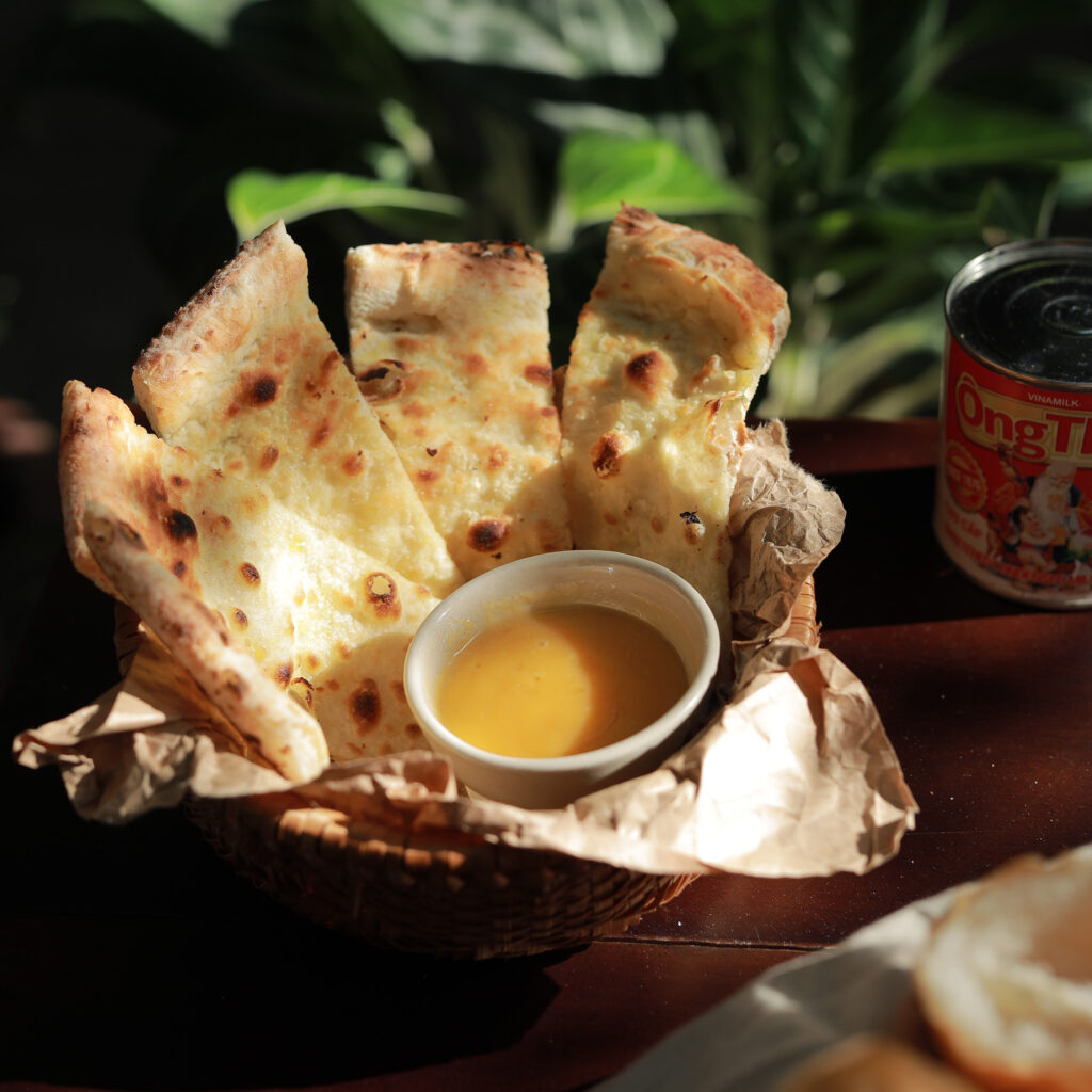
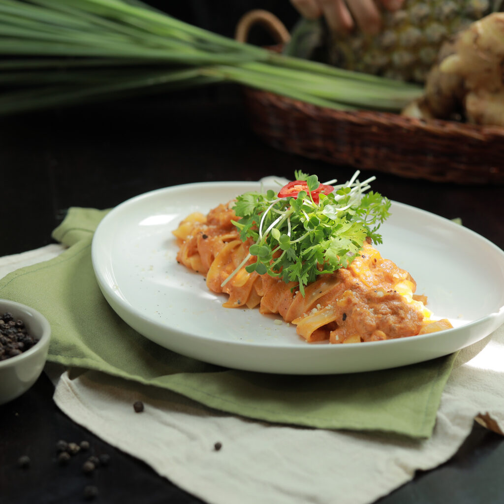
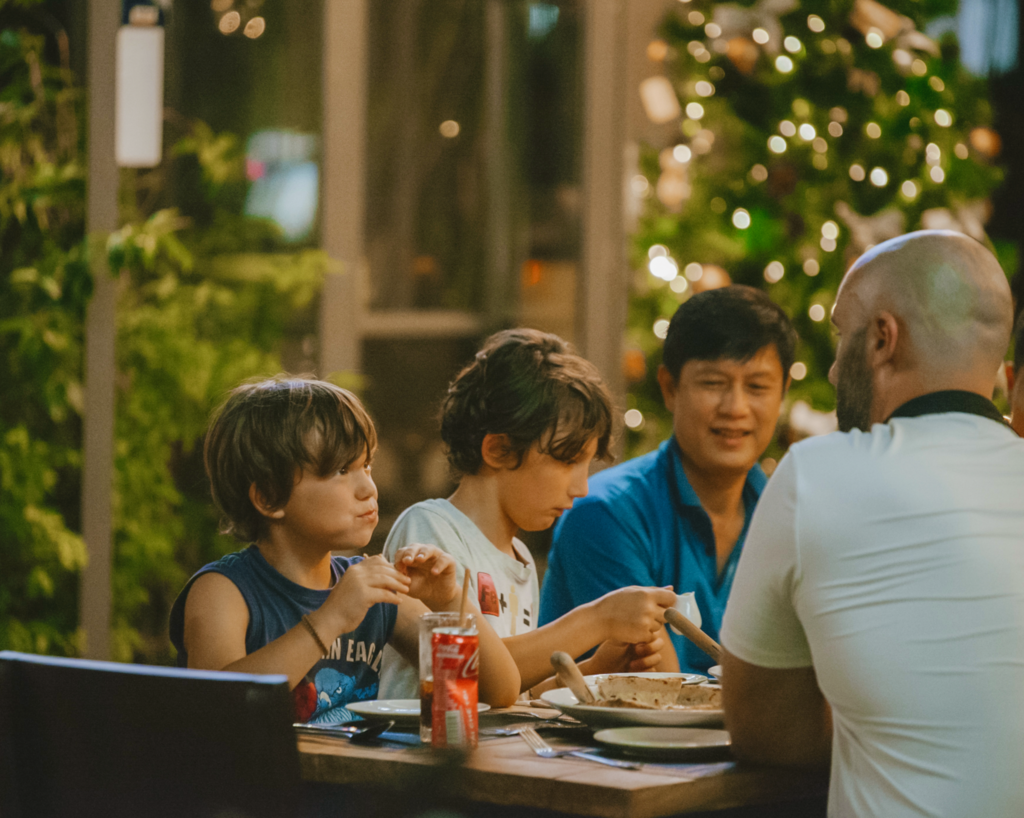
The Home Pizza is arguably the first pizza joint on Phu Quoc Island, Vietnam. What sets The Home Pizza apart is our unique fusion of famous Vietnamese island delicacies with Italian cuisine. You can explore The Home Pizza’s menu here to get a better idea. The restaurant launched with the slogan “Make Yourself At Home” because we wanted every foreign traveler visiting Phu Quoc to feel as comfortable as if they were at home, enjoying familiar dishes while experiencing the culinary excellence of Vietnam.
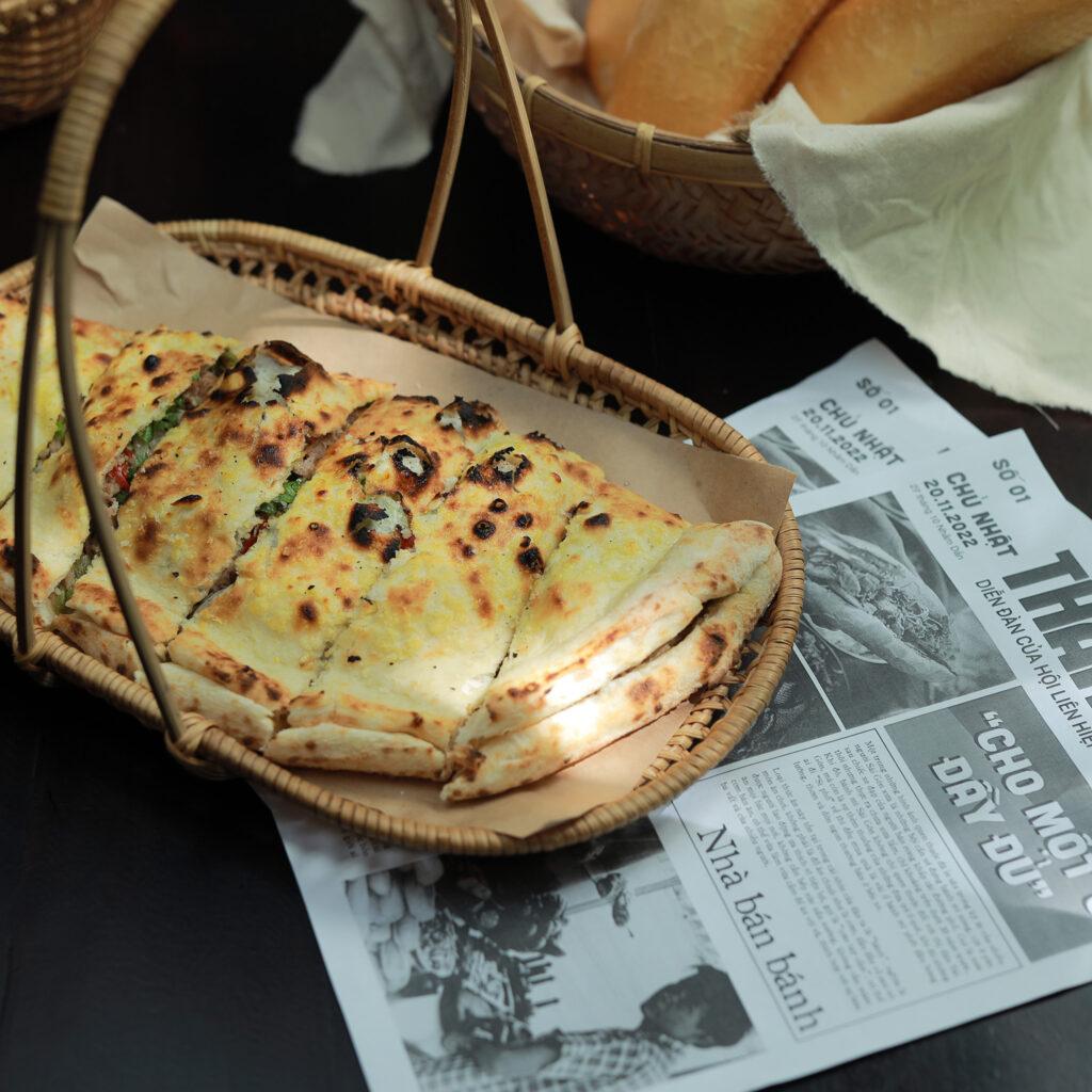
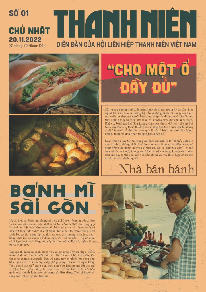
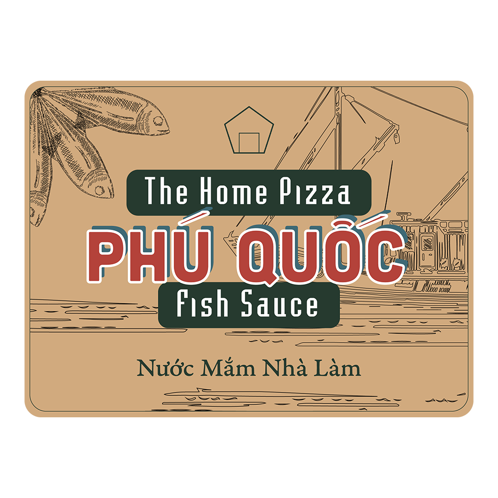
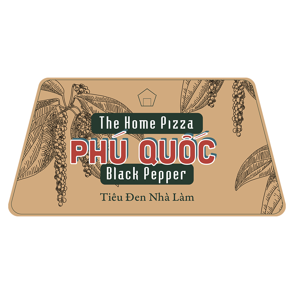
Below are three highlights from our new menu. My team and I collaborated on brainstorming these enticing dishes and devising photography concepts, promotions, and complementary gifts for the occasion. Notably, we introduced the Một Ổ Đầy Đủ Pizza, also known as the Banh Mi Pizza, offering a novel gastronomic experience. Additionally, guests are treated to a small jar of pepper or fish sauce upon their visit, both local specialties of Phu Quoc Island.
With the right marketing strategies, The Home Pizza has successfully opened another branch in Ho Chi Minh City, the largest city in Vietnam, and plans to open one more in Thailand next year.
Origin 1982 Bar
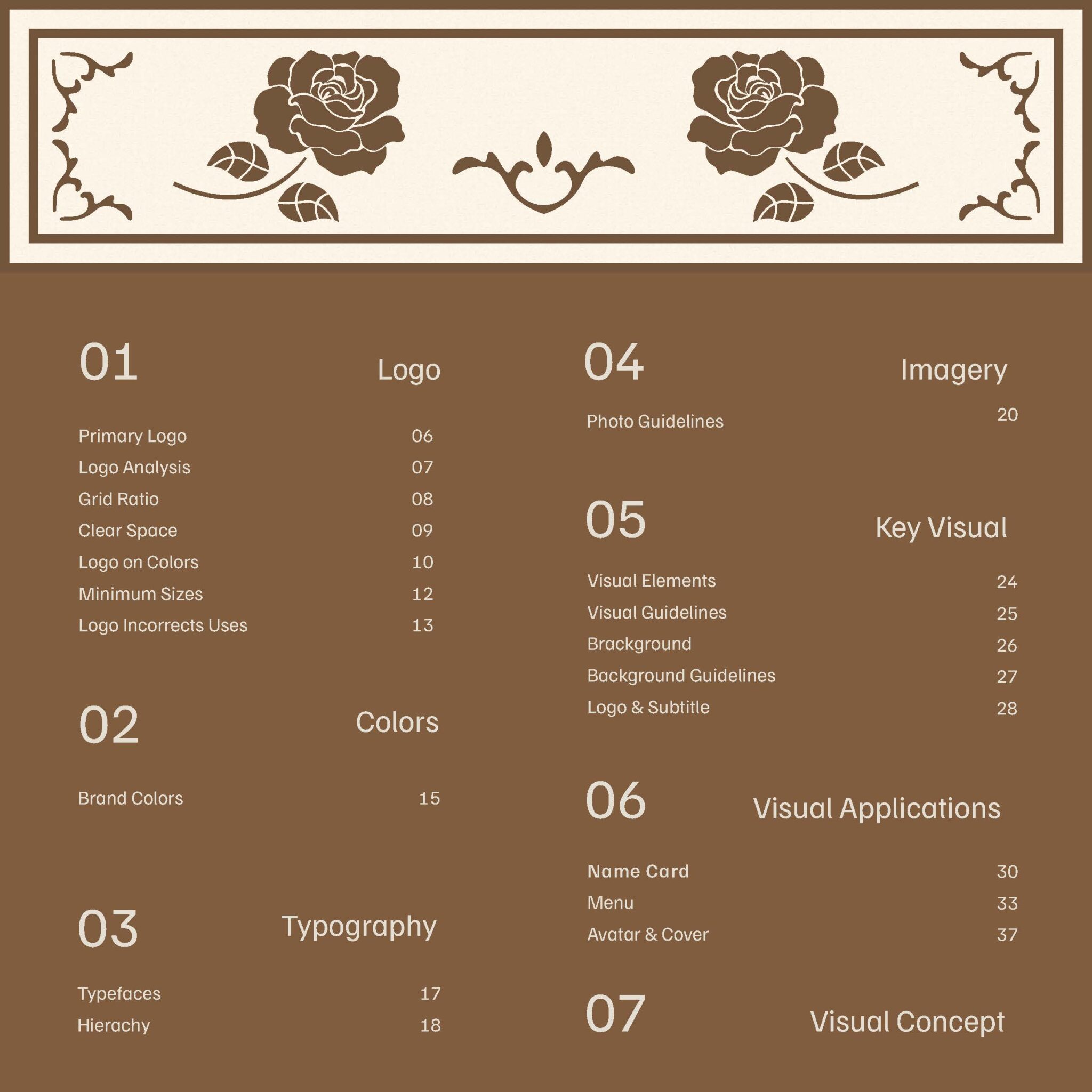
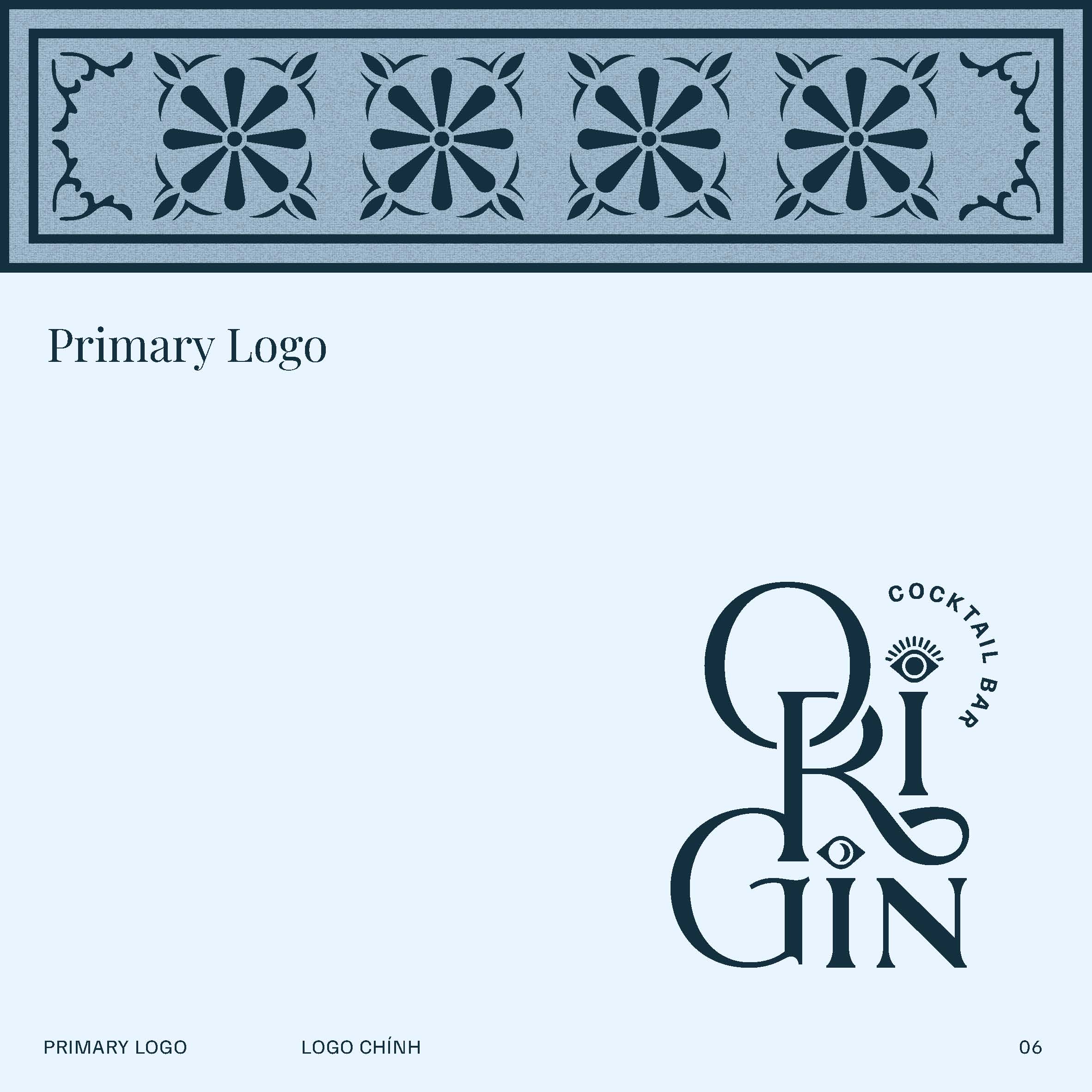
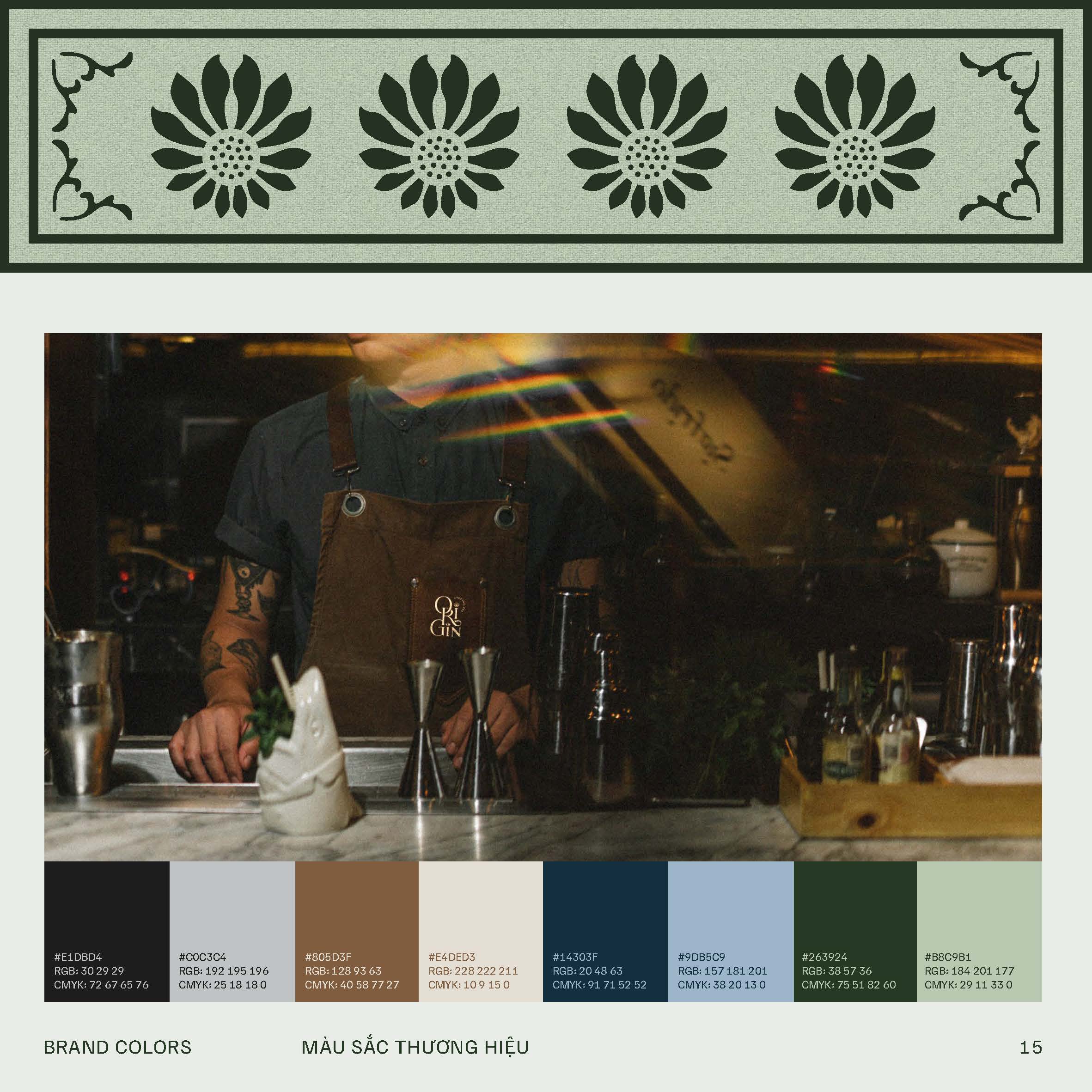
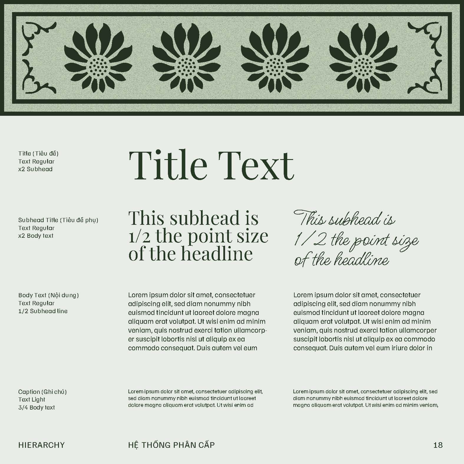
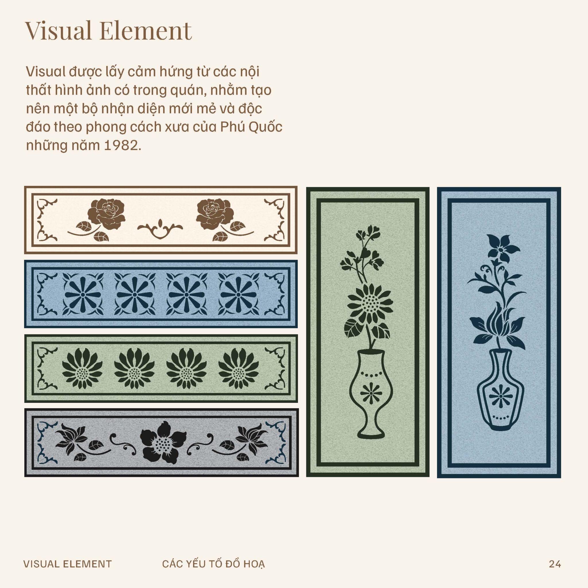
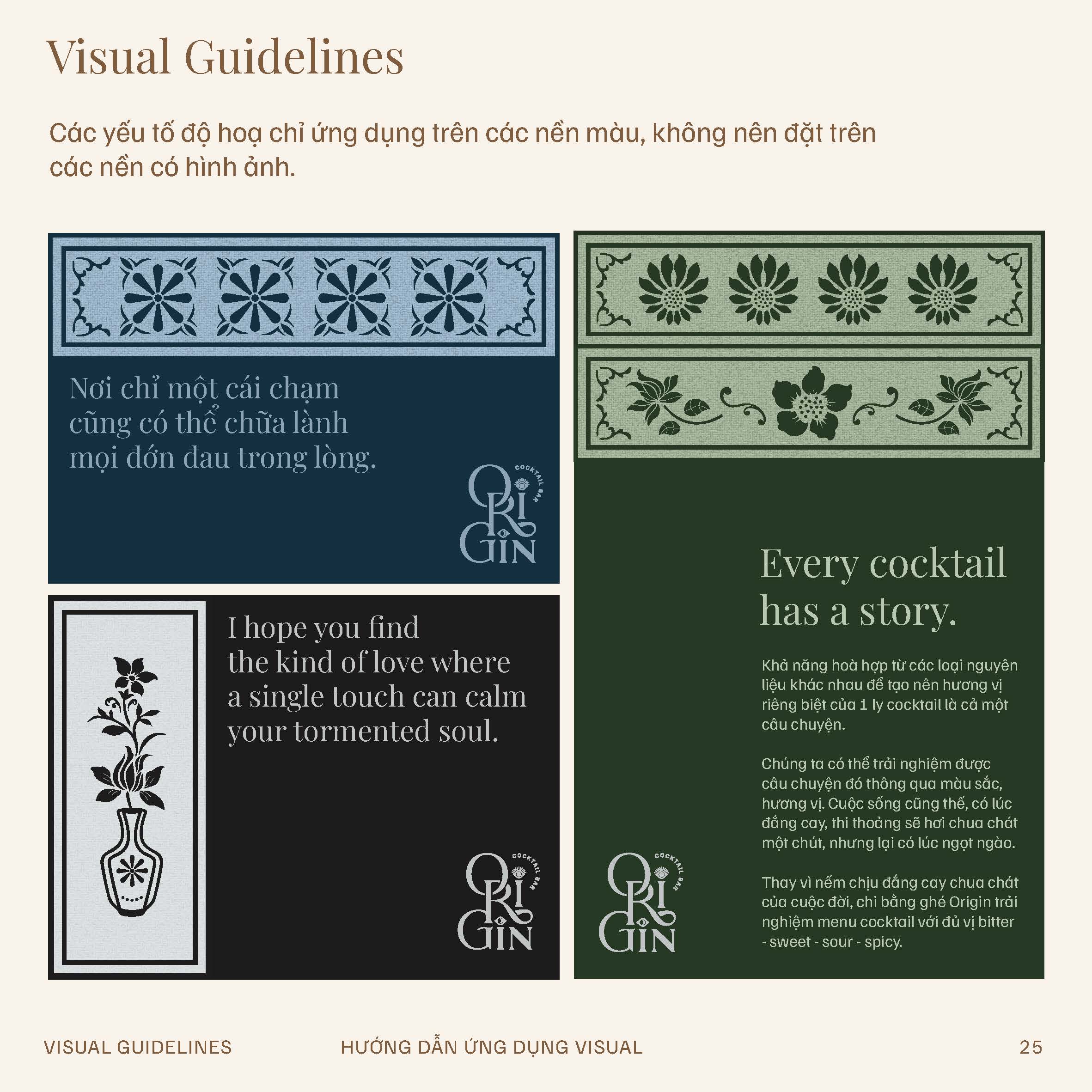
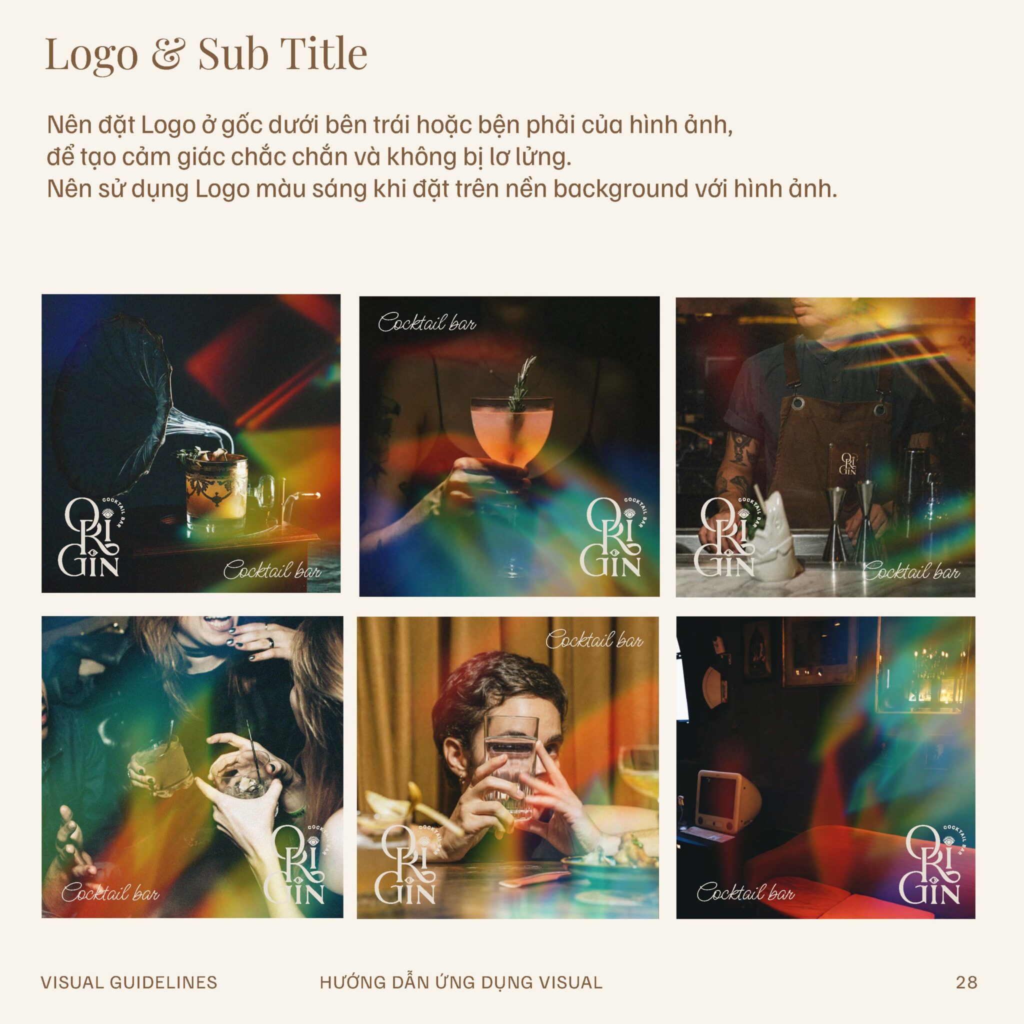
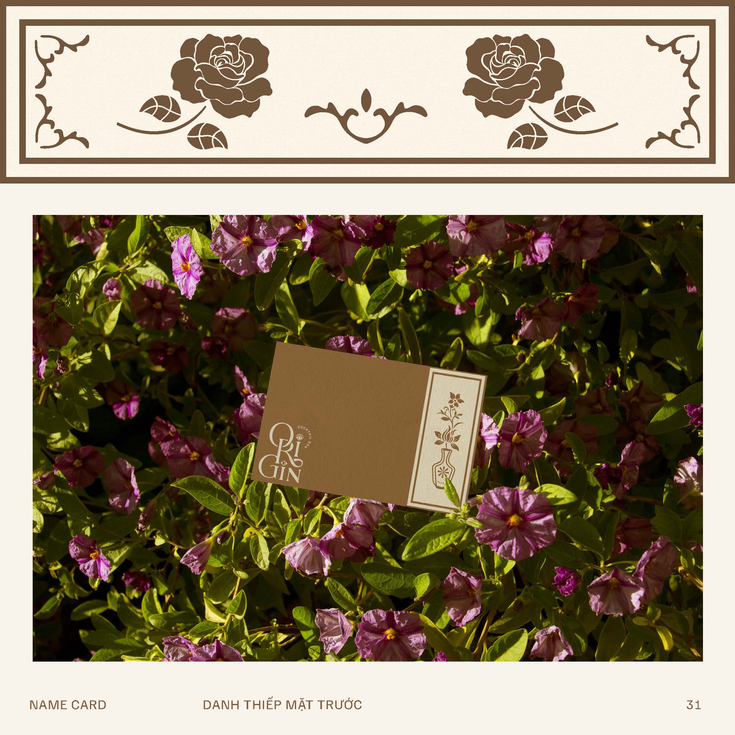
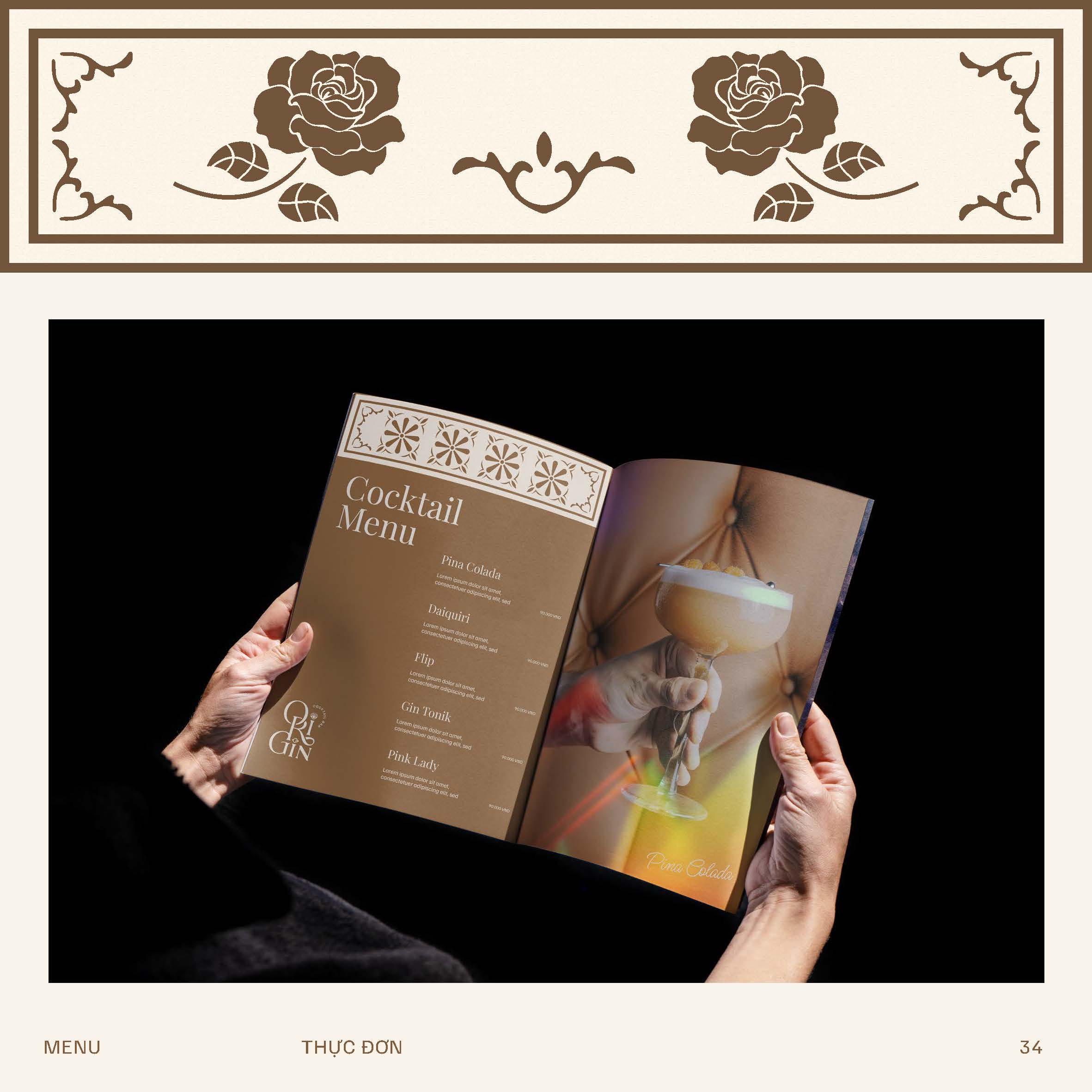
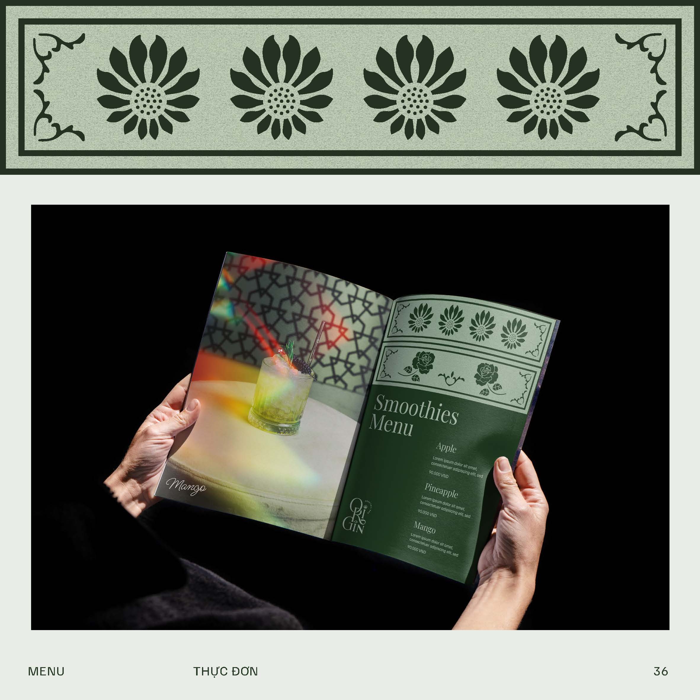
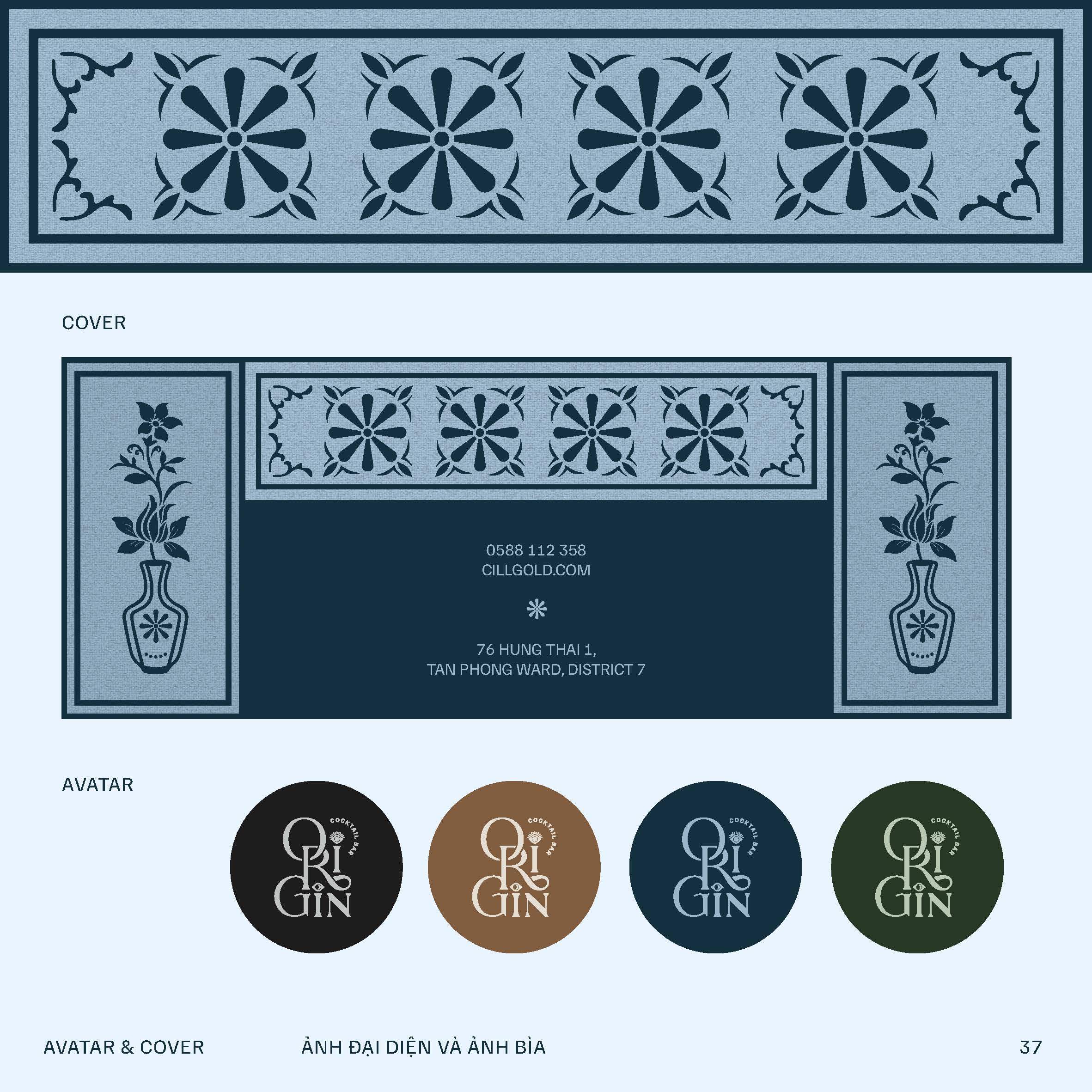
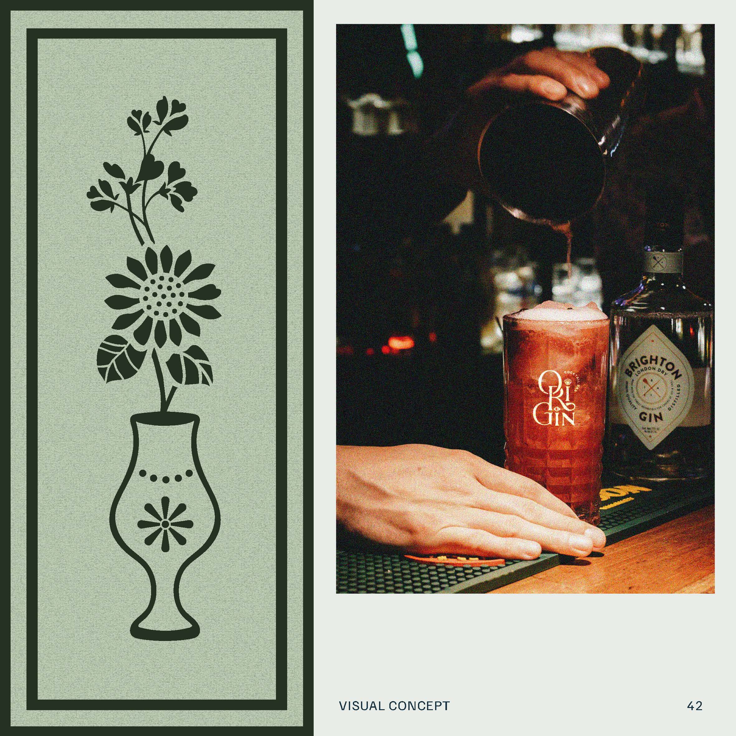
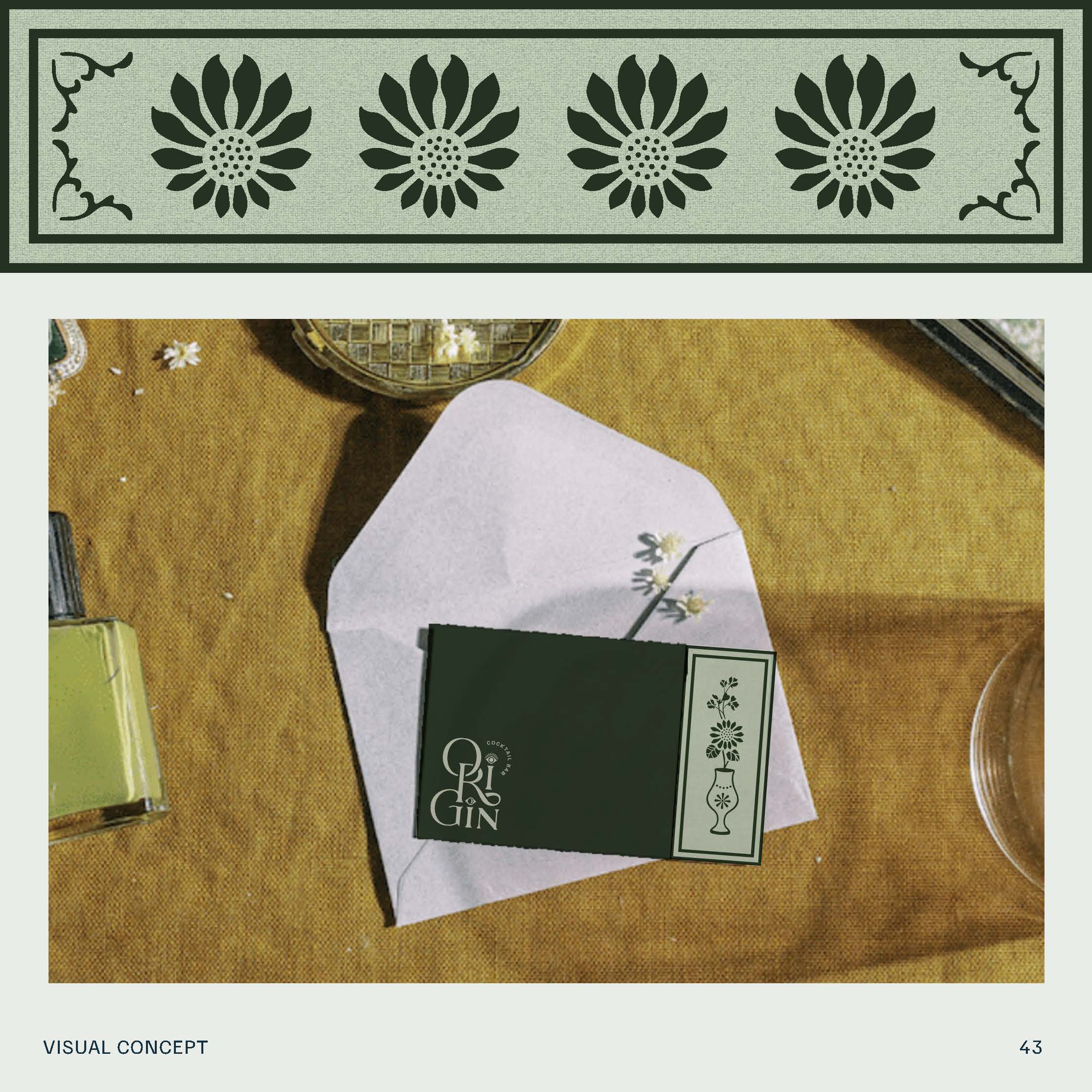
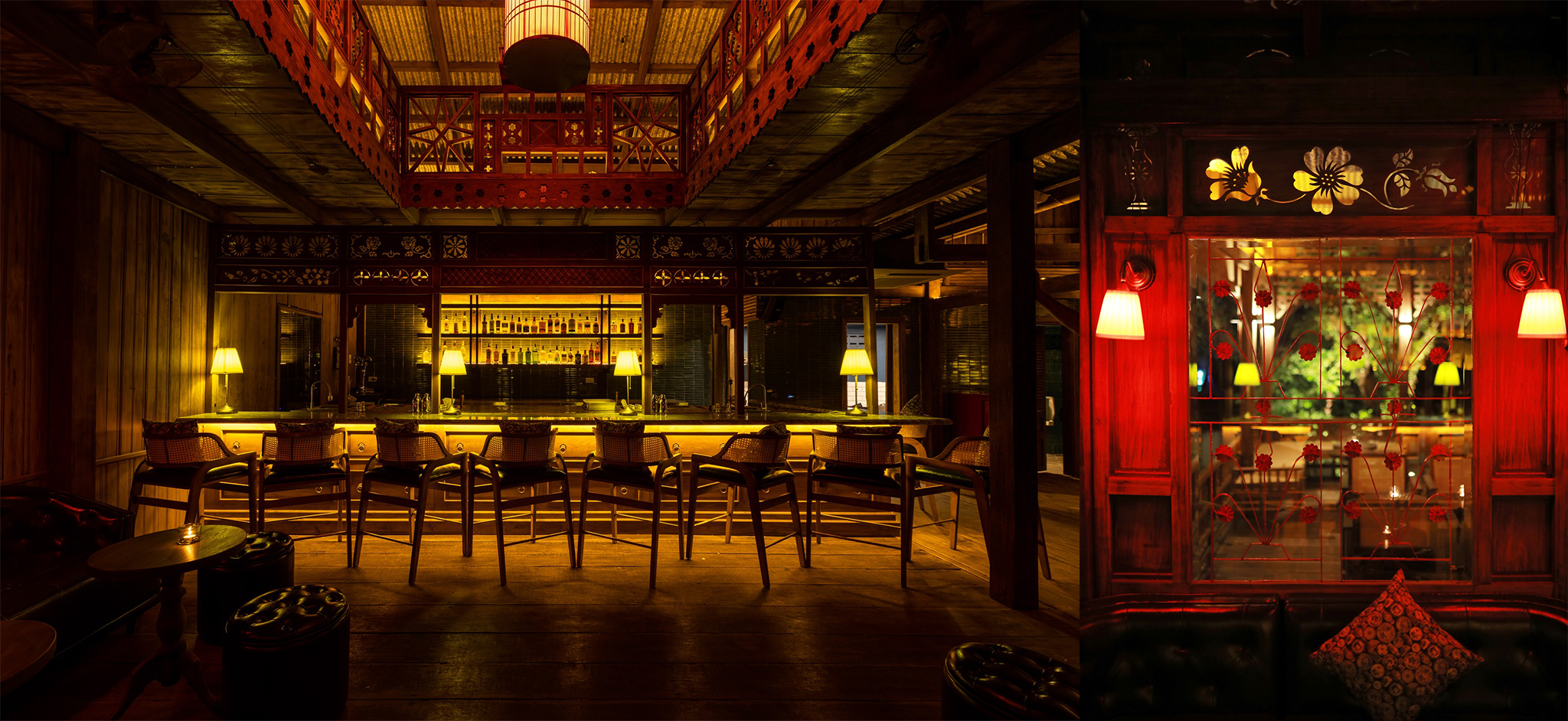
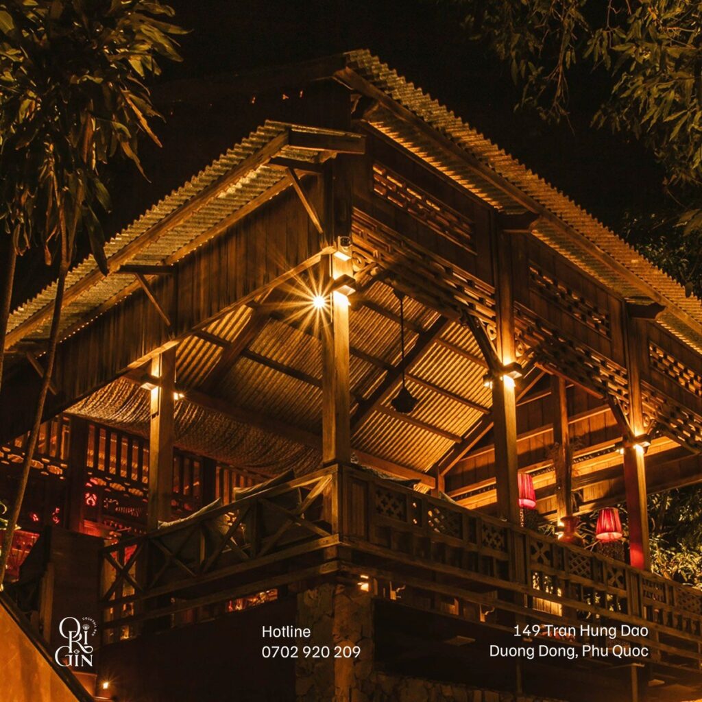
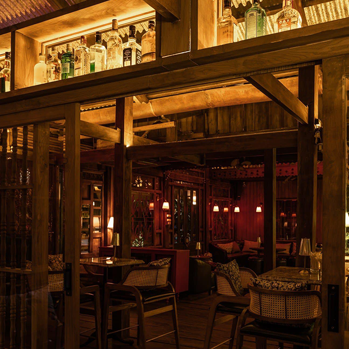
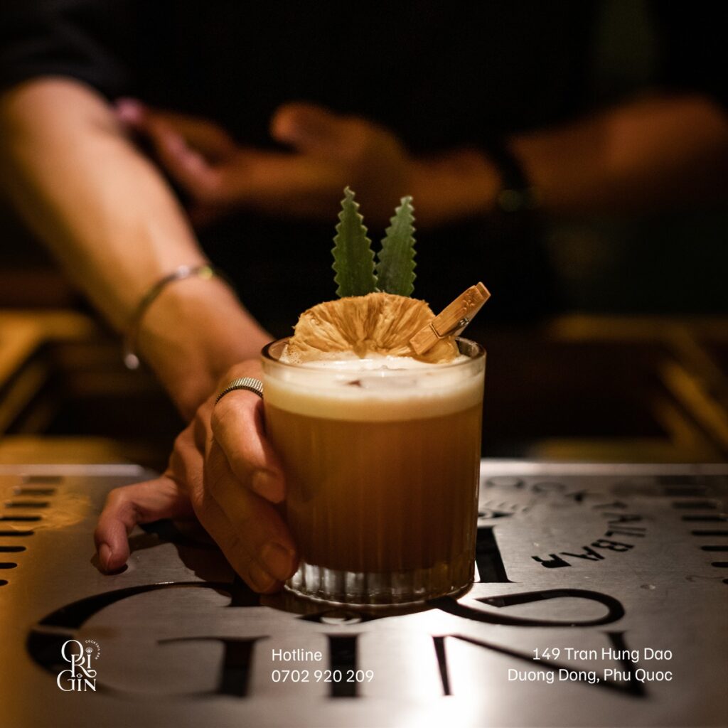
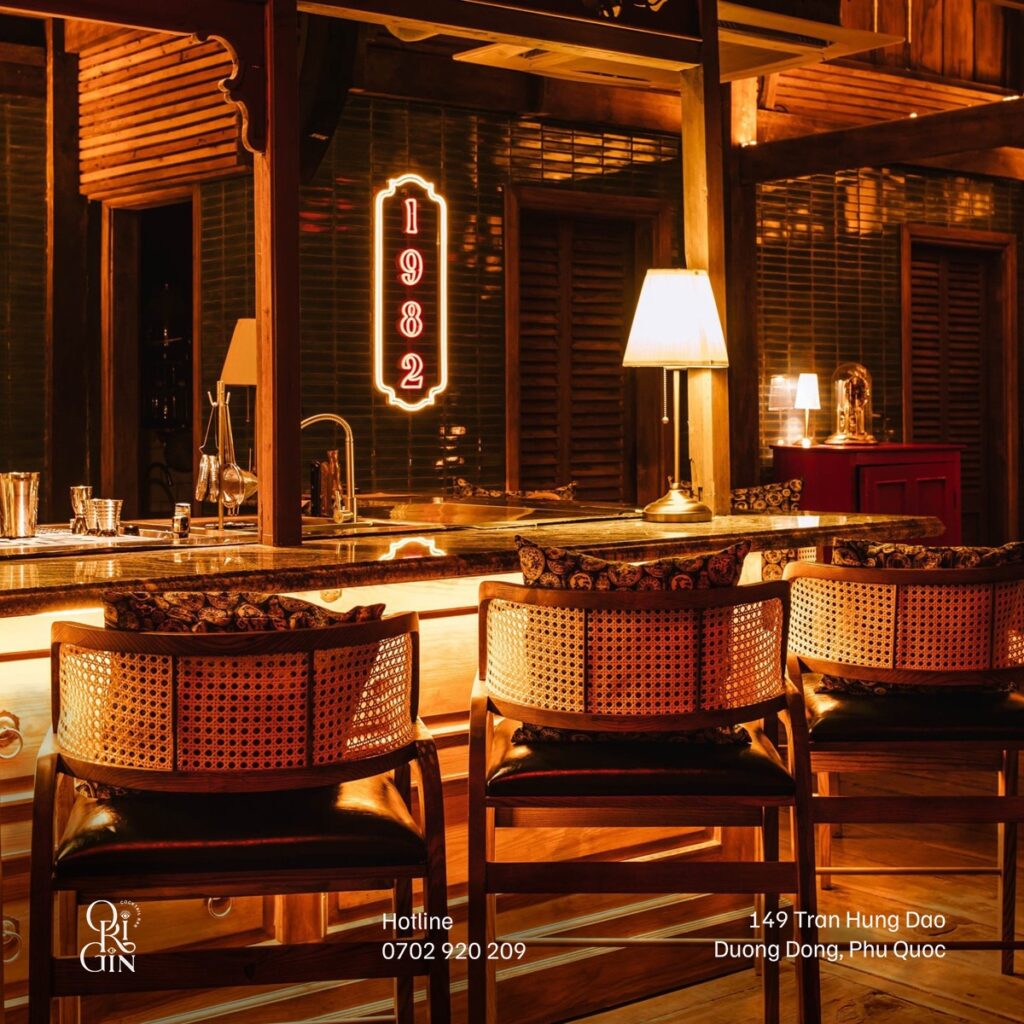
Origin 1982 Bar is situated in a century-old wooden stilt house adorned with French-style motifs, steeped in history. When designing the bar and its brand identity, we took great care to preserve its unique historical charm. Our approach involved meticulously integrating the original motifs of the ancient villa into all aspects of our designs. We opted to maintain the villa’s authentic Indochine style, honoring its legacy.
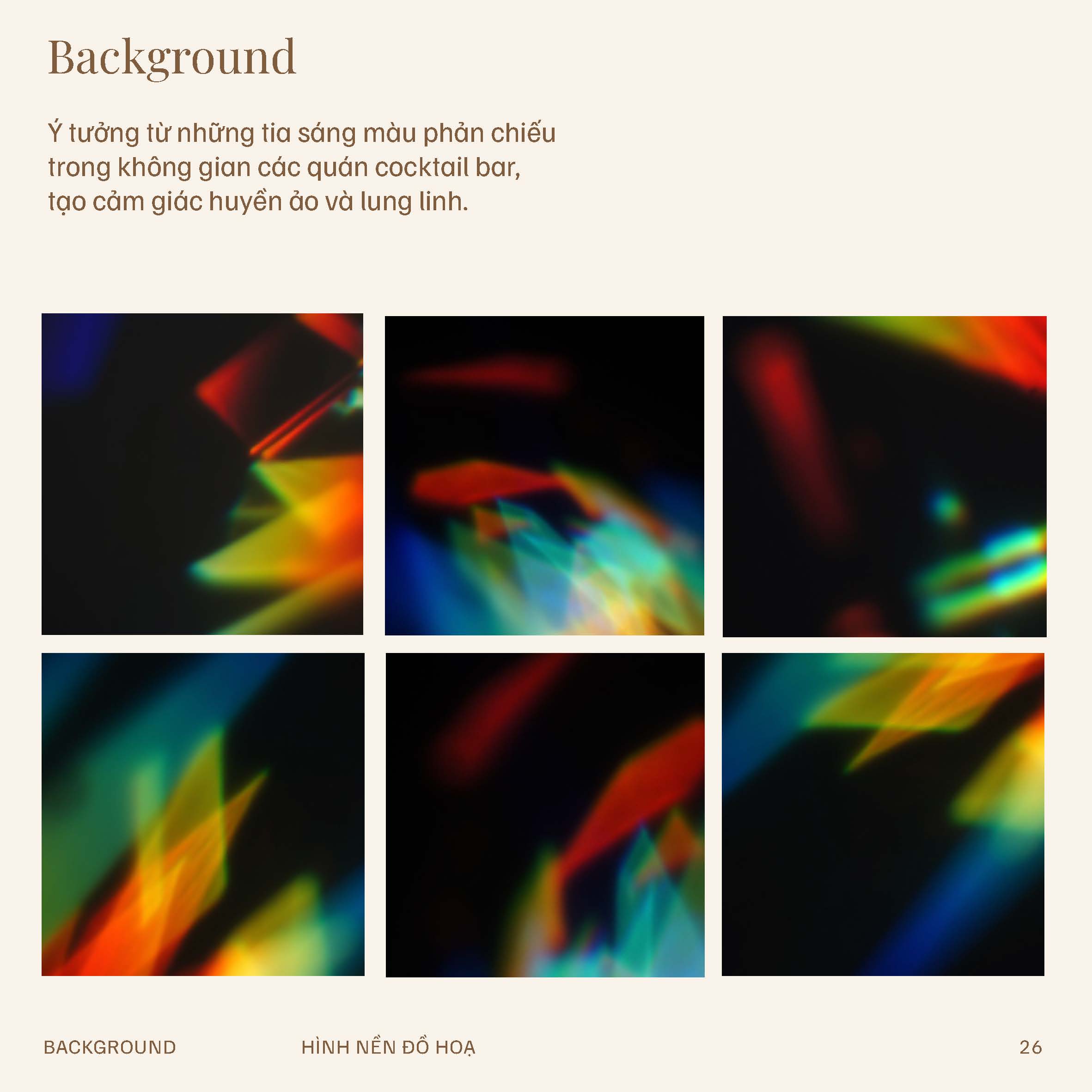
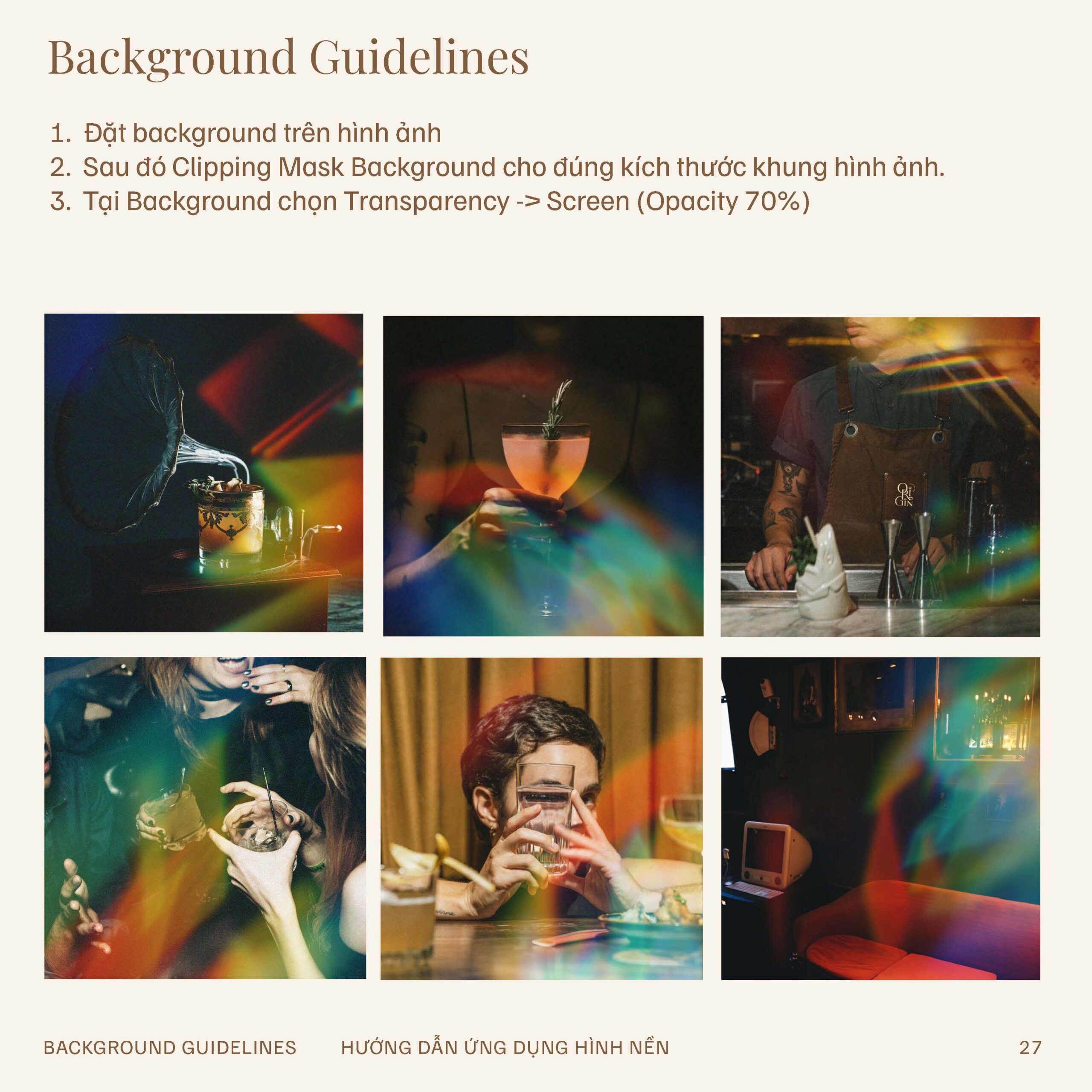
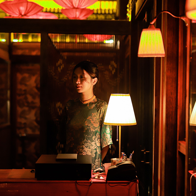
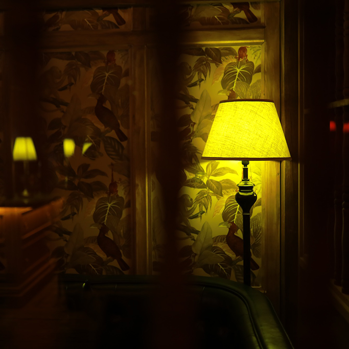
We closely supervised the construction of Origin Bar to ensure that every detail—from style and ambiance to colors—aligned perfectly with our vision. Additionally, Origin’s menu is equally special. We curated cocktails using local specialties from Phu Quoc, such as Fish Sauce, Peppercorn, and Pearl Cocktail. Below are the Brand Guidelines that my team and I developed, along with real images of Origin 1982 Bar.
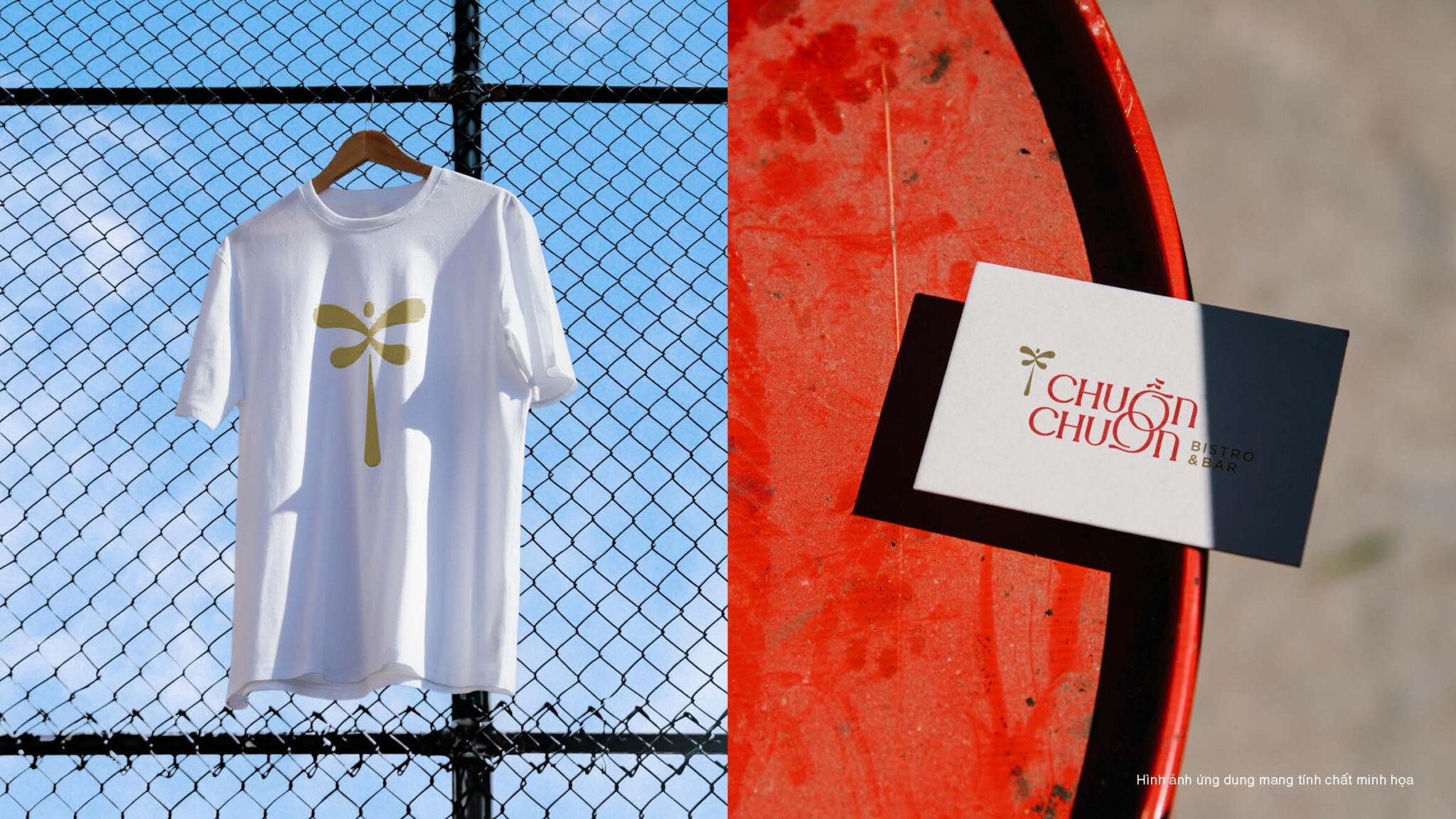
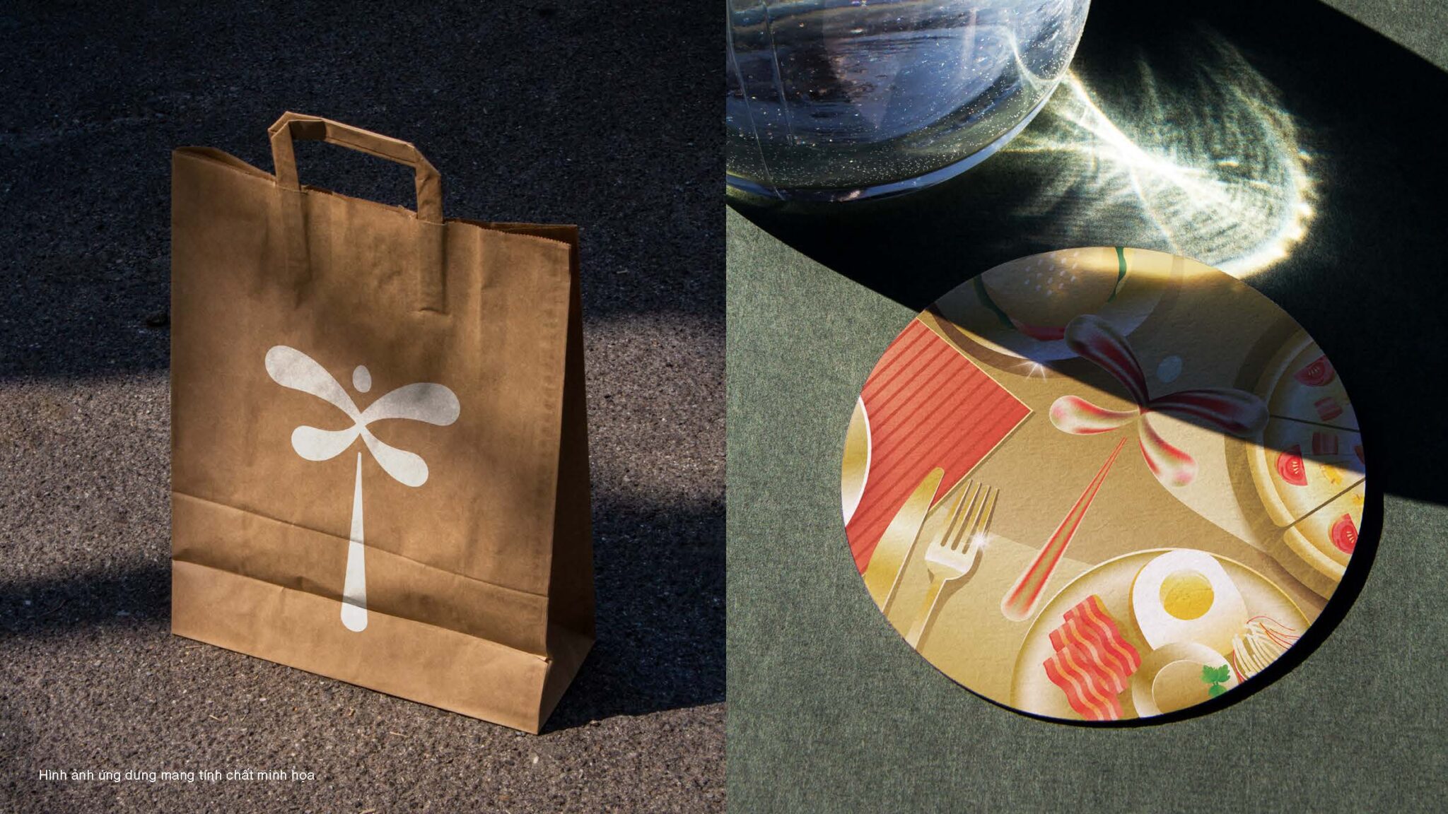
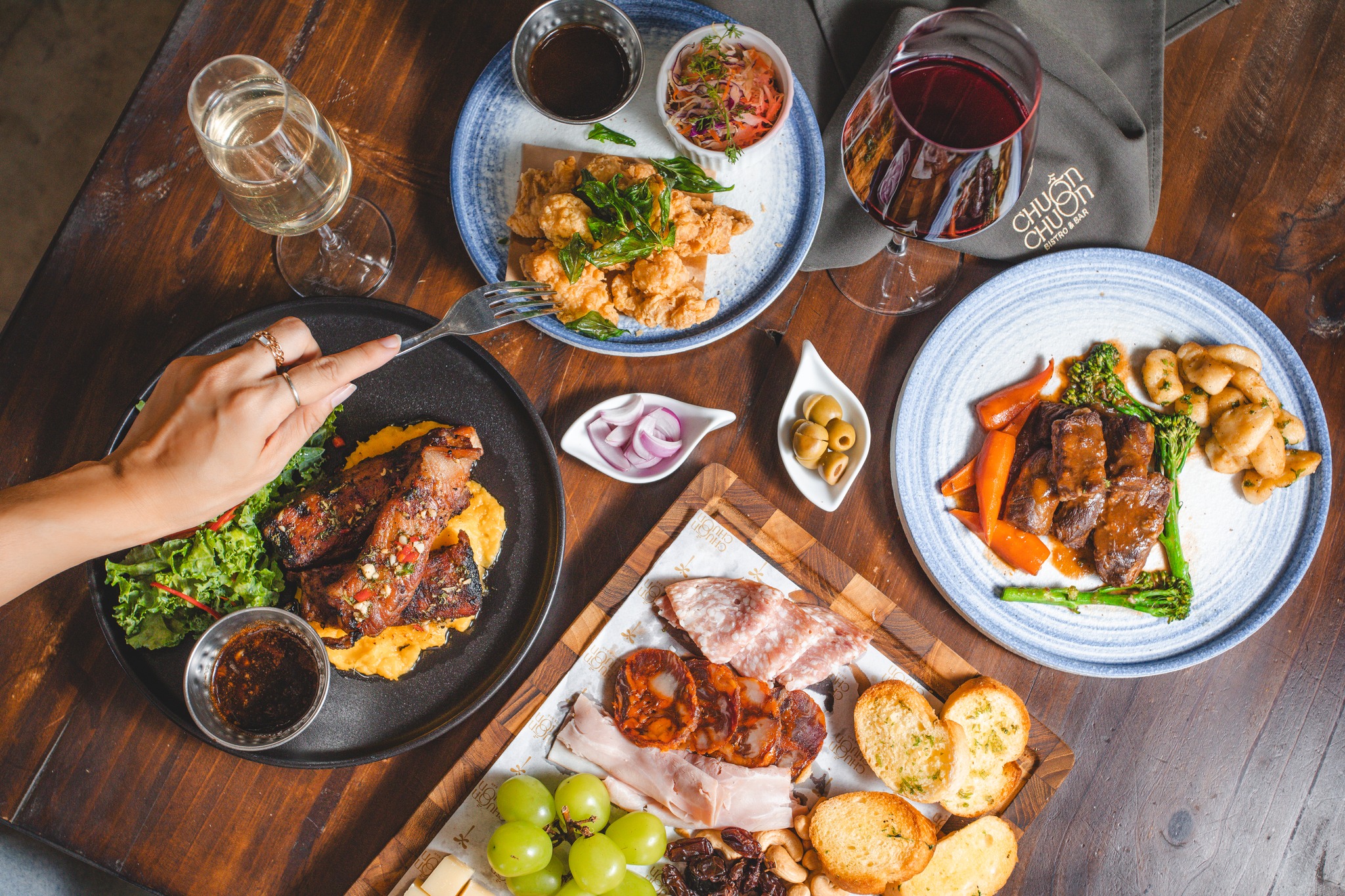
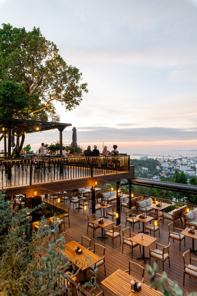
Chuon Chuon Bistro
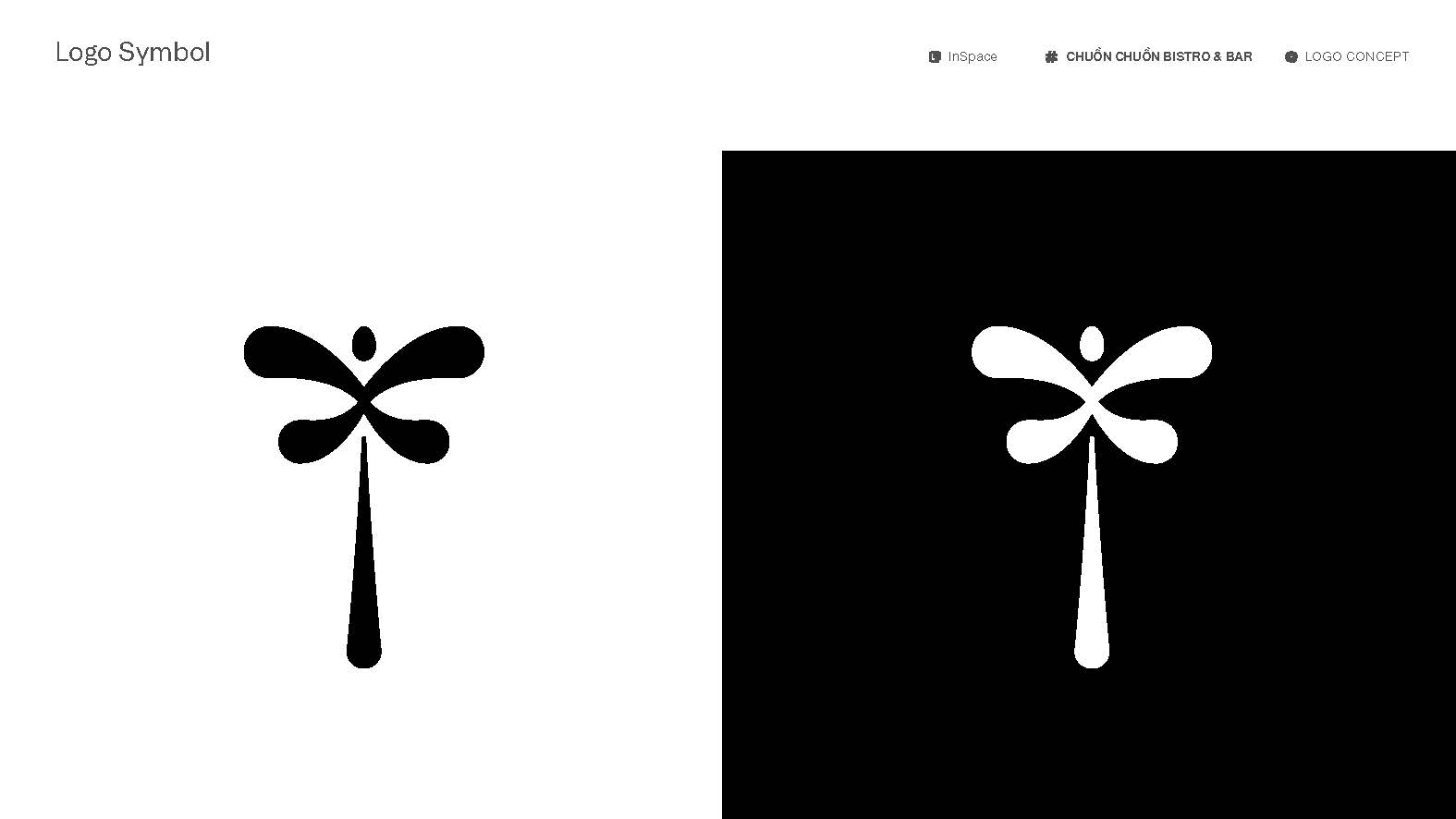
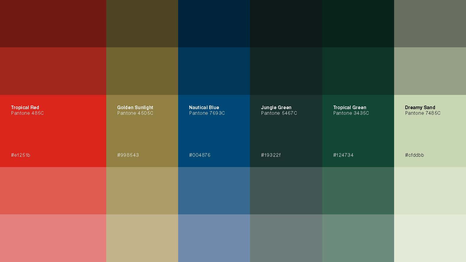
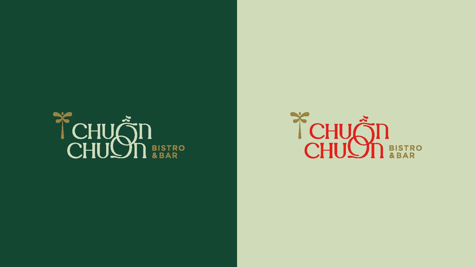
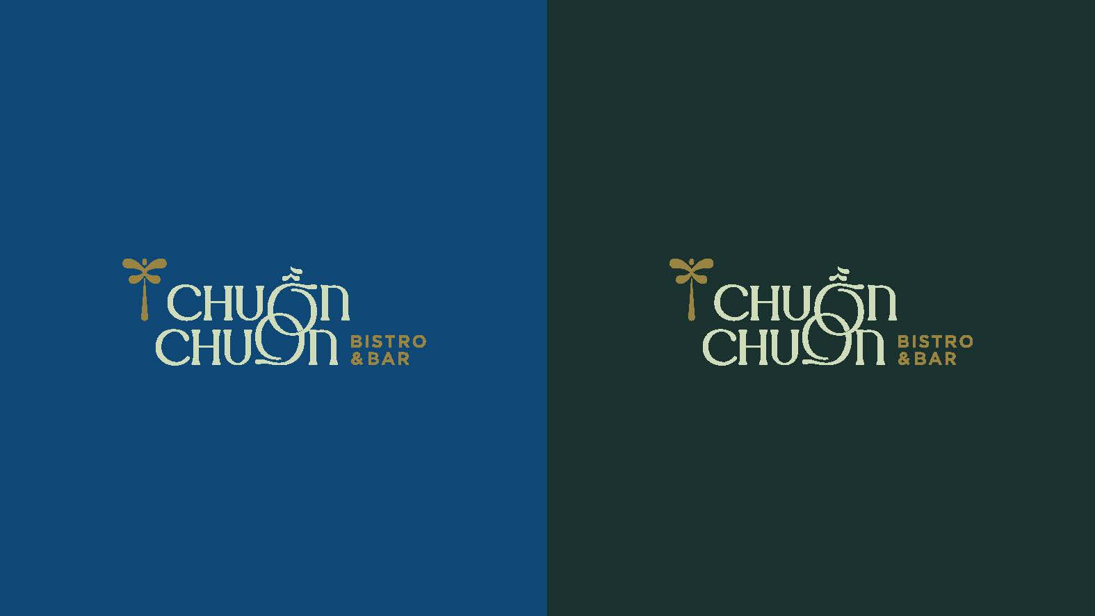
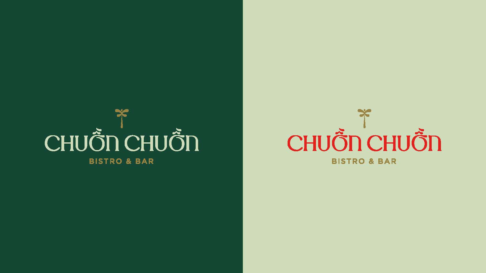
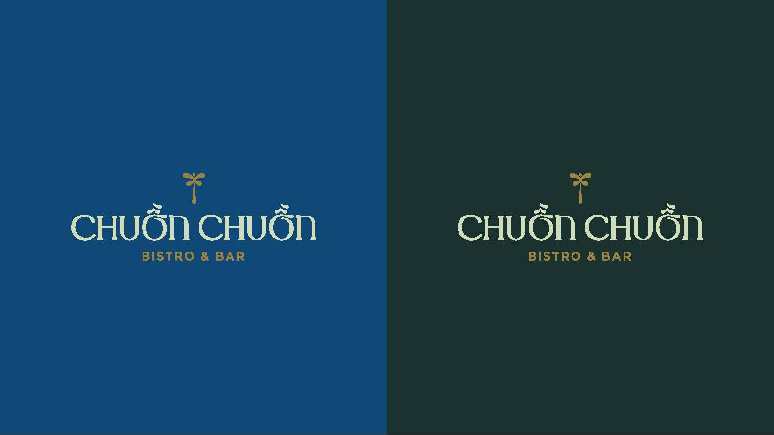
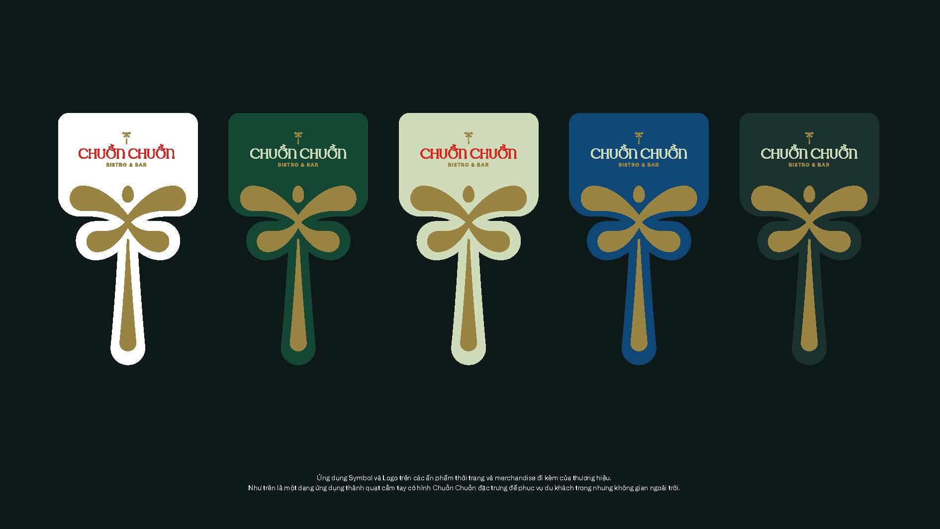
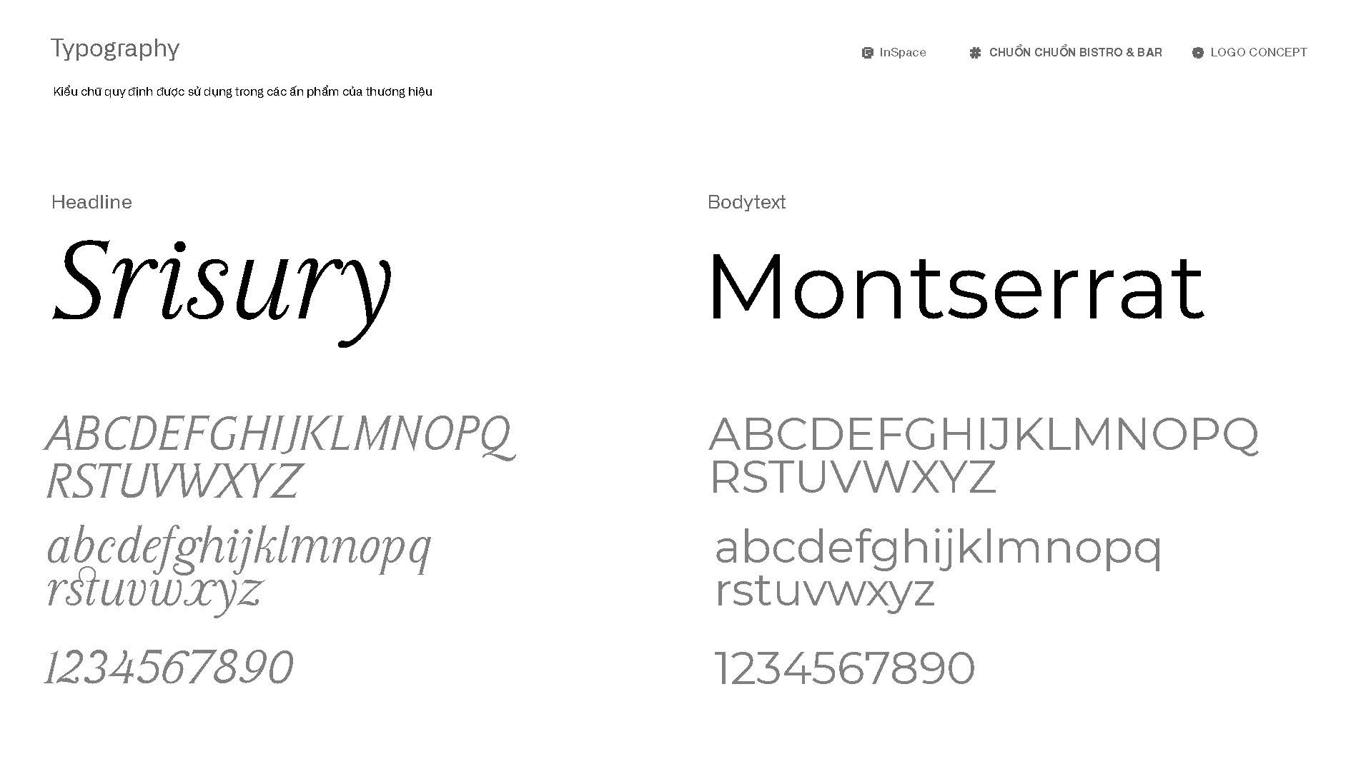
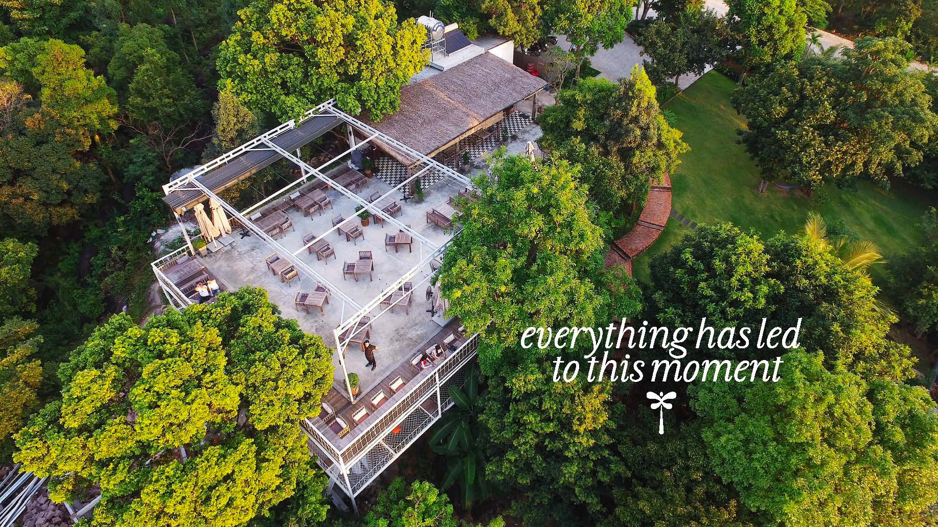
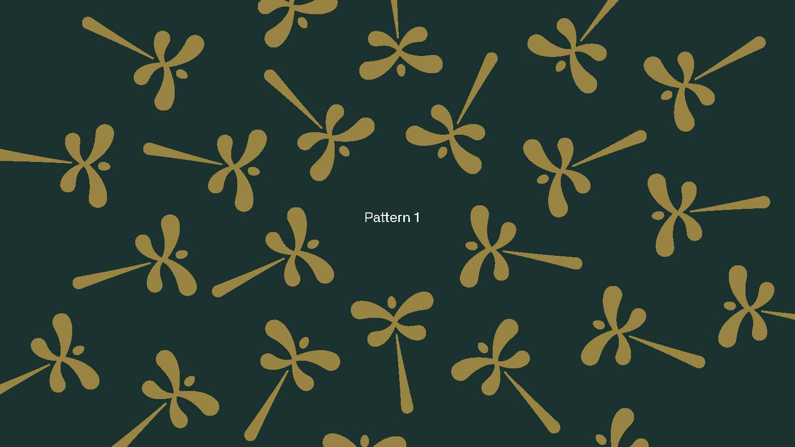
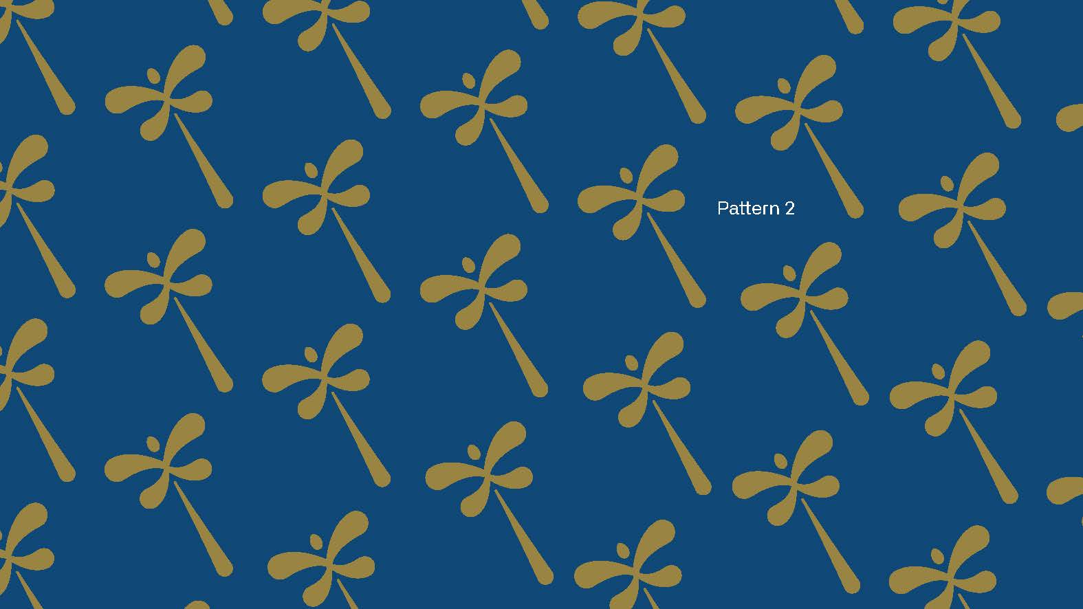
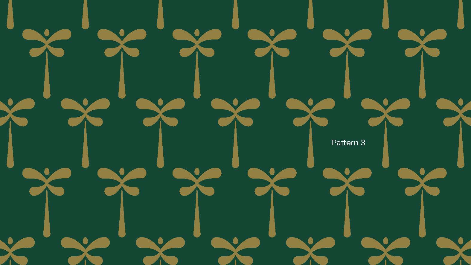
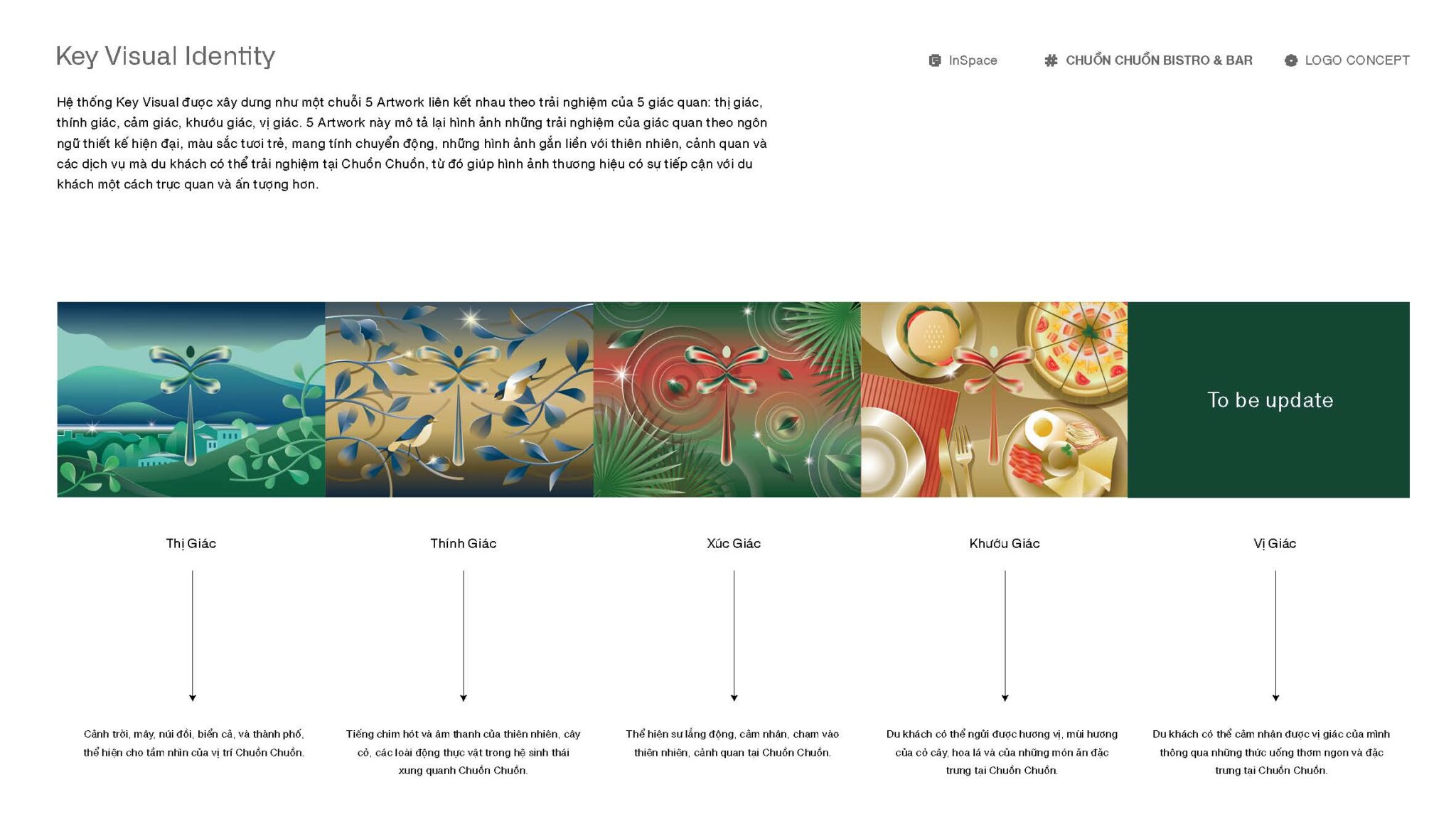
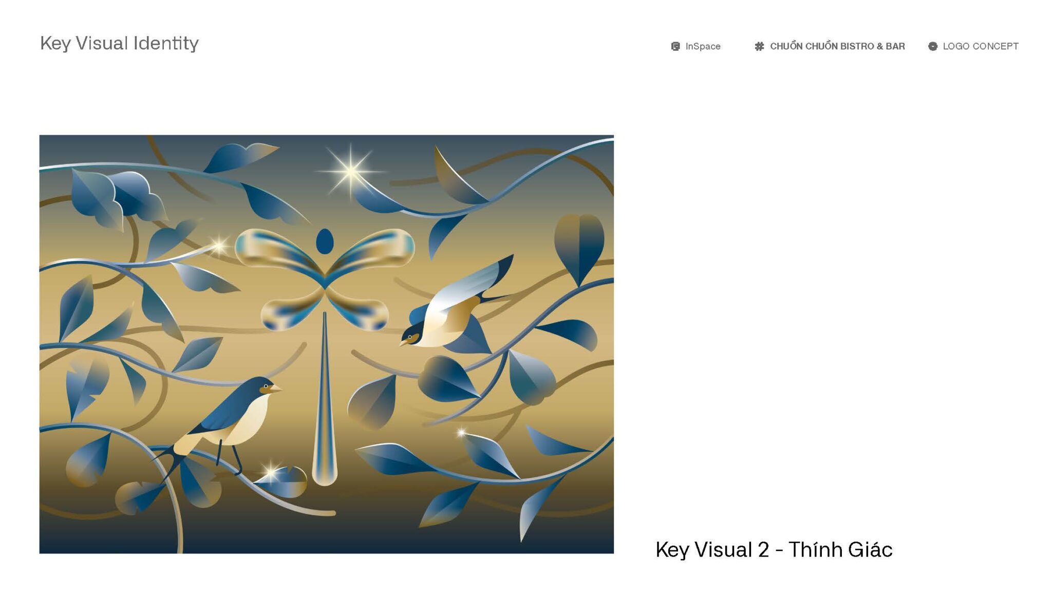
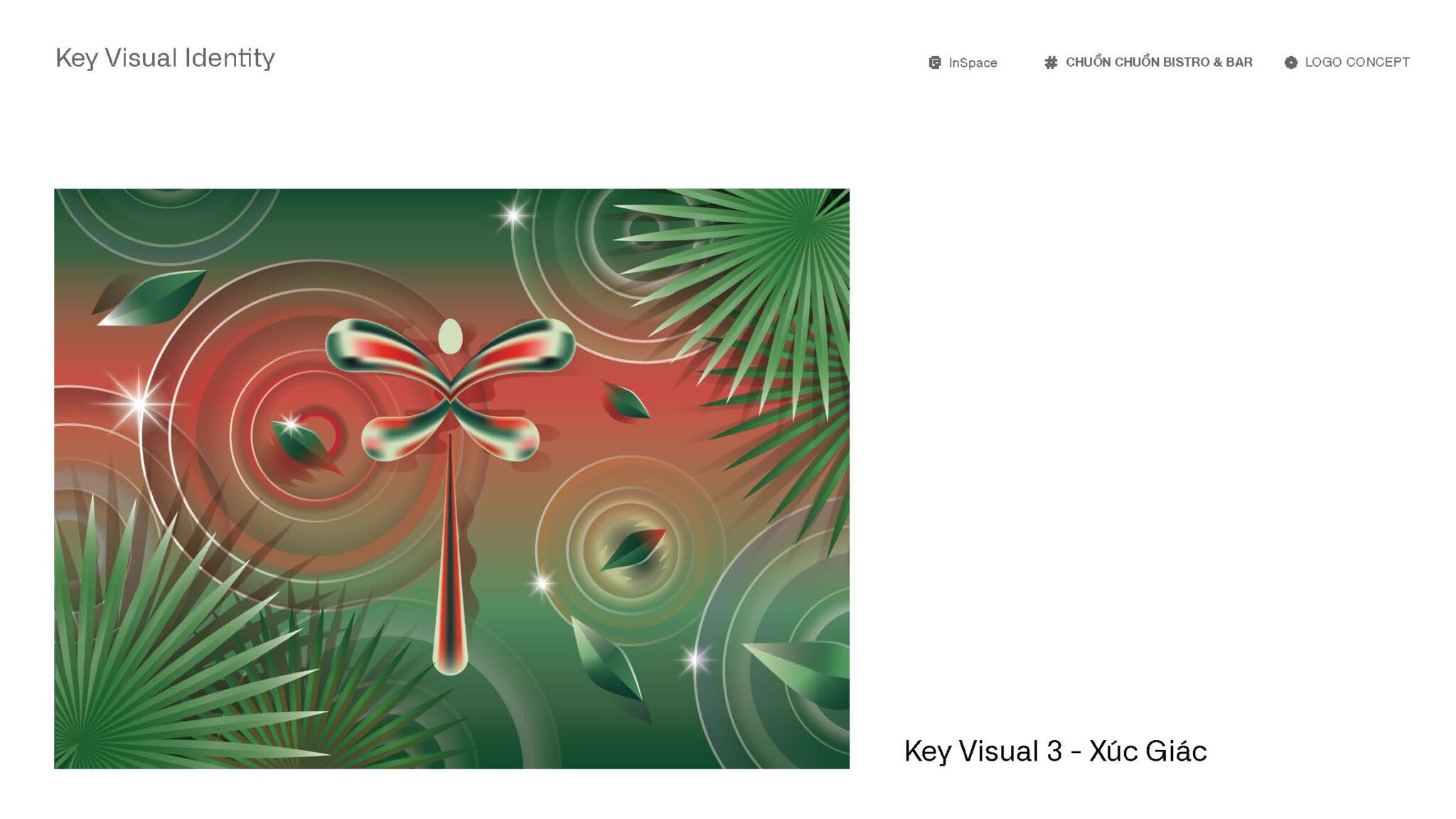
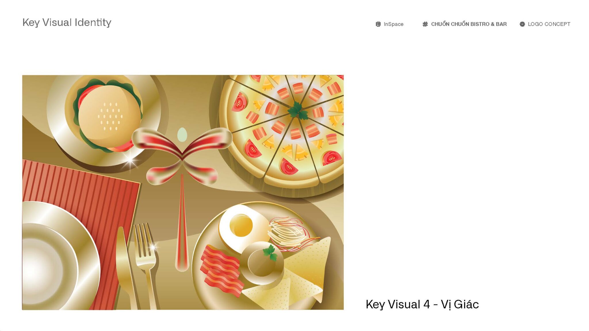
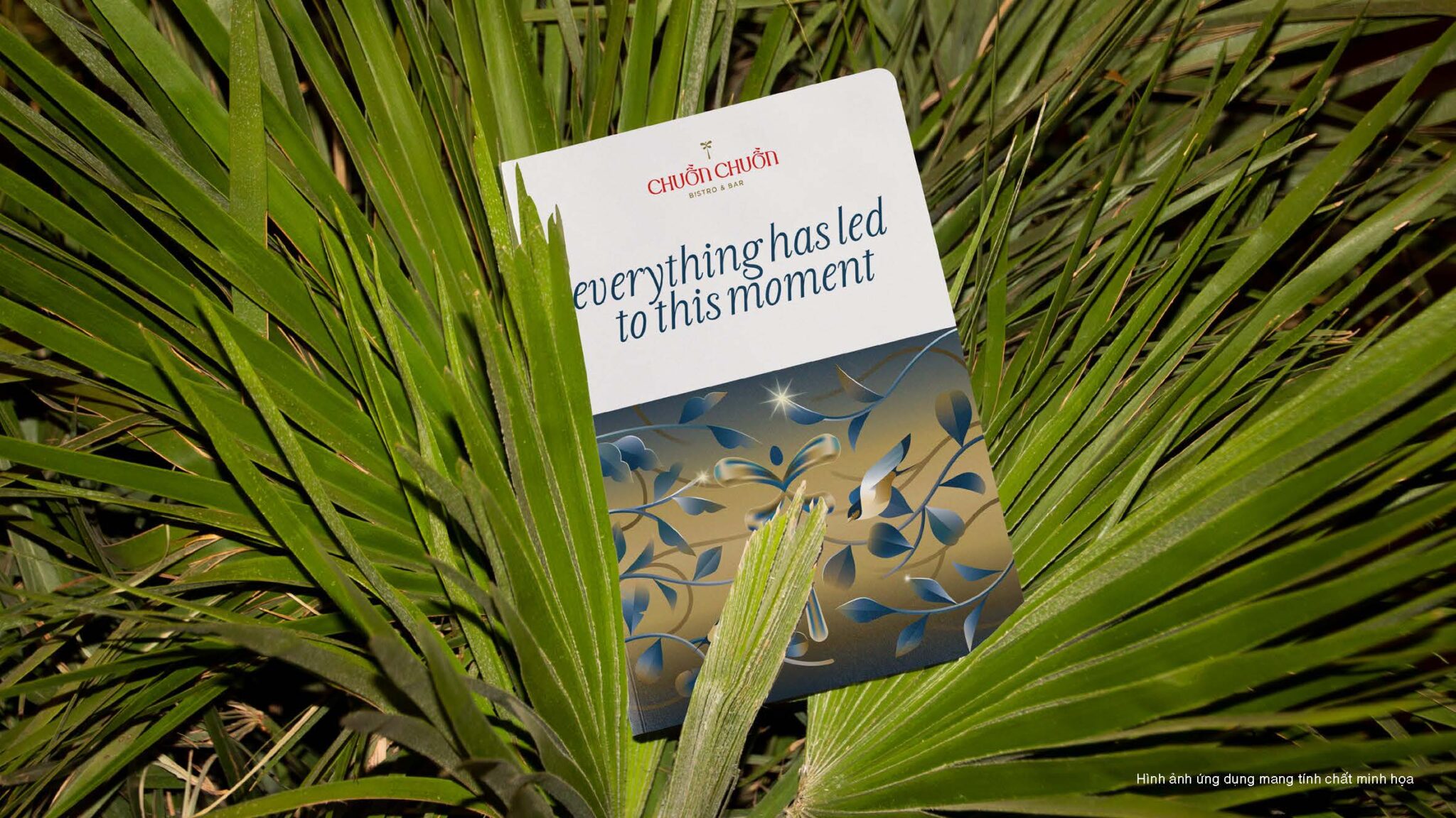
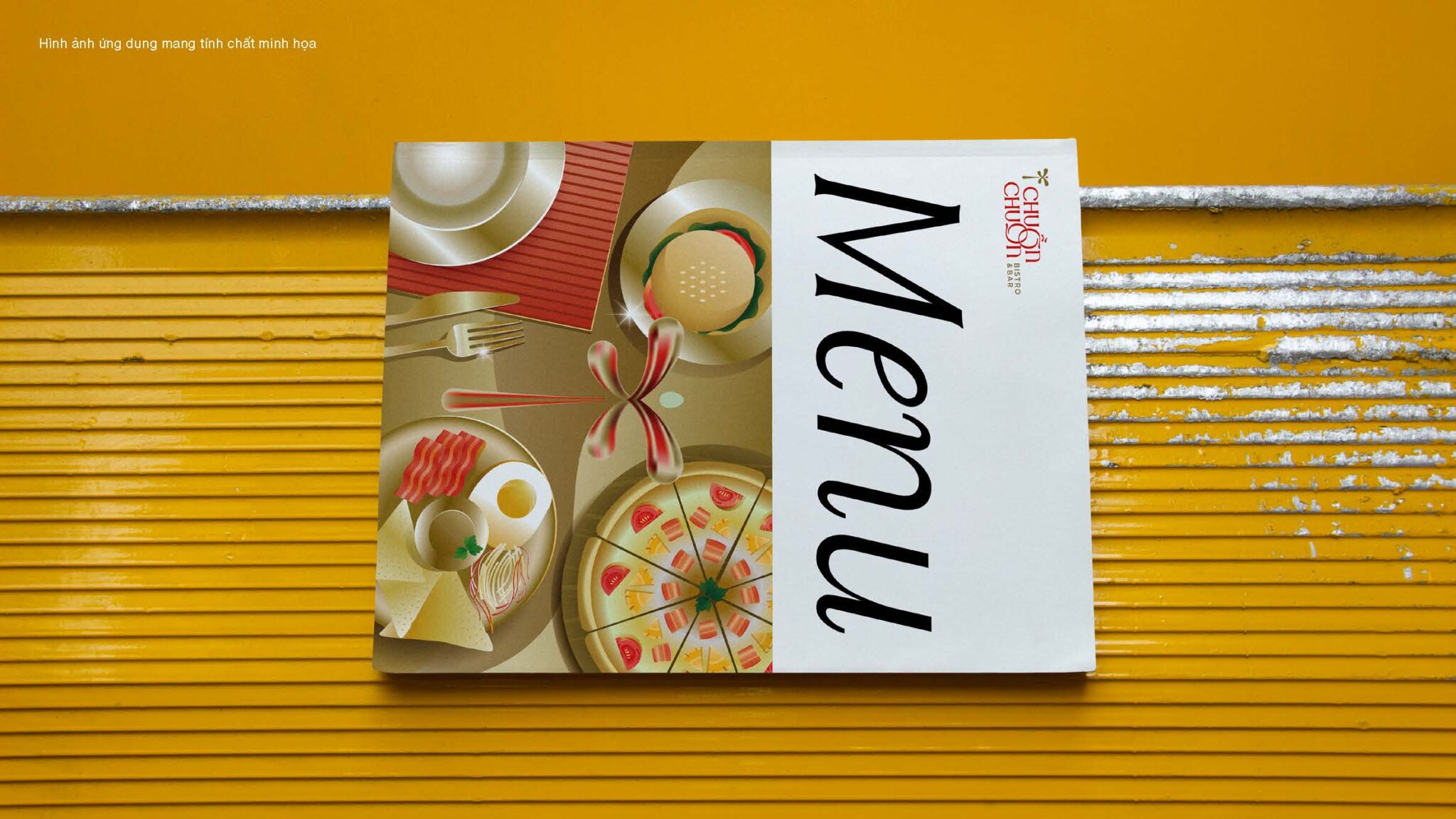
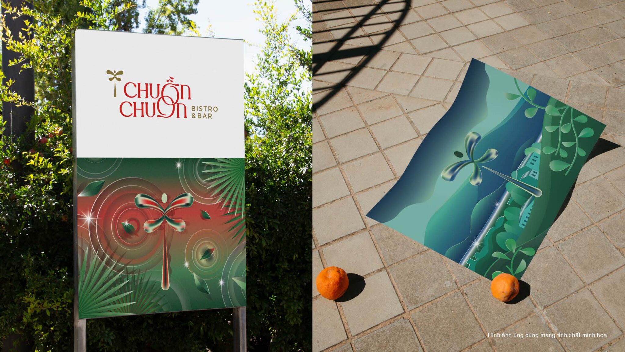
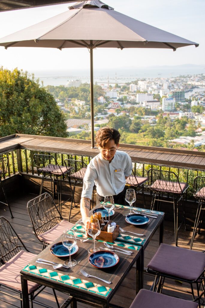
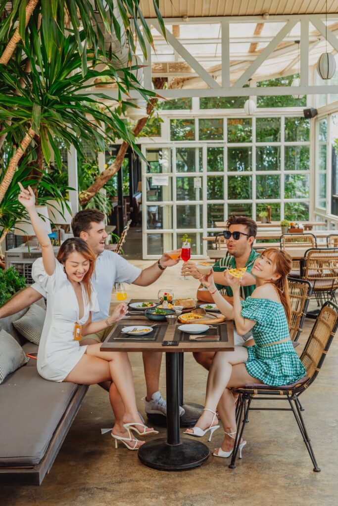
Just as tourists yearn to behold the panoramic views of Paris from the Eiffel Tower or Toronto from the CN Tower, travelers seeking the essence of Phu Quoc Island are drawn to Chuon Chuon Bistro. We envisioned Chuon Chuon Bistro as a haven for visitors of all ages and nationalities, catering to guests at any time of day. Therefore, when guiding Chuon Chuon Bistro through its rebranding, my team and I focused on crafting designs that were elegant, inviting, and resonated with diverse cultural preferences.




CAMPAIGNS
Laziit.
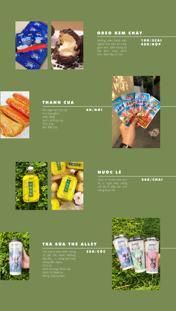
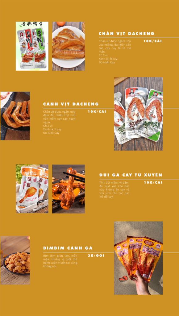
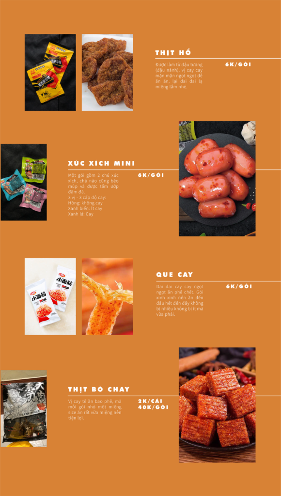
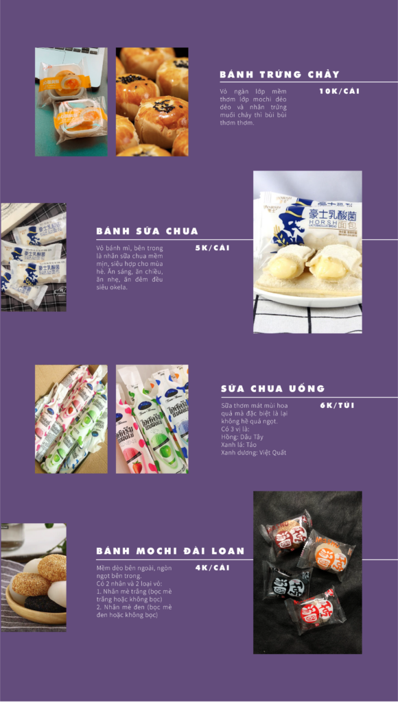
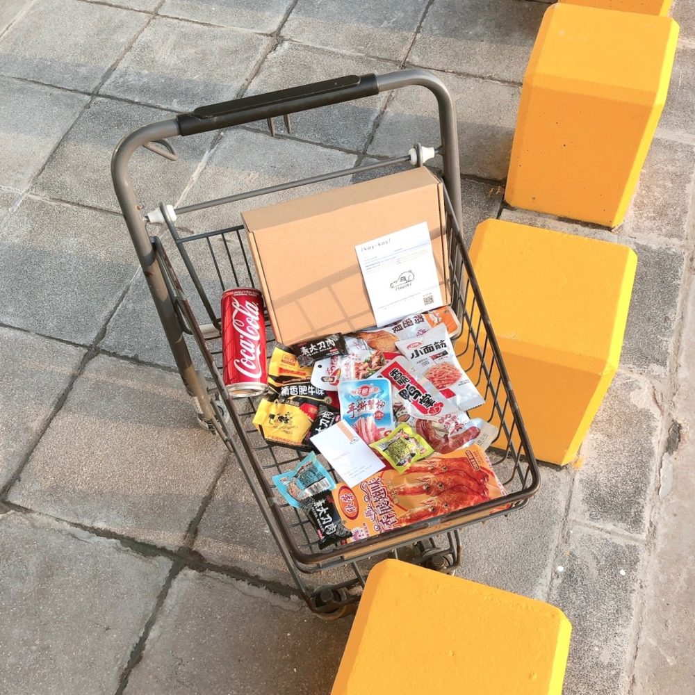
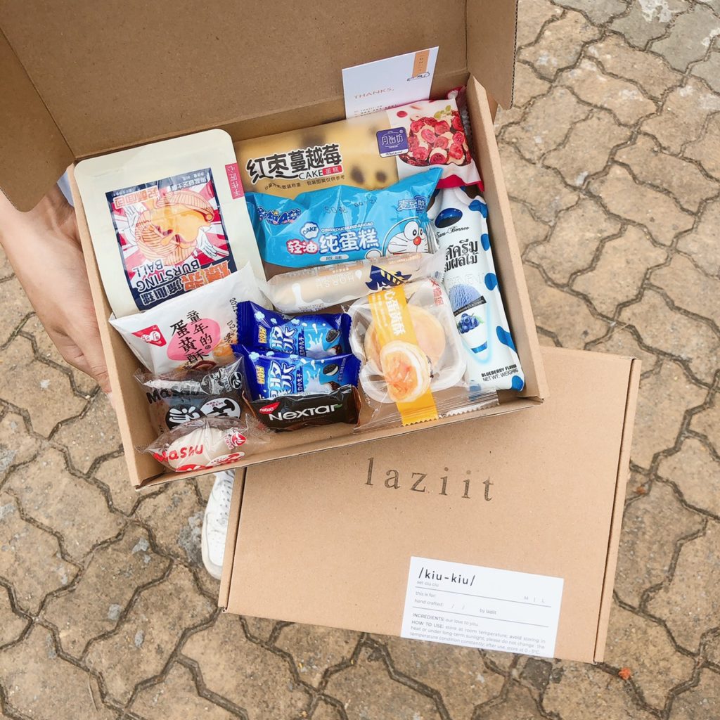
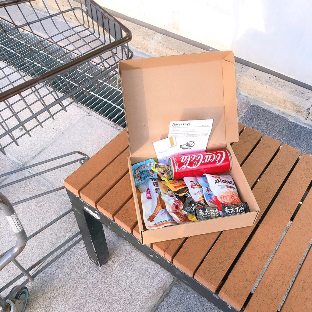
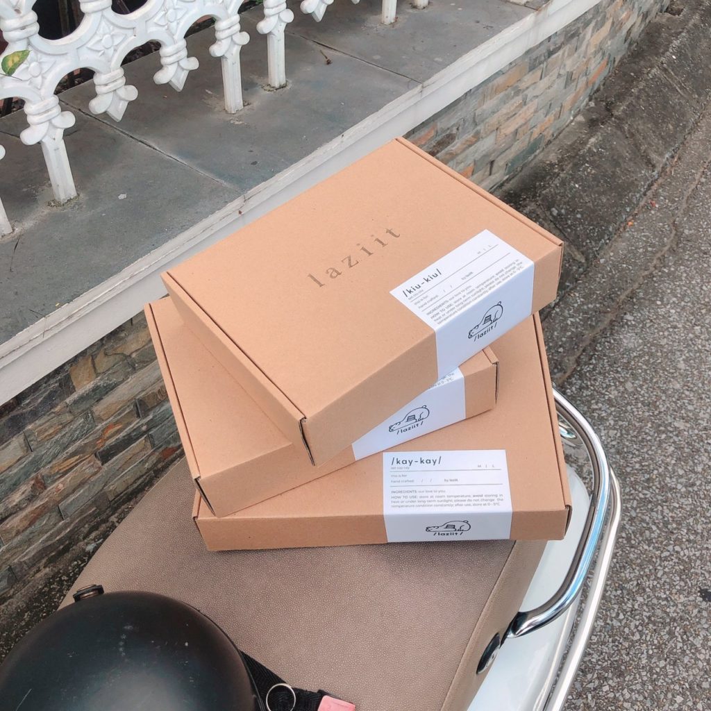
Laziit is a small snack shop my sister and I launched in Vietnam. Initially operating primarily online and occasionally at student fairs, we utilized Instagram as our main sales platform. Currently, our Instagram boasts over 2200 followers and a dedicated customer base. Despite being a small business, we handle everything ourselves – from management and marketing to design, copywriting, sales, and auditing.
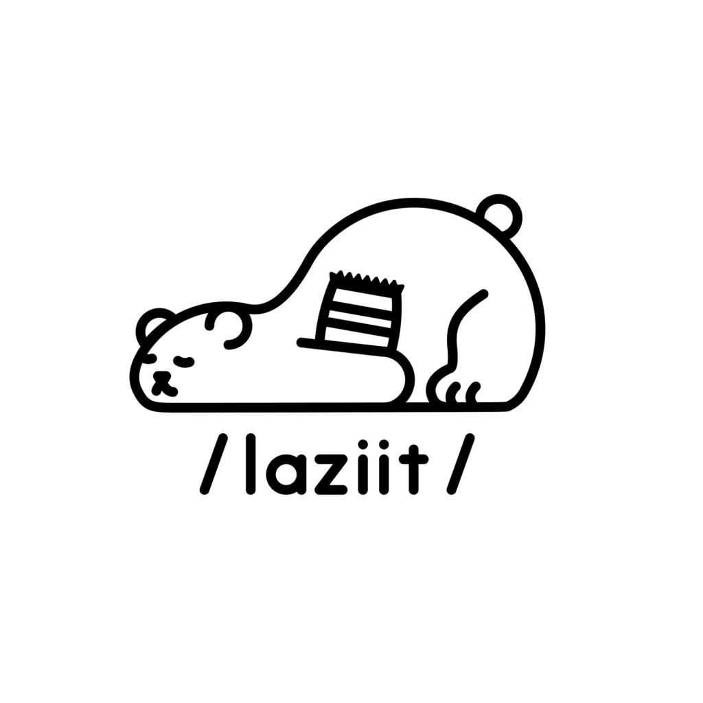
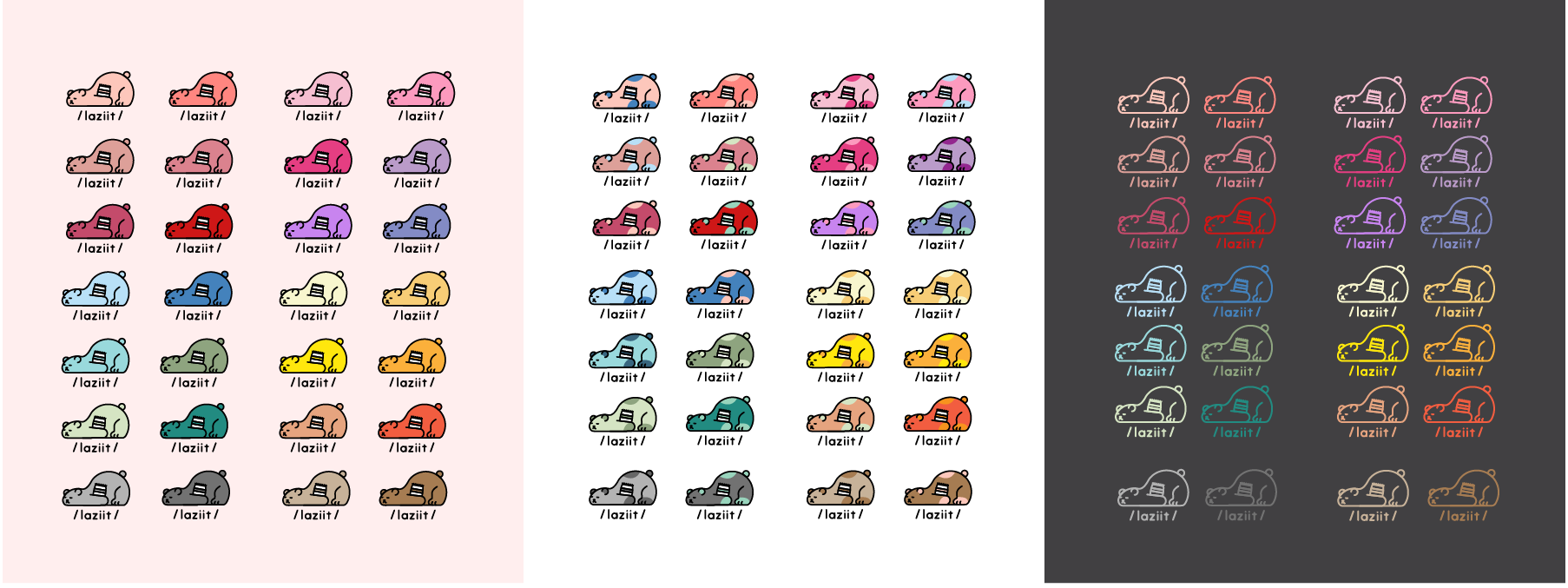
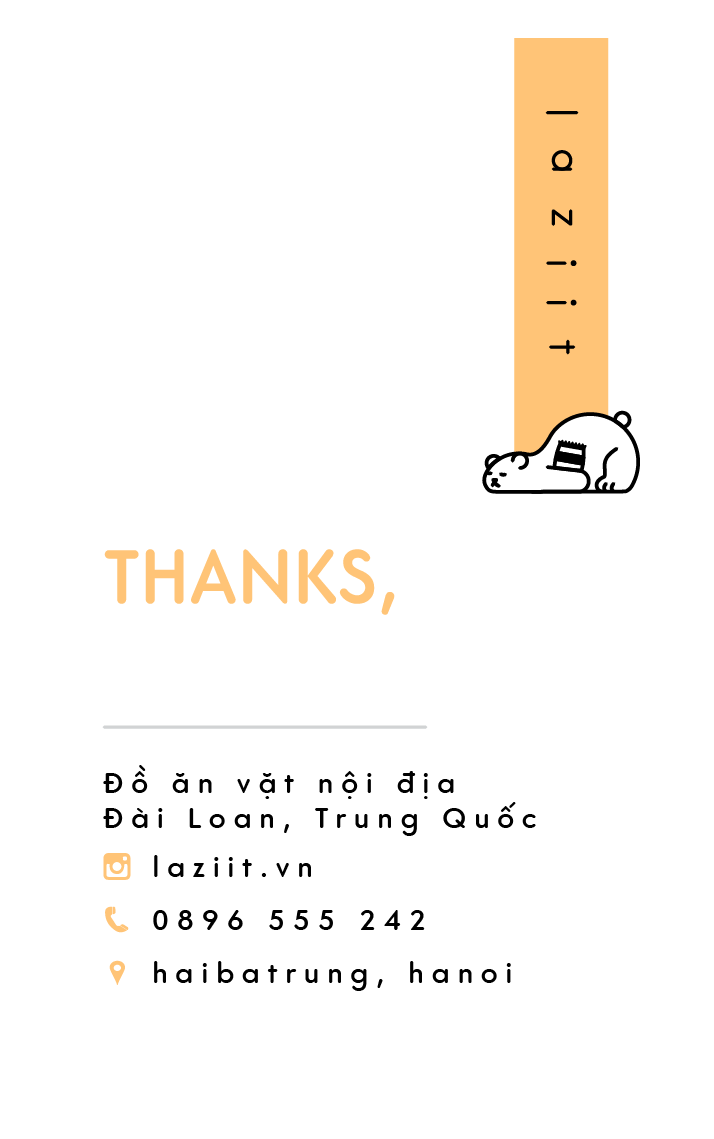
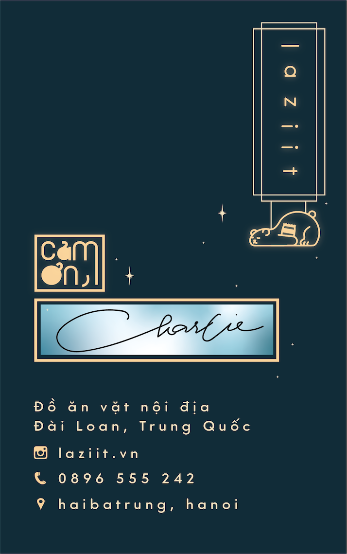
The name Laziit is a playful twist on “lazy-eat,” directly inspired by the modern habit of young people opting to snack in bed rather than preparing a proper meal. Our logo, a lazy bear cuddled in a blanket with a pack of chips, embodies this image perfectly. Unfortunately, the store is temporarily closed.
Thanks Card
All - Year Version
Moon Festival Version

Packaging
Menu
